30 of the Most Mind-Blowing Japanese Landing Pages (Not safe For Epileptics)
Japan is known for being... Ehmm... Being not like the rest of the world. So are some of the landing pages - they're known for sometimes being the designers' nightmares (or vicious dreams of web design's evil geniuses). We're sure you understand why, we've all seen those long landing pages overloaded with "buy now" buttons, testimonials and other tricky design elements.
We're not here to judge though and you're the ones who is supposed to decide whether or not these designs and promo methods are 'kosher'. All we want to say is that Japan has turned this design direction into arts (as it usually does) and Japanese landing pages appear to be really ass-kicking.
So as someone who's constantly broadening your horizons TemplateMonster is proud to present the 30 of the most mind-blowing (and thus inspirational) Japanese landing page designs.
Scalp-d.com

* * *
Elleseine.co.jp

* * *
Sunstar-tuhan.com

* * *
Pasoapaso-lavita.com

* * *
Drre.jp

* * *
Elleseine.co.jp

* * *
Lovecosmetic.net

* * *
Kenkoucorp.com

* * *
Suntory-kenko.com

* * *
Ashitaba.co.jp

* * *
Riceforce.com

* * *
Everlifegroup.jp

* * *
Yawata.tv

* * *
Lionature.jp

* * *
Attenir.co.jp

* * *
Ozio.jp

* * *
Yawata.tv

* * *
E-hapi.com

* * *
Teinei.co.jp

* * *
Kenkoucorp.com

* * *
Besides, there's a whole category of landing pages promoting some sort of green drink (or perhaps it's not a drink, it's just that it's being seductively poured into drinking glasses all the time, so we assume it's meant for drinking). These ones are simply awesome, so green and totally make you want to drink something green and seaweed-based right away!
Kenkounomori.co.jp

* * *
Kyusai.co.jp

* * *
Ashitaba.co.jp

* * *
Kyusai.co.jp

* * *
That was unusual, wasn't it? Our dearest Japan, please let us thank you for this unforgettable experience. We would also like to thank LandingPage-Link.jp for gathering tons of those landing pages from Japan as well as Mr. Keijiro Tsuji and Mr. Nomura Miho for sharing this website link with us. You're all doing a great job over there, we love you!
Among the huge number of custom-made templates on the market, it is quite difficult to find a suitable option for one’s particular business. Choosing the right template can affect the success of your business so you should not go wrong. TemplateMonster marketplace offers a huge variety of premium landing page templates for any business niche. I have picked up the best 10 landing page templates which will easily generate the leads and boost your business. Just have a look!
Lintense - All-in-one Landing Page Template
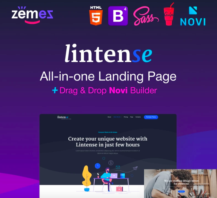
If you are thinking about a multi-functional landing page template for your project, Lintense is a flagship product which is worth choosing. This all-in-one solution is 100% responsive and cross-browser compatible. No doubt, your web page will work great on a variety of tablets and smartphones, with different operating systems. In-built Novi Builder will realize your website development ideas with no coding skills required. 5 perfectly designed templates, effective plugins, regular updates, and dedicated 24/7 support are included in the package.
More features:
- Parallax effect
- Bootstrap framework
- Top-notch performance
- SEO-friendly coding
- Valid and clean HTML code
- Google web fonts
- Google map
- Accurate documentation
SEO Studio - Consulting HTML with Novi Builder Landing Page Template
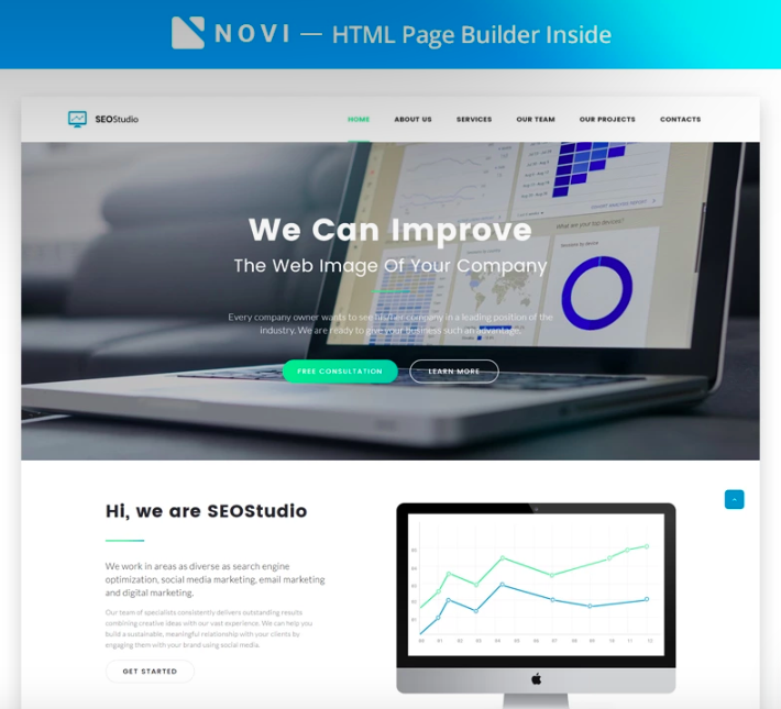
With SEO Studio landing page template, you can promote your digital product or services in a professional manner. As the one who will install and customize the web page, you will appreciate a great number of features and opportunities to work with. Novi Builder will allow you to create a stunning HTML web page easily and efficiently. The template is equally good for newbies and web experts. 100% responsive layout built with Bootstrap will run smoothly in all web environments.
More features:
- W3C valid well-commented code
- SEO-friendly layout
- Working Contact Form
- Newsletter subscription
- Stick-to-top menu
- Google web fonts
- Accurate documentation
- 24/7 premium support
Flooria - Flooring One Page Clean HTML Landing Page Template
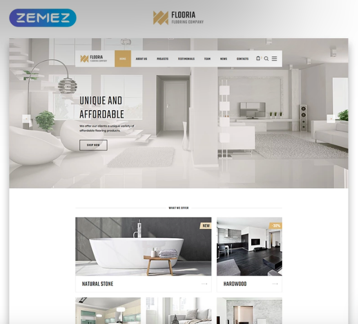
No doubt, you will be able to build an effective online presence of your flooring business with Flooria template. This is a stylish and highly customizable solution which does not require any coding skills. You will get such settings as creating pages in the in-built webpage builder, shortcodes, unlimited choice of color palette and custom-made pages, and etc. It has never been easier to adjust the template to your business needs and preferences. The template comes with the rich UI kit, tons of quality images, material parallax feature, and other essential tools.
More features:
- 100% responsive design
- Well-commented and SEO-friendly code
- Cool animation effects and transitions
- Blog module
- Google map
- Cross-browser compatibility
- Detailed documentation
- 24/7 support
Medical Assistance Program - Medical School Clean HTML Landing Page Template

If you are running a business in the medical field, you should not miss Medical Assistance Program template. This solution is fully responsive and works perfectly on any devices and screen sizes. Also, this premium landing page template can boast of regular updates and support. To say nothing of the fact that you can fully customize it to fit your needs. Medical Assistance Program is packed with cool animation effects and transitions, images, working Contact Form, and etc.
More features:
- SEO-friendly layout
- Well-commented and clean coding
- Cross-browser compatible
- Bootstrap 4 framework
- Google web fonts
- Sliced PSD
- Premium support
- Detailed documentation
87 - Business & Corporate Creative HTML Landing Page Template
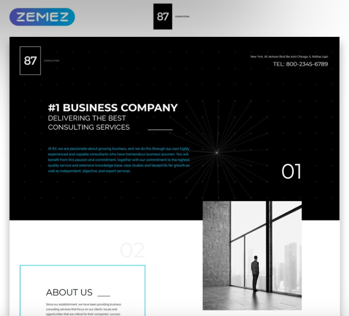
Clean, minimalistic, and stylish, the next landing page template is a great catch for any corporate and business needs. Rich UI kit, free premium images, responsive layout built with Bootstrap 4 are just a few features the package includes. The template is extremely easy to work with for both beginners and professionals. In case any question appears, you will be able to address it to the professional technical support team which is available for you 24/7.
More features:
- Cross-browser compatible
- Valid and clean coding
- Google map
- Working Contact Form
- Parallax effect
- Optimized for speed
- Google fonts
- Detailed documentation
Andrea - Architecture and Interior Design Landing Page Template

Promote your architecture interior design business with a modern and attractive landing page template. This option allows you to create a project in minutes with no coding skills. Good responsive design is crafted for any platform and device. No doubt, Andrea landing template will speed up the marketing campaign to promote your service thanks to SEO-friendly layout. Check out a live demo to discover more features and customization tools.
More features:
- HTML5 & CSS3
- Cross-browser compatible
- 100% retina ready
- Minimal and clean design
- Working AJAX Contact Form
- Detailed documentation
- Clean and well-commented coding
- 24/7 support
Green Day - Food Store Clean HTML Bootstrap Landing Page Template

Are you developing your healthy food-related business? I am sure you know that a professional website is a must. Fresh and clean Green Day landing page template will help you to launch the marketing campaign with no time and hassle. No coding skills required, beautiful juicy design, and a number of effective customization opportunities will help you to achieve the goal as quickly as possible. Your customers will have a pleasant shopping experience thanks to intuitive navigation and modern design.
More features:
- 100% responsive design
- Material parallax
- Google fonts
- Working Newsletter Subscription Form
- Gallery
- Powerful Search Engine
- Bootstrap 4 framework
- Effective 24/7 support
BestTravel - Landing Page Template

Let your visitors explore their dream destination on your eye-catching web resource. BestTravel is a modern landing page template for your travel agency. The best practices of website development and modern tendencies are implemented in this product. It has an elegant, attractive, and highly customizable layout, and includes everything necessary for successful marketing. Creating and editing your landing page is a matter of minutes – simply change the position of blocks, colors, removing unnecessary blocks.
More features:
- 100% responsive design
- Google maps
- Working Contact Form
- Awesome Google fonts
- SEO-friendly layout
- Cross-browser compatible
- Detailed documentation
- Professional 24/7 support
Taxpro - Taxi Minimal Bootstrap HTML Landing Page Template

Taxpro was designed for taxi-related business and includes all the features and tools you may need for a taxi company website. Its key features are the focus on usability, lightweight structure, 100% valid code, and cross-browser compatibility. With Taxpro, you will get tons of high-quality images on different car topics. Your web page will quickly adapt to any gadget with any screen size the user has in hand right now. Text and images are flexible to get rendered correctly.
More features:
- Well-commented code
- Parallax effect
- Stick-to-top menu
- Google fonts
- Optimized for speed
- Working Contact Form
- SCSS and PUG files included
- Cool animation effects and transitions
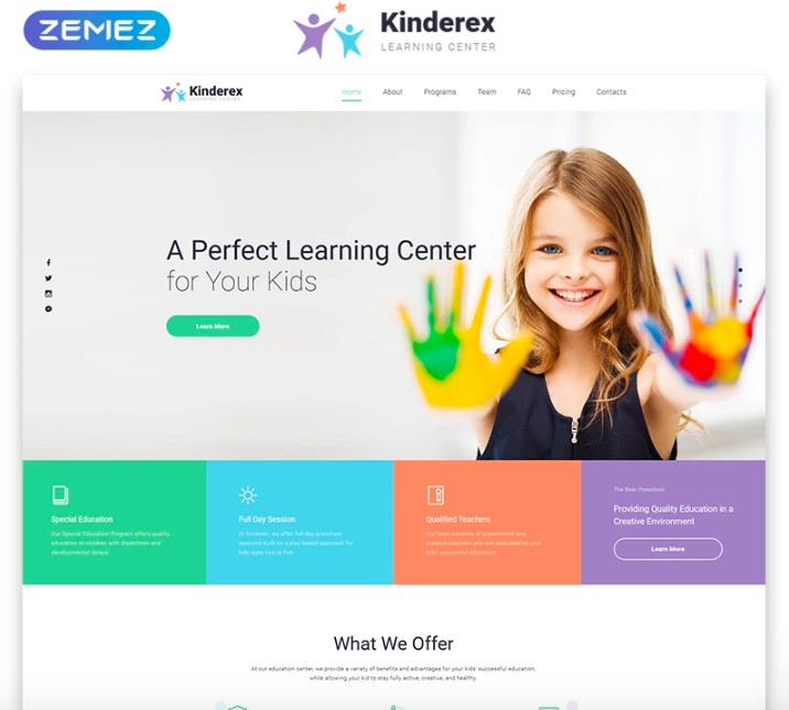
Kinderex - Kids Learning Center Clean HTML5 Landing Page Template
If you are still in search of the landing page template for your learning center's presentation, you have just found the one. You just need to download and install this landing page template, adapt it to your business and launch your online business card without any third-party specialists. This autonomy is ensured by the fact that the landing page templates is already equipped with everything necessary for an effective presentation of your business. Its modern web design is characterized by the presence of such an extensive set of visualization tools which allows you to realize any ideas.
More features:
- 100% responsive design
- Bootstrap 4 framework
- Cool animation effects and transitions
- Stick-to-top menu
- Blog module
- Gallery
- Google map
- Optimized for speed
21 Signs of a Perfect Landing Page Design [Free eBook]
Don’t miss out these all-time favourites
- The best hosting for a WordPress website. Tap our link to get the best price on the market with 82% off. If HostPapa didn’t impress you check out other alternatives.
- Website Installation service - to get your template up and running within just 6 hours without hassle. No minute is wasted and the work is going.
- ONE Membership - to download unlimited number of WordPress themes, plugins, ppt and other products within one license. Since bigger is always better.
- Ready-to-Use Website service is the ultimate solution that includes full template installation & configuration, content integration, implementation of must-have plugins, security features and Extended on-page SEO optimization. A team of developers will do all the work for you.
- Must-Have WordPress Plugins - to get the most essential plugins for your website in one bundle. All plugins will be installed, activated and checked for proper functioning.
- Finest Stock Images for Websites - to create amazing visuals. You’ll get access to Depositphotos.com to choose 15 images with unlimited topic and size selection.
- SSL Certificate Creation service - to get the absolute trust of your website visitors. Comodo Certificate is the most reliable https protocol that ensures users data safety against cyber attacks.
- Website speed optimization service - to increase UX of your site and get a better Google PageSpeed score.

Lilian is a young but very talented copywriter who does researches on various themes. It seems that she knows everything about TemplateMonster products and loves to do listings that could help users to find something they need. Design trends, typography, coding, website building - Lilian writes about all those topics.
Get more to your email
Subscribe to our newsletter and access exclusive content and offers available only to MonsterPost subscribers.

Leave a Reply
You must be logged in to post a comment.