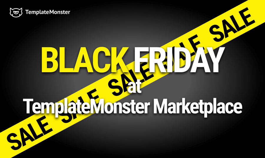
TemplateMonster Black Friday Deals 2023
Black Friday doesn't mean traffic jams on the highway or the country is at a standstill. It's more like a period of sales where merchants can make a lot of money before the holidays. As for consumers, it is a time to take advantage of great shopping deals. It's a term that's been around since the 1800s to describe the day the stock market crashed. Today, it's a month before Christmas when there are great deals. This year, we have TemplateMonster Black Friday deals that you cannot afford to miss.
Black Friday Month Starting on November 1
We've got some sweet Black Friday deals at TemplateMonster on WordPress themes, WordPress plugins, graphic assets, Shopify themes, Joomla themes, web services, and much more. Stay tuned to our website so you'll know when a new stage of our Black Friday sale is activated, to take advantage of it.
Mark your calendars and prepare to be amazed! Black Friday is right around the corner, and TemplateMonster is getting ready to release a whirlwind of discounts and deals. It's no secret that Black Friday, the quintessential shopping event that began in the United States, is now a global phenomenon, and TemplateMonster is at the forefront of it.
🌎 Black Friday isn't just a day, it's a cultural phenomenon that bridges Thanksgiving and the holiday season. Shoppers worldwide gear up for incredible discounts, epic sales, and unbeatable deals. Our goal at TemplateMonster is to make this Black Friday the best ever.

The discounts we've curated are so exceptional, that they're sure to elevate your projects to the next level. We're about to start our Black Friday celebration, and it's gonna be awesome. Let's dive into what's in store:
A Sneak Peek at Black Friday Savings
Flash Sales - November 1-6, 2023
We're kicking off Black Friday with a flash sale! Get the MonsterONE All-in-ONE package for just $137 - a 40% discount. But beware, this offer is only good for 5 days. Here's your chance to experience MonsterONE like never before!
Hot Hours Sale - November 6-13, 2023
During Hot Hours Sale week, we're turning up the heat! During specific hours, we're offering a scorching 15% discount on all retail products. Grab the MonsterONE All-In-One PRO for just $174 and enjoy these hot deals:
Bundle Deals - November 13-20, 2023
These bundles are tailored for different product types, including WordPress (business, hotel booking, portfolio), Shopify, WooCommerce, Prestashop, and HTML. In each bundle, you get a CMS template, PowerPoint templates, and graphics (logos, icons, corporate identity, etc.).
HTML Creative Black Friday Bundle
Boost your web projects with HTML Creative Black Friday Bundle. You can let your imagination run wild with a curated collection of HTML templates, fonts, and icons. For only $49 this Black Friday, you can take your design game to the next level. Take your website to the next level with these products!
Items packed in this bundle:
- Multipurpose Intense - #1 HTML Bootstrap Website Template
- Worthwhile Consulting PPT Design PowerPoint Template
- Agile Multipurpose Business Presentation PowerPoint Template
- Expert Business PowerPoint Template
- Business Project Complete PPT Slides Set PowerPoint Template
- Multi-Profit Financial Company Presentation PPT PowerPoint Template
- 10 Best Professional CV and Resume Templates Bundle
- Business Consulting Trifold Brochure
- Business Card Template For Business Analyst
- Business Stationery - Corporate Identity Template
- Entorum - Business With Flexible Infographics PowerPoint Template
- Aura | Free Round Sans Serif
- Mocha | Modern Display Sans Free For Personal Use
- Violence | Retro Sans Free
- Partake | Modern Serif Free
- 20 Free Outline Icons Set
- 10000 Business Icon Set
- 3400 Professional Outline Icon Pack
- Free Business Card - Corporate Identity Template
- Bifold Brochure - Corporate Identity Template
- Corporate Bifold Brochure Template
- One-Page Modern Business Flyer Corporate Identity Template Free
- Agency Flyer Design
- Modern Roll Up Banner Design
- Free Green Color Bifold Brochure
- Corporate Letterhead Minimalist Design
- Free clean business letterhead design template
- Free Business Card - Corporate Identity Template
- Free Morden Business Card - Corporate Identity Template
WordPress Business Bundle
It's time to power up your business with the WordPress Business Bundle. This bundle has it all, from powerful themes to professional presentation templates. Take your online presence to the next level for just $59 this Black Friday. Don't let your business go without the digital products it needs!
Items packed in this bundle:
- Monstroid2 - Multipurpose Modular WordPress Elementor Theme
- 101 Business Design Logo Template
- Worthwhile Consulting PPT Design PowerPoint Template
- Agile Multipurpose Business Presentation PowerPoint Template
- Expert Business PowerPoint Template
- Business Project Complete PPT Slides Set PowerPoint Template
- Multi-Profit Financial Company Presentation PPT PowerPoint Template
- 10 Best Professional CV and Resume Templates Bundle
- Business Consulting Trifold Brochure
- Business Card Template For Business Analyst
- Business Stationery - Corporate Identity Template
- Entorum - Business With Flexible Infographics PowerPoint Template
- Aura | Free Round Sans Serif
- Mocha | Modern Display Sans Free For Personal Use
- Violence | Retro Sans Free
- Partake | Modern Serif Free
- 20 Free Outline Icons Set
- 10000 Business Icon Set
- 3400 Professional Outline Icon Pack
- Free Business Card - Corporate Identity Template
- Bifold Brochure - Corporate Identity Template
- Corporate Bifold Brochure Template
- One-Page Modern Business Flyer Corporate Identity Template Free
- Multipurpose Square Flyer v3
- Business Graphics
- Style Business Card
- Style Business Card
- Creative Letterhead Template
- Business Flyer
- Corporate Flyer
Elementor WordPress Bundle
Make your website stand out with Elementor WordPress Bundle. At an exclusive Black Friday price of $39, get 60 themes, 10 plugins, and 5 templates. You can make visually stunning websites in no time. This is your chance to transform your Elementor experience!
E-Commerce Black Friday Bundle
Make your online store more profitable with E-Commerce Black Friday Bundle. You'll get everything you need for Shopify and WooCommerce, including marketing materials. This Black Friday, get it all for $69! Don't let eCommerce success pass you by!
Items packed in this bundle:
- Vendy Pro - Innovative Multipurpose Shopify Theme Os 2.0
- Hugesale - Multipurpose Store Elementor WooCommerce Theme
- Fashion And Beauty PSD Web Banner PSD Template
- Cornflower Fashion Business PowerPoint Template
- Lemon Art 7-In-1 PPT Design PowerPoint Template
- Innovation Creative PPT For Design Agency PowerPoint Template
- 10 Cover Photos For Facebook Timeline Bundle
- 10 Fashion Instagram Templates PSD Designs For Social Media
- 10 Clean Style Instagram Pictures Social Media Template
- Clean Style Instagram Story Package Social Media Template
- 50 Food & Drinks Icons Set
- 101 Business Design Logo Template
- 25 Business Shopping Icon Set
- Smoking Typeface + Illustration Font
- Giftbox Font
- Rough Weld - Color Bitmap Font
- Modern Fashion Product Catalog Template
- Modern And Creative Fashion Product Catalog Template
- Fashion E-Commerce Social Media Banner Templates
- Fashion Week Sale A4 Flyer Design Template
- Shopping Gift Voucher Card Design Template
Black Friday PRE-Sale - November 20-22, 2023
From November 20 to 22, 2023, TemplateMonster is having a Black Friday PRE-SALE! 🎉 Discover the goodness of WordPress and WooCommerce treasures with up to 50% off. With fantastic discounts on themes, plugins, and more, you can enhance your online presence. TemplateMonster's Maintenance services are also available for only $649, saving you $100!
Special MonsterONE pricing opportunities.
- Lifetime - $529 - (
$749) - All-in-ONE - $159 ($13.25/mo) - (
$229) - All-in-ONE Pro - $186 / ($15,5/mo) - (
$249) - Creative Yearly - $89 (7,40/mo) - (
$96) - Creative Monthly - $18/mo (
$24)
Black Friday - SALE - November 22 - 24, 2023
Get ready for a website glow-up! Our Black Friday PRE-SALE from November 22 to 24, 2023, is your ticket to a stunning online presence. Enjoy up to 50% OFF on CMS and E-commerce wonders. Elevate your website game with irresistible deals – because your online space deserves the best!
Black Friday - SALE - November 24 - 27, 2023
It's time to make your website dreams come true! From November 24 to 27, 2023, dive into our Black Friday SALE and enjoy up to 50% OFF on Website Themes and services. Special treat: get up to 50% OFF website templates, and a sweet 20% OFF on the rest. Let your website shine without breaking the bank!
We're not done with the Black Friday sale yet! Stay tuned for more money-saving opportunities this month, and get ready for some mind-blowing discounts!
There's no better time to boost your creativity, boost your online presence, and expand your project portfolio than now. You can unlock a world of possibilities with our Black Friday discounts, whether you're a business owner, freelancer, or webmaster.
Don't miss this webmaster's dream! Make your web projects unforgettable this season with TemplateMonster's Black Friday celebration. Get ready for the grand reveal of discounts, surprises, and exciting updates this holiday season.
Get ready to shop, save, and get creative! It's Black Friday time, and you're invited.
Black Friday Is Just The Beginning of Our Holiday Sales!
Our holiday discounts don't end on Black Friday. We're gearing up for even more pleasantries for our clients during the Christmas and New Year shopping sprees.
No matter what you've done, we'll always have something special for you. Keep an eye out for exciting announcements that will keep the spirit of giving alive throughout the season as we roll out incredible discounts, irresistible offers, and exclusive surprises.
You've made TemplateMonster a part of your creative journey, and we'd like to say thanks. Let's make this holiday season one to remember as we celebrate the joy of giving, the warmth of togetherness, and the magic of creative possibilities.
Keep an eye out for our Christmas and New Year discounts, and let's make this holiday season extra special.
Top Web Products for Black Friday & Cyber Monday
CyberMonday - Cyber Monday Sale Landing Page HTML Template
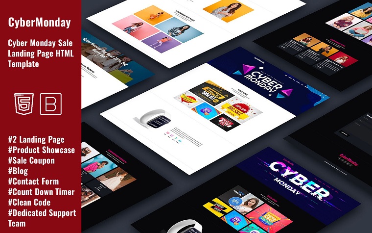
It is because of this 24/7/365 online shopping world we live in, there is no excuse for not having a website. And if you want to start great and grow big, CyberMonday will help. That is a cyber Monday sale landing page HTML template that will help hype your unique value proposition. It is built with Bootstrap and therefore, has a lightweight fast-loading page speed. Also, it has a clean, valid code that follows the latest SEO rules will keep your site rankings higher. The good thing about CyberMonday is that it is easy to convert into any CMS platform you might want.
Other notable features packed in CyberMonday are:
- Performance optimization;
- Single product;
- HTML plus JS;
- One page template;
- Working web form for contact;
- Count down timer;
- Product showcase;
- Sale coupon.
Black Friday Coupons - Cool Discounts HTML Template
You will definitely like Black Friday Coupons if you are looking for a cool design and the discounts HTML Template. This layout is great for many sales. Its originality attracts buyers with excellent graphics and a minimalist and colorful appearance. However, the discounts HTML template is not just a new design. With the help of layouts, you get other improvements for the website:
- Mobile version. This function means that the pages will look great on different device sizes. You can confidently plan an advertising campaign for smartphone and tablet users.
- The logical structure of pages. Web developers used all their experience to create a consistent and intuitive form of sections. Consequently, visitors feel comfortable while shopping and easily find the desired goods.
- Attention-grabbing blocks. It can be a selection of goods with the lowest price, unique coupons, sales leaders, and more.
- Universality. You may easily adapt the purchased discounts HTML template for other purposes. After all, there will be new goods that you want to sell.
- SEO-friendly help you get a ranking in the TOP search engines faster.
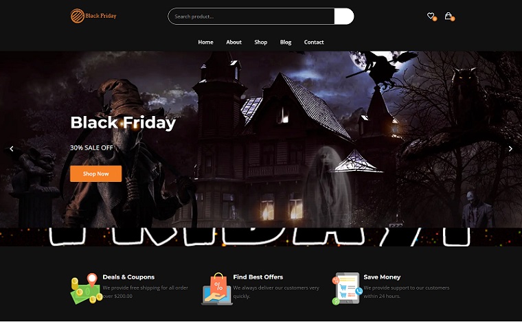
Black Friday - Special Sale Black Friday Landing Page Template
Black Friday landing page template is absolutely impossible to forget. In combination with red, black color creates a special mood for shopping. At the same time, dark shades always sell goods in a high-price category very well. Consequently, many business owners can use the Black Friday landing page template.
Visual effects deserve separate praise. Cool pop-up products, a smoothly appearing main banner in the top of the page, a huge counter with the end date of discounts - this is far from a complete list. Pay attention to cool links in social networks. You have not seen this before.
In addition to a memorable and bright appearance, buyers receive the following functions:
- Lazy load effect.
- Responsive layout perfectly adapts to any parameter of the gadget's screen.
- Search engine-friendly functions, in combination with planned work on promotion in search engines, give you visitors from Google or Yahoo.
- Bootstrap.
- Multipurpose, to use the landing in the future for other goods and purposes.
- Convenient feedback form without extra fields.
- Google Maps.
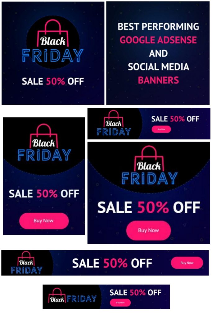
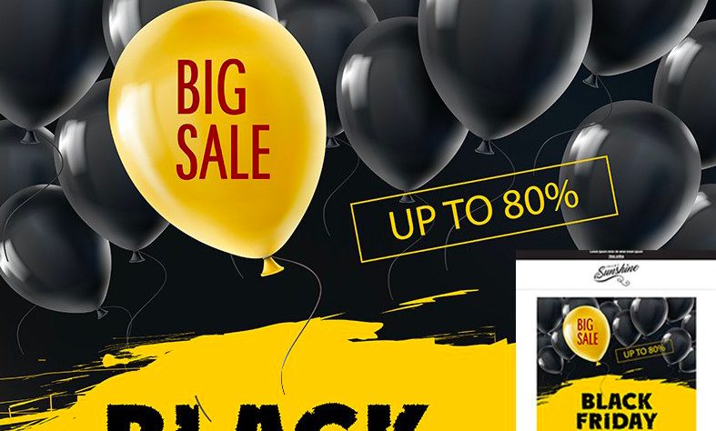
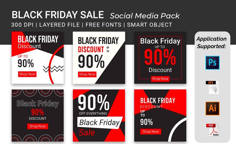
Black Friday Promo Banners Bundle
All websites use promo banners for their huge sales or deals, and what usually happens, these banners correspond to the theme of the sale occasion. While Halloween, Thanksgiving, and Christmas banners strive for bright fall and holiday colors, Black Friday banners, obviously, look different.

The following bundle is very minimalistic in color range and design, so it can be used for an eCommerce project of any kind, whether you sell clothing or electronics. The bundle contains 2 sets of banners for Google AdWords with 15 items in each set. All files are compatible with Adobe Photoshop so that you can configure the details, like the logo and text.
18 Black Friday: Google AdSense and Social Media Banners Bundle
This is another option for your future Black Friday ad banner in case the first one wasn’t to your taste. This bundle seems more original and eye-catching, especially for projects with creative products or services. The bundle has banners created specifically for social media posts and Google AdSense. All of them can be customized to your preferences.
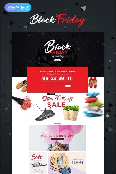
Black Friday - Event Planner Elementor WordPress Theme
To all WordPress lovers, we’ve got some good news: Zemez not only created a powerful Black Friday Elementor theme but also made it look super stylish. You can use this template to change the look of your website for an upcoming sales weekend in minutes!
Event Planner Elementor WordPress theme includes a professional functional module that you can utilize while working with the Elementor page editor. With the help of a JetElements plugin, you can make outstanding content, add custom modules, and apply styling settings to them. There is also a JetTabs plugin to help you organize the content into nice tabs; a mega menu option with drop-down sections; a JetThemeCore plugin to build the site's header and footer thanks to ready-made blocks and pre-styled widgets and many more. Just see for yourself!
Black Friday Landing Page Template
This MotoCMS landing page template contains several blocks of content created by professional web designers. You can edit these blocks and the information there as you like. The template has a 100% responsive design, which means that all your text will be readable and will look great on any modern device, regardless of the screen size. In addition, the template contains many useful and good-looking widgets, such as a countdown timer, that can be placed on your page in just one click. In addition, the landing page has 3 pre-installed pop-up pages, which correspond to the color scheme of the main page.
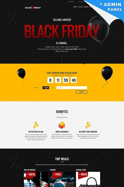
As you can see, the Black Friday Landing Page template is a great platform to quickly arrange a smart advertising campaign for any eCommerce project and respectively raise sales.
Black Friday - Email Newsletter Template
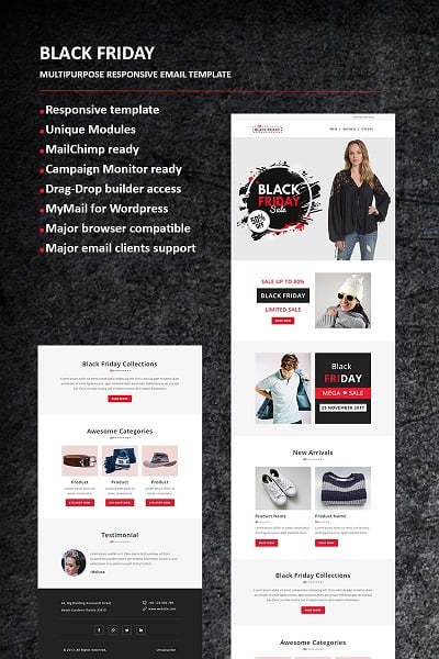
Finally, let’s not forget about email newsletters that regular users are not so excited to see in their inboxes. However, newsletters can be an effective marketing tool that lets people know about your greatest deals and discounts even without visiting your website physically. We recommend you buy this multipurpose responsive email template that not only fits the Black Friday or Cyber Monday theme but also is relevant for spreading emails about sales during the Christmas and New Year seasons. StampReady, MailChimp, Campaign Monitor, and Mymail-compatible files are included in the pack.
Black Friday – Multipurpose Responsive Newsletter Template
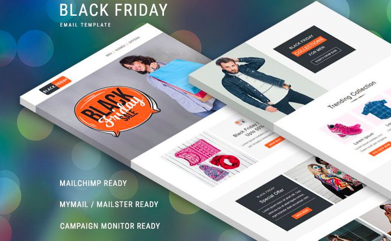
This multipurpose responsive newsletter is a must-have tool this Black Friday. It comes with MailChimp and Campaign Monitor Compatibility features. Moreover, the template supports popular email systems like Apple Mail, Outlook, Yahoo, Gmail, and Hotmail.
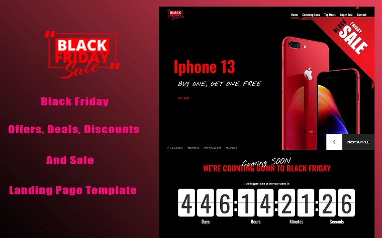
GetSales - Fancy Black Friday HTML Landing Page Template
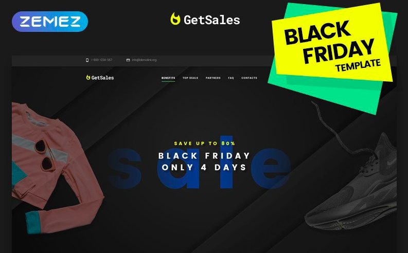
Do you want to raise your sales? Do you want hassle-free Black Friday preparation? If you do, we know what you need. GetSales HTML Landing Page template is a product full of useful features. Let's name a few of them:
- Amazing CSS3 effects;
- Rich UI Kit;
- Easy to use the Stick-to-top menu, etc.
Stockhouse - Wholesale Store Shopify Theme
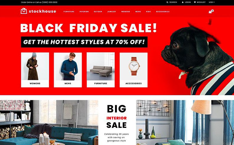
Do you want to improve your Internet presence this shopping season? Check out Stockhouse Shopify Theme, which includes a search form, contact form, and other essential elements. Besides, it is mobile-friendly. Potential customers can browse your products using mobile devices, tablets, or PCs.
Black Friday Responsive Email + StampReady Builder Newsletter Template
Tell your customers about big sales coming before Black Friday. This fully responsive newsletter comes in StampReady, and the MailChimp-compatible version will be very handy this year. Check it out today to know the discounted prices.
SQUARE Marketing Banner Pack Social Media
Square Pack is suitable for social media purposes. It has a stylish design and comes in PSD, AI, EPS, and PDF formats. Moreover, the team from Uihunt promises to provide upscale support if you have additional questions regarding their products. Their experienced specialist will master any technical issue in no time.
Summing it Up
Black Friday is high time both for businesses and customers.
- Over 54 percent of consumers (about 89 million shoppers) shop online on Black Friday and Cyber Monday. It's your chance to hit the jackpot this year and sell your products like never before.
- Almost $2.5 billion in Black Friday sales came from smartphones alone in 2021, so make sure your website is mobile-friendly and update it today.
- There were also more people using mobile devices than the previous year.
- Black Friday sales are dominated by mobile devices. The majority of people begin their search on a mobile device and complete the purchase on a desktop.
- Online shopping is the way to go for 25% of customers, and in-store buying is the way to go for 21%. That's why you need to consider browser compatibility. This way, you can be sure that users will easily access, stay, and buy from you.
If you are planning to start your online project or boost your online marketing - don't hesitate to do it now, because only during the BC sales you can grab the sweetest discounts.

Posting contributed articles about the major web design highlights and novelties. Come across a handful of useful tutorials and guides shared by experts in the web design and online marketing fields.
Get more to your email
Subscribe to our newsletter and access exclusive content and offers available only to MonsterPost subscribers.

Leave a Reply
You must be logged in to post a comment.