HOWTO: Design an Infographic Really Worth a Thousand Words
I'm sure that web community is grateful to all those people who have devoted plenty of their precious time to creating infographics, you really can’t find a better way to visualize a huge amount of data in a way more efficient and comprehensive.
Without a doubt 2010 was a year of informational graphics and this design technique has become one of the main trends of the last year, creating both positive and negative factors in a further development of this practice within the bounds of web design industry.
Creating a really interesting, communicating and useful informational graphic is a really complicated task, which requires skills and tons and tons of patience. I have been a witness to when unwise usage of this design technique had caused a splash of negative reactions on giant social media networks such as Digg.com or Reddit.com - which is obviously not what the authors have designed these infographics for. There was a period when anyone thought he could design an infographic, promote it and gain certain benefits. But in fact there's a lot to think about before actually starting to work on it. First thing whether a web community actually needs the information you're about to provide. The second problem is about the visual appeal of your graphic. The right correlation between the quantity of information and visual techniques used to present it is an extremely important thing. So if you don’t want to confuse - or even irritate - your visitors please be careful while creating next informational graphic, otherwise it may harm the reputation of your website.
Types of Data
There are three basic types of what is best presented in a form of an infographic. Knowing all about your info will help you from the very outset of creating infographic. Of course you can mix these types/approaches but it would be better to use one of them, besides it easier for the audience to perceive. Believe me - in most cases infographics have enough "heavy" facts within just one type of info, don't make it all even harder. So, here are the three types we're talking about:
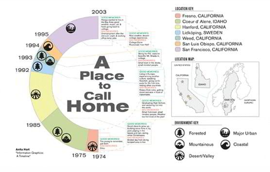
- Time – it is the most popular one because timeline perfectly illustrates dynamical changes of any process, and you shouldn’t worry about the structure – just choose whether it will be a horizontal or a vertical timeline. It is much easier to collect information simply by checking time period and looking for interesting, useful and significant data concerning the topic.
[ Source ]
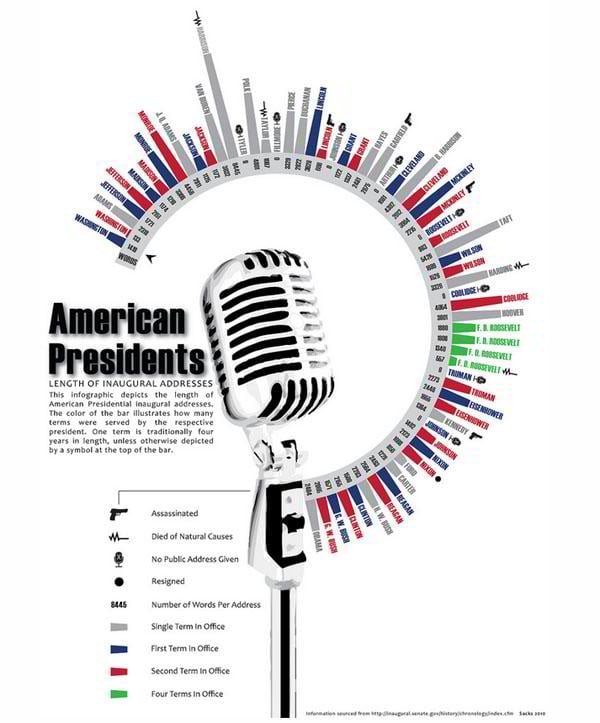
- Quantity – you can set this type as the directing vector of general data presenting in your project. Of course you have seen many examples containing various quantitative analysis, however you should never forget that mostly people can't accept and remember many numbers so, don't go too far with them.
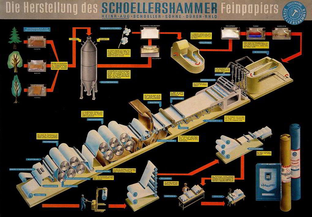
- Space - this type describes physical relations between some objects or conceptual locations. To be more precise, infographics of this type describe some physical processes or they are geolocation-oriented.
[ Source ] What is also important is the communication approach in creating informational graphics. Our article is devoted to the static infographics which are the most widely spread ones around the web, basically when someone says "infographic" the static infographics are what you think of the first. In addition to this approach there are also two other major types used. Here's more on each of them:
- Static – all information is placed on a single page and there are no dynamic elements on this page. Maps, product manuals and other are the best examples of static informational graphics (besides the ones you've seen on Digg or Reddit of course).
- Interactive – in this one the information is selectively presented according to the user’s opinion or actions, it is a very user-friendly approach which allows avoiding the informational oversaturation.
- Motion – this approach enlivens the visualized data with video or animation creating more conductive atmosphere for perceiving the information.
Visualizing Tools
Frankly speaking, there is nothing revolutionary about this part because I’m sure you all know that any infographic combines various data visualizing techniques. It is obvious that everything starts with creating the major vision of the layout so you have to pick the background color and texture wisely, make sure that the text will be visually appealing and absolutely comprehensible. So, at first you have to choose the textures, typography and colors. Actually these components are essential for any design project so obviously they play major part in creating infographics. The other important part is a smart usage of various clipart icons, charts, diagrams, maps etc. The main trick here is that you have to make your work look really simple and effective.
Marketing Boom
We have seen a number websites which have brought tons of useful and beautiful infographics to a mainstream media. For all young design studios and freelance designers producing a content of such type can be really helpful in terms of their brand recognition and overall marketing. Also you can gain some great SEO benefits just by embedding the links to infographic copyright info - infigraphics are great in link baiting strategy, so use them wisely. Without a doubt this is one of the most creative and profitable types of media promotion. Of course embedding the infographic to your website will engage your visitors by providing a large amount of information in a confined space. So, you can improve even a very boring article with excellent images and make the laziest visitors rush to check out this content.
2011 – A year of new trends for Infographics?
One of the fresh trends marked out by some trustworthy sources is a huge growth of the infographic influence during 2010 - so-called "infographic driven designs". For example you can present Clients page on your website as geolocation infographic or simply desiging the background of the home page with some visualized data about your particular business sphere. Basically there are many opportunities to integrate informational graphics to the website design and we hope that this year will give us more excellent examples to follow. We strongly believe that this design technique is one of the most advanced ways to increase the website usability and you shouldn't underestimate it.
Also we would love to know your opinion concerning the infographic-driven designs in 2011. Is it worth trying out such approach in creating professional websites for Internet business? Does this design technique have a future in brick-and-mortar businesses segment? Let us know!
Don’t miss out these all-time favourites
- The best hosting for a WordPress website. Tap our link to get the best price on the market with 82% off. If HostPapa didn’t impress you check out other alternatives.
- Website Installation service - to get your template up and running within just 6 hours without hassle. No minute is wasted and the work is going.
- ONE Membership - to download unlimited number of WordPress themes, plugins, ppt and other products within one license. Since bigger is always better.
- Ready-to-Use Website service is the ultimate solution that includes full template installation & configuration, content integration, implementation of must-have plugins, security features and Extended on-page SEO optimization. A team of developers will do all the work for you.
- Must-Have WordPress Plugins - to get the most essential plugins for your website in one bundle. All plugins will be installed, activated and checked for proper functioning.
- Finest Stock Images for Websites - to create amazing visuals. You’ll get access to Depositphotos.com to choose 15 images with unlimited topic and size selection.
- SSL Certificate Creation service - to get the absolute trust of your website visitors. Comodo Certificate is the most reliable https protocol that ensures users data safety against cyber attacks.
- Website speed optimization service - to increase UX of your site and get a better Google PageSpeed score.
Get more to your email
Subscribe to our newsletter and access exclusive content and offers available only to MonsterPost subscribers.


Leave a Reply
You must be logged in to post a comment.