Top Mobile App UI Design Trends to Follow in 2020
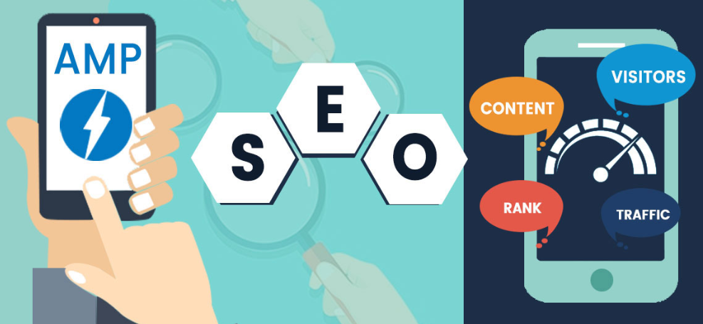
- Accelerated Mobile Pages
- AR & VR
- Artificial Intelligence
- Cloud-Based Mobile Apps
- Bigger Screens are In
- User Interface: The Simpler the Better
- Swiping
- Creative Navigation
- Animation Feature
- Storytelling
- Adaptable Typography
- Icons Opacity
- Voice-Activated Interface
- Conclusion
The mobile app market has become very popular, with 2.53 billion individuals now using a smartphone.
This number will only continue to rise as we head into 2020 and invest in the future. Why is this statistic important? 180 billion applications were downloaded from the Apple Store in June 2017 alone. This means that the owners of mobile applications have a lot to gain from this promising market.
To flourish, however, you will need to know the app UI design cost. You also have to stay abreast of the latest mobile app designs trends, which we will look at below. Let’s clarify what we mean by «UI design for mobile apps». UI elements for mobile apps are mobile application design. It focuses on usability and user experience. Users always appreciate simple and efficient design. UI includes various components: information architecture, interaction design, graphic design, and content.
Mobile applications have, indeed, revolutionized how we live our daily lives. Because of this, their demand is constantly on the rise. This is very good news for start-up companies looking to use an application to grow. Let us identify some of the best trends in UI mobile app design to take advantage in this year.
Accelerated Mobile Pages
AR & VR
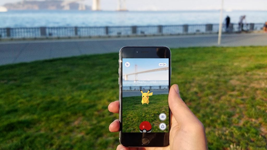
Augmented Reality (AR) and Virtual Reality (VR) are not new to mobile apps, having made their appearance last year. These concepts have revolutionized the gaming and entertainment industries with games like Sky Siege, Pokemon Go, myNav and iOnRoad being shining examples of AR. Similarly, Google Cardboard, Samsung Gear VR, and Oculus Rift have gained a lot of popularity as VR devices of choice. According to one of the most reputed app development companies in Mumbai, both AR and VR will be the things to watch out for in mobile app development in 2018 and beyond.
Artificial Intelligence

AI is expected to provide business website users far more powerful insights than before with the use of cognitive interfaces, machine learning technology, and advanced analytics. Due to this enormous potential, there has been a spate of acquisitions of start-ups by companies like Google, Facebook, IBM, eBay, to mention just a few.
The expression “Artificial Intelligence” has been tossed around a great deal as of late, however, what is it precisely? In a general sense, it's a machine or PC with the capacity to take care of issues that are normally done by people utilizing characteristic knowledge. AI advancements are starting to grab hold in an assortment of businesses. AI-injected applications, or "keen applications" are currently being worked to help clients finish everyday assignments. Retail mammoths, for example, eBay and Amazon effectively demonstrated the achievement of AI versatile applications. With new headways in innovation and moving purchaser requests, AI versatile application advancement is the following enormous thing for endeavours.
As we see more AI and machine learning-driven applications, organizations can use the information that applications are gathering through the purpose of offer machines, online movement, cell phones, and then some. The calculations will have the capacity to filter through this information, discovering patterns and altering the applications themselves to make more important and setting rich encounters. Groundbreaking ventures are profiting by the points of interest AI gives as it interfaces clients nearer to brands, rethinking the expression, "personalization".
Cloud-Based Mobile Apps
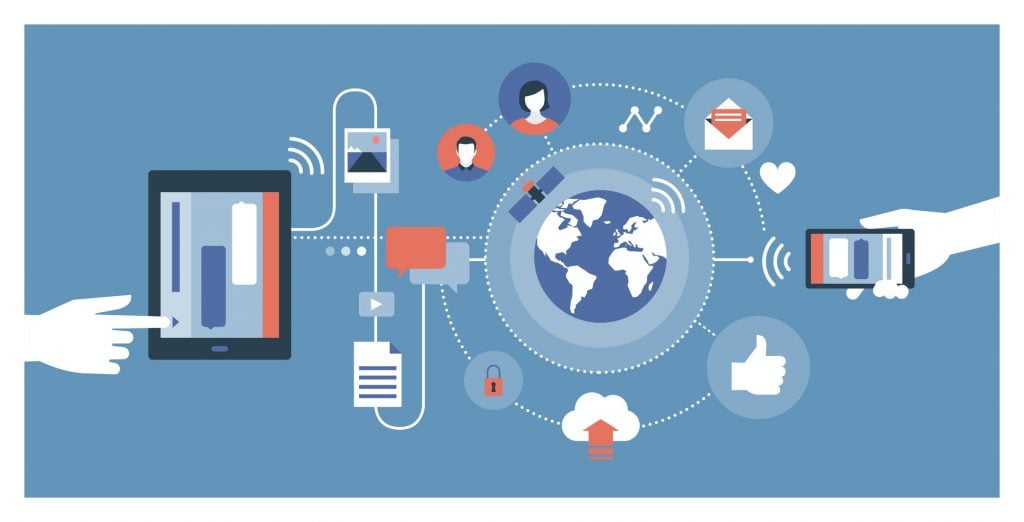
With the shift to the cloud, mobile apps can now directly draw data from the cloud thus freeing up valuable phone memory. According to CISCO, by 2020, 90% of the total mobile data is likely to be driven by cloud apps, with the mobile cloud traffic slated to rise by 11 times.
Sooner rather than later, as engineers move far from local applications, the world will see more shopper applications worked as versatile cloud applications - programming that lives in the cloud, however, is gotten to by means of an interface or program on a portable device. HTML5 and CSS3 selection are on the ascent, making it less demanding to plan and assemble versatile cloud applications.
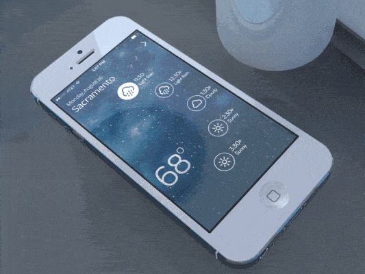
Bigger Screens are In
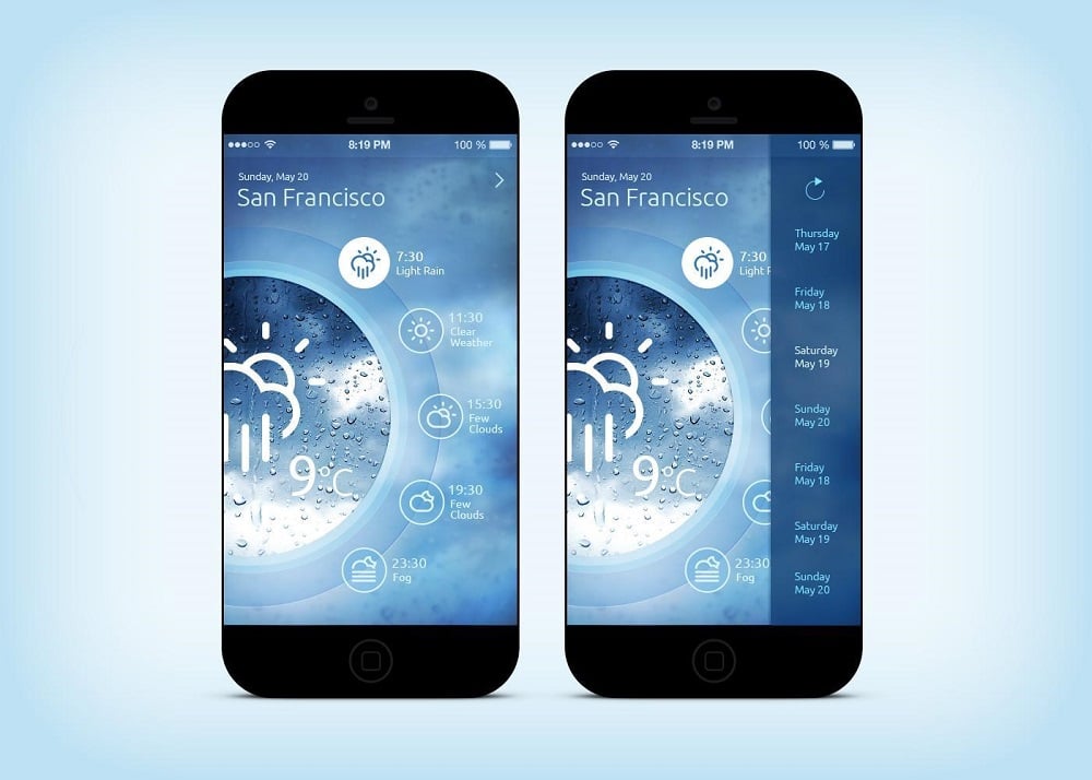
It seems that people have become fond of their large screen Android and IOS devices. The tablet market has grown exponentially over the past few years and has never been as popular as it is in 2018. In the upcoming year, this trend will grow further. That being said, it is not always easy to build an app for larger devices from scratch. There are other problems involved when trying to make an application for smaller devices adapt to larger ones. Several changes have to be made to the user interface, and most of the navigation patterns have to be changed, which leads to a different UX.
User Interface: The Simpler the Better
If you want to get a great design in 2018, your goal should be to make the simplest user interface possible. A simple UI design always translates into an application with better functionality, which is what users are looking for. It is important to keep the following vital features as part of your user interface:
- Open screen space is essential.
- Digital screens are taken advantage of.
- UI is clear and functional.
- Elements are used effectively but kept to a minimum.
Swiping

Another important modern mobile app design trend is developing the swipe action and making it more fluid. Smartphones have had this feature for a while now, and it is quite acceptable in terms of functionality.
However, there is always room for improvement and, this year, developers should pay a lot of attention to it. Additionally, the best ideas right now involve the use of a card-based feed which has been extensively used in applications such as Pinterest and Twitter. Another option includes the use of both the universal swipe and the card layouts.
Creative Navigation
Creating more navigation options is one of the more important mobile app design trends. This navigation trend involves the use of simple but creative navigational buttons. Other key features in the new navigation patterns should include:
- Provision of more navigational options. This includes horizontal, vertical, modular, parallax scrolling and hidden navigation.
- Infinite scrolling for mobile applications that have a lot of content.
- Navigation buttons should not remain on the screen at all times and disappear when the app is inactive for a certain period of time.
- Modular scrolling to tackle scrolling through several rows of content.
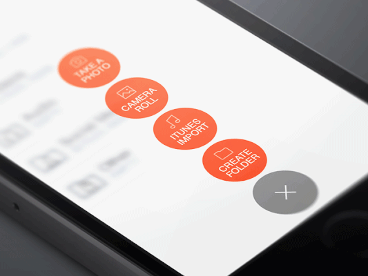
Animation Feature
Adding an attention-grabbing element should never be overlooked by any app developer - and what better way to do this than by adding a simple but well-designed animation.
Apps that have included this feature have received a great reception from users. They also play an important role in improving the user experience. How will a typical designer take advantage of animations? Let’s review what you can do and what you can get out of it:
- The animation can lighten up the navigation
- It can be a transition between zooming in and out
- It can act as a confirmation of actions made by the user
- It may provide a better user experience for the user
- It can also provide a direct visualization effect
- It’s a great feature that makes use of parallax design
Storytelling
The process involves using your brand to create good relationships with your customers. This is only possible if you create a mobile application that can easily tell the story of your brand.
Most businesses are making use of special illustrations and graphics to make this possible. Remember the following principles of developing a relationship with your users:
- Aim at providing a unique experience to the user.
- Try your best to look for ways to get your brand out there.
- Focus on how you will improve your app user experience.
- Look for new technologies and what they will cost to make your job easier.
Branding for mobile app designers is still in its infancy. It will only get more important with time, and paying attention to it can make a big difference.
Adaptable Typography
Typography will always be an important feature of an application and should never be ignored. Many designers consider it to be secondary to other design components such as navigation and color; however, iOS 7 and the use of Helvetica Neue has changed this by introducing scalable typography. Scalable typography has the ability to greatly influence the overall appearance of the application and make the design stand out more.
Icons Opacity
A transparent navigation bar or icons are one of the most popular trends of 2018 and will be still on the top in 2020. This design trick makes the whole application look more sophisticated and up-to-date. While working on the design play with opacity settings to see how different and fancy the app's look can be. Using the transparency effect, you can create an interesting space for text or focus on a specific element.
Voice-activated interfaces

A voice-activated interface is a new way of working with information. Many developers will be able to remake their products to make users communicate by voice. Of course, this is an entirely new way of interaction, which applies to new tasks. 2020 is going to become a year of rapid voice interface development.
However, voice recognition needs some experiments with voice interfaces. For example, it will be very convenient for a user that drives a car, but for an office worker, especially if he works in an open space, voice interface will have few advantages. When those little problems will be solved, voice assistants will become a new way of using tablets, computers and mobile phones.
Conclusion
We have reviewed some of the best trends in app interface designs that will be in the focus in 2020. If well implemented, these can certainly make a difference for any business trying to capitalize on an app they decide to make, right from the start.
Hope you liked the article and found a few useful insights for the application design you are currently working on. If so - I will be glad to hear from you in the comment section below. Any tips, suggestions, feedback and comments are welcome!

Read Also
Top 9 UI Design Trends for Mobile Apps in 2018
Mobile App as a Powerful Marketing Tool
Top 7 Reasons to Choose React Native for Mobile App Development
Mobile App Development Trends That Are Likely to Be of Significance in 2018
7 Smart Reasons Why Your Business Needs a Mobile App
Don’t miss out these all-time favourites
- The best hosting for a WordPress website. Tap our link to get the best price on the market with 82% off. If HostPapa didn’t impress you check out other alternatives.
- Website Installation service - to get your template up and running within just 6 hours without hassle. No minute is wasted and the work is going.
- ONE Membership - to download unlimited number of WordPress themes, plugins, ppt and other products within one license. Since bigger is always better.
- Ready-to-Use Website service is the ultimate solution that includes full template installation & configuration, content integration, implementation of must-have plugins, security features and Extended on-page SEO optimization. A team of developers will do all the work for you.
- Must-Have WordPress Plugins - to get the most essential plugins for your website in one bundle. All plugins will be installed, activated and checked for proper functioning.
- Finest Stock Images for Websites - to create amazing visuals. You’ll get access to Depositphotos.com to choose 15 images with unlimited topic and size selection.
- SSL Certificate Creation service - to get the absolute trust of your website visitors. Comodo Certificate is the most reliable https protocol that ensures users data safety against cyber attacks.
- Website speed optimization service - to increase UX of your site and get a better Google PageSpeed score.

Website design is something you can't ignore - I'm sure. It defines the success of the site and its visibility. I write about it to help you make your projects better. LinkedIn
Get more to your email
Subscribe to our newsletter and access exclusive content and offers available only to MonsterPost subscribers.

Leave a Reply
You must be logged in to post a comment.