How to Get Started with Responsive Web Design
“We should embrace the fact that the web doesn’t have the same constraints, and design for this flexibility. But first, we must “accept the ebb and flow of things.”
John Allsopp, “A Dao of Web Design”
Smartphones and tablets of all kinds are in high demand today and web audience can’t stop buzzing about the necessity of the new technologies applicable for various devices. iPads, iPhones, Android mobile devices, laptops and netbooks have captivated the web audience, and it's no longer enough to build websites for standard computer screens only. New technologies require brand new approaches, and the most promising trend is represented by the so-called “responsive web design”. What does it mean? In simple phrase, it is aimed at building a website that responds in compliance with the medium you use to view it.
Some firmly believe that well-organized HTML and flexible layout are supposed to deplete the concept of responsive web design, but this definition is hardly comprehensive. In fact responsive web design implements all the modern web technologies to make the web pages flexible to the max. And flexible layouts become rather imperative than alternative requirements today. The reason is clear: 1024 pixels is no longer a universal resolution width, since people are viewing websites on various kinds of screen sizes. We all remember that boom when Apple sold 3 million iPads in just 80 days and we still can clearly see this enormous demand for nonstandard screens and flexible designs. The recent iPhone4 models, for instance, are released with a super high-resolution screen and require the super high quality of a visual representation as well.
According to the web design studios and free-lance webmasters, many companies order “an iPhone website” as part of their projects. The demand for the mobile version keeps growing and includes more and more requirements regarding the page resolution, the code flexibility, and the like. So why not to contemplate the features that could make the web page flexible for various screens and devices? Implementing responsive design features you finally get a chance to create adaptable layouts, comfortable for all your readers.
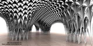
The term is probably derived from the discipline of “responsive architecture” that is admired for its ability to identify the number of people in the apartment and adjust the physical spaces to their presence and density. You might have probably heard about that magic bending, flexing of the wall structures that respond to the crowd approaching. “Smart glass” is another amazing technology providing some flexible level of opaqueness depending on the number of the room occupants. And timely enough, the essence of this technology was adopted to the web space in the form of responsive web design.
According to Ethan Marcotte, the author of the responsive web design concept, the images should be flexible and the site itself should use fluid grids and media queries allowing to get different views in different contexts. These are the basic components of the today's responsive design, and we are sure that both newbies and experienced web designers would find it useful to adopt this approach into the projects they make. Below you may enjoy some details and guidelines about implementing media queries, fluid grids and flexible images into your website structure.
Media queries
Media queries depend on the browser window size and determine such parameters as orientation, color, screen resolution etc. In fact they act as conditional comments that are able to indicate the used device and show up the certain layout, developed for its physical characteristics.
In other words the device is being asked if its horizontal resolution is 480px or less. If the screen resolution is smaller (like on iPhone), device will load the proper .css file. Otherwise, the link will be disregarded.
The plugins for managing media queries are jQuery plugin (quite an old one) or css3-mediaqueries.js. The first option provides with the limited media query support like min-width or max-width properties. As for css3-mediaqueries.js, its library promises to make IE 5+, Firefox 1+ and Safari 2 easily apply CSS3 Media Queries.
By the way, W3C includes media queries as a part of specification for CSS3 which makes us believe in their blissful future.
Flexible Grid
One of the greatest solution for creating a flexible design is defining your own parameters for various objects in code like columns, spacing and containers. Of course, you can use standard CSS classes of the existing grid systems but building your own unique grid would be much more flexible and efficient. We'd recommend you to work out your own parameters for defining size, space, alignment etc.
Respected web designers tend to get rid of pixels and use percentages and em’s for the layouts like units of measurement. In other words flexible grid means the relative unit of measurement.That doesn't mean forgetting about pixels at all — you consider them as unique units while working with digital image editors. But adding some basic math will make design process far more efficient.
You will see the perfect layout using the flexible grid on the sample page created by Ethan Marcotte.
Flexible Images
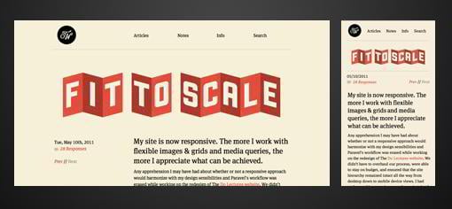
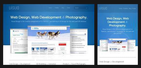
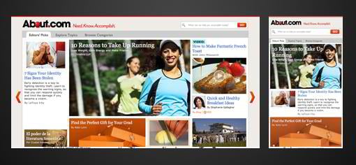
It's high time to decide whether your web page needs to be overloaded with the heavy imagery. Logically enough, you would prefer your page loading fast and therefore the images that scale and change their position with the flexile grid. This means scaling down according to the HTML attributes of height and width for creating more space. The smaller devices will load more space for text content and less for images. This method decreases the page load time which is extremely appealing for the visitors.
The other way to scale images is cropping them with the help of CSS overflow property (like overflow: hidden). After applying these properties the images can be cropped dynamically. This makes contaners around them fit unstandard resolution. One more way is loading different versions of the images to your server and displaying the proper size version dynamically depending on the used device. This can be achieved by using server-side or client-side feature detection altogether with DOM manipulation.
Besides, you may make use of hiding images by means of media queries that assign optional images (in a class like optional-img) to allow some choice of loading or not loading images depending on a device you deal with.
We can't help mentioning that media queries are used effectively only with the solid HTML and CSS that requires both flexible images and flexible grid.
So it's reasonable to keep abreast of your customers needs and create adaptable web pages using all 3 key components of responsive web design, namely:
- media queries;
- flexible images;
- flexible grids.
To ease the process of learning responsive web design feel free to check out following responsive web design interactive infographic where all valuable information about RWD is gathered.
Don’t miss out these all-time favourites
- The best hosting for a WordPress website. Tap our link to get the best price on the market with 82% off. If HostPapa didn’t impress you check out other alternatives.
- Website Installation service - to get your template up and running within just 6 hours without hassle. No minute is wasted and the work is going.
- ONE Membership - to download unlimited number of WordPress themes, plugins, ppt and other products within one license. Since bigger is always better.
- Ready-to-Use Website service is the ultimate solution that includes full template installation & configuration, content integration, implementation of must-have plugins, security features and Extended on-page SEO optimization. A team of developers will do all the work for you.
- Must-Have WordPress Plugins - to get the most essential plugins for your website in one bundle. All plugins will be installed, activated and checked for proper functioning.
- Finest Stock Images for Websites - to create amazing visuals. You’ll get access to Depositphotos.com to choose 15 images with unlimited topic and size selection.
- SSL Certificate Creation service - to get the absolute trust of your website visitors. Comodo Certificate is the most reliable https protocol that ensures users data safety against cyber attacks.
- Website speed optimization service - to increase UX of your site and get a better Google PageSpeed score.

Helga Weber is an experienced columnist, enthusiastic about web design and digital arts. Find her on Flickr
Get more to your email
Subscribe to our newsletter and access exclusive content and offers available only to MonsterPost subscribers.

Leave a Reply
You must be logged in to post a comment.