Psychological Selling Tricks for E-commerce Stores
Manipulation is an essential part of our everyday life and business. Artful psychological techniques make us vulnerable and eager to follow suggestions or buy the advertised products. Online business is flourishing due to various mental shortcuts and persuasion tactics.
First and foremost, you are to analyze how clients use your website. You may make customer surveys, use heat maps and usability audits to track how users navigate around your website stores. These observations as well as selling tricks below will help you to understand and influence the audience behavior in order to increase conversion of your store.
Below you'll find several effective Psychological Selling Maneuvers to apply and enhance your online shops. Learn how to recognize and implement manipulation in your business!
Use General Supermarket Psychology
Standard supermarket techniques are known to be the major tried-and-true strategy to be applied to online stores. You may increase profits and conversion by involving some basic marketing tricks like giving better positions to products with the highest profit level or place the items complimenting each other (like wine and cheese, slippers and pajamas) into one product category or on a single page while giving out search results. As for the proximity of complimentary products, you may locate them next to each other to pay the users attention to the products they may need.
This tactic will encourage customers to buy more items. Some techniques described below are also derived form the supermarket tricks.
Test Minor Tricks
Analyze your store users behavior by testing every single minor edit, such as changing the button or add color, content color and background, header images, location of calls to action and sales announcements. Google Website Optimiser is a free tool that is aimed at helping you to manage your testing easily.
Tricks with Promotions, Prices and Percentages
If we remember the Marketing experiments of Dr. Flint McGlaughlin, the majority of customers perceive the first price as an average standard. Meaning if we announce the sales as “15-30% off” we should know that people will think the most goods are 15% off, and only several items are 30% off. So it's highly recommended to use the “up to” approach naming the headline “up to X% off” in order to cause appropriate reaction. By the way, have you ever noticed that the “up to” model sounds far more persuasive than “over ” model? If taking the dollar prices it's better to inform the store visitors about the lowest price like “ From $15” that looks more appealing than “$15-$40”. But in case you use these tricky wordings you may want to make sure you have disclaimers and discount terms somewhere, and make them as clear as possible. Otherwise you may have problems with customers who just don't get the concept, and having a page to refer them to is a good tool of proving that you're right.
![]()
Buyers are into free shipping offers and may even disregard the $20 discount in comparison with the free shipping that costs $15. Try to make use use there irrational peculiarities of human mind.
Using proper numbers and percentages you will draw people with persuasive banner ads, newsletter subject lines and things like that.
You have most likely met the Pricing model like $99.95 or $49.95. The hidden trick of it is that we subconsciously accept these numbers as closer to $90 or $40 respectively, despite the logical part of your mind knowing the real value. Some experiments show that products offered at a price of $9.99 are being sold twice as much as the ones priced at $10.00! Isn't it unbelievable? It may be, but it's a fact that nobody can deny. This trick is more effective for the American audience though. Moreover, it better works with the certain groups of products.
Make Use of Reciprocation Rule
This rule is colorfully presented in Robert Cialdini's book entitled "Influence: The Psychology of Persuasion". In short, it could be explained as the favor you need to do for anyone in return.
This rule is cultivated in us in early childhood. When parents taught us to be polite and grateful they actually fostered us in yielding to manipulation. We used to think that people won't like us if we don't do them favors in return.
Sale is exactly a kind of a favor you need to return. Online stores can present some additional bonuses, discount coupons, upsale offers etc. and visitors will do the stores a favor by purchasing goods. This rule is as easy as breathing. And the price itself doesn't matter: if you increase it and put the sales sign, the visitors will still come and buy.
Attractive Web Store Layout
It's proven for many years that more nice-looking sellers bring more purchases and attractive people will be more lucky in the court of law. The buyers are just like judges - they don't have any chance to get to know you better, so the first impression is the fundamental one. There is a firm unconscious belief that more attractive stores are nicer.
Personal Content Presentation
According to stats, people are attracted by texts written to create a more personal feel. Just imagine you enter some e-commerce store and see the cold, neutral showcase of products with an apathetic general greeting and a feeling that you are alone in this location of buttons, images and bullet points. You would be far more glad to see some appeal to your personality in some shopping cart applications and personal, conversational texts. You should create a feeling that you want to get to know your customers through the site, and open up the personality or your brand personal information.
Testimonials, polls and personal address to audience could come in handy to increase confidence in your professionalism and uniqueness.
Consistent Naming Conventions
People believe in things they do understand so try to present instructions and calls-for-action as clearly as possible. The visual cues and signs placed on your store page should be vivid and clear enough to make the users follow the right paths to get what they want. Giving consistent naming conventions will make your website easy to navigate and your company will look persuasive.
Upselling offer
What is an upselling offer? This offer is usually located on one of the checkout pages or on the product page itself. You may offer some additional services, appliances, warranty or delivery conveniences associated with the goods your customers opt for. The clients may accept this automatic upsell before confirming the order and get bonuses for minor extra fee. Your task is to make these bonus offers really awesome! E.g. extra products are usually the best bet for this purpose.
One little trick is making upselling options the default choice on the checkout page, but it can be dangerous and may result in refunds.
Price Anchoring
This trick offers a few options of different values. The price rates and packages are chosen in such a way that customers opt for the items with higher prices though the products difference is not so crucial. E.g. Amazon.com offer free “super saver” shipping you may get on any order that exceeds $25.
Let's illustrate this trick with the following example as well:
If you offer 3 options like “web only”, “print only” and a “web + print” for the prices of $59, $125 and $135 respectively, you may notice the third option being purchased by the majority of customers. But if you exclude the “print only” option from the list you will get much less profit since the majority of people will order the cheaper “web only” option.
Color Selling Psychology
It's not a secret for anyone that certain colors evoke certain natural emotional and physical responses, though you should always consider the cultural environment of potential visitors. Various colors may affect specific markets in a different way. So it would be helpful to make some research of colors before creating the mockup for your future store. The proper color combination will bring you more devoted users.
Major Color Regularities In Web Stores Design
Major colors for store design:
Blue is known to make a calming effect on American audience, but always consider national associations since in Iran it symbolizes mourning. The general meaning of blue on a website is tranquility and harmony.
Red is tied with strong emotions like passionate love or aggression and may even cause the rise of blood pressure.
Pink will suit better the websites built for the female audience as it emphasizes femininity and love.
Green reminds you are living beings, connected with nature and at the same time addicted to money. Americans often read it as a call to action. Therefore green is known to be effective for checkout buttons. Great Britain and Ireland accepts green as a lucky color, while Chinese audience try to avoid this color of "disgrace".
Purple adds some air of spirituality, wealth and mystery to your store. This sensual color can be used for some website elements or its darker shade as the basic color, but not for Thai people - they connect it with mourning.
Brown is reliable and steady, it reminds of earth so will suit perfectly for real estate, landscape design or agricultural stores. Beige is a neutral shade of brown that evokes feelings of trust and friendship. But be careful with your site audience: Indians associate it with mourning.
Secondary colors to use:
Orange makes visitors more active and enthusiastic, gives a feeling of balance and could be great for the stores devoted to sports goods, tools, active rest etc.
Yellow may speed up your metabolism and therefore is nice for food stores and restaurants. It's not recommended to use it as a major color 'cause it may cause some feeling of weakness. Yellow brings creative ideas but you are to use it carefully for your designs as it is the hardest color to perceive for human eyes.
Grey means neutrality and respect but can also evoke depressive thoughts about death for older people.
White symbolizes pureness and security. Being non-color for the Americans, it can be associated with mourning in some eastern countries.
Black stands for power and elegance but don't overload the site with black as it may seem heavy.
As for the majority of colors: brighter and lighter shades render stronger emotional effect, while darker shades are more reserved and conservative.
Additional Materials to Plunge Deeper into Selling Psychology
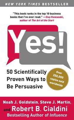
The majority of e-commerce persuasive maneuvers are derived from the work of two experts in Psychology: Robert B. Cialdini with his “Influence: Science and Practice” book and Joseph Sugarman with his “Triggers “ book
According to Cialdini, you may read more about 6 great elements of influence naming Commitment and Consistency, Reciprocity, Social Proof, Liking, Authority and Scarcity. The nice interpretation of these and some more tricks is presented by Bucaro TecHelp in their article called “Psychological Tricks in Selling” .
Guido Jansen offers many helpful pieces of material about the Psychology of E-commerce and its various tricks such as Authority figure, Framing effect, Immediate Feedback, Limit choices, Positive mimicry, Recurring events, Reminders, Subliminal Stimulation, Conceptual Metaphor and many other recipes for providing psychological effect. You may get a deeper look at his recommendations and try to apply them to your e-stores to make them popular.
You are probably aware about the average retail conversion rate that makes around 3%, so you should accept the fact that 97% of visitors are anyway not going to buy anything. So you are to put up with this fact and not over use all these tricks forgetting about the general quality of your products and delivery services.

Helga Weber is an experienced columnist, enthusiastic about web design and digital arts. Find her on Flickr
Get more to your email
Subscribe to our newsletter and access exclusive content and offers available only to MonsterPost subscribers.

Leave a Reply
You must be logged in to post a comment.