Designing a Shopping Cart Page – UX Tips
You may often meet such a word abbreviation as UX meaning user experience. It's all about how you perceive the product, system, application or service. This touches invisible threads of human-computer interaction and practical things such as utility, usability and overall efficiency.
Being concerned with e-commerce designs, we'd like to shed some light on the issue of user experience design of shopping carts. This has to do with all facets of people's interaction with a shopping cart. The way users feel about the cart is of utmost importance. Being versatile, UX design implies psychology, sociology, graphic design, computer science and even cognitive science.
Looking for the best design powerpoint? There are 550+ ready-made solutions waiting for you.
Knowing some simple principles may ease users' navigation through your shopping cart. After studying various popular e-stores we'd like to offer you 12 use-proven UX tips for your shopping carts:
Keep Tab On a Clickstream In Your Analytics Program
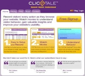
The best way to trace customers' activity on your shopping cart pages is to use special clickstreams and conversion funnels. This is achievable due to the analytics programs like Userfly, ClickTale etc. For finding some weak points you may even get customers' sessions recorded or screens captured. Thus you are able to find out where people get errors or difficulties and why.
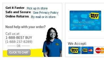
Make an Easy Access to Customer Service and Shipping Info
Try to make information on your customer service, shipping, and return policy easy and accessible. The best solution would be to place it on each page of your checkout system. Try to predict the potential customers' questions they may ask while checking-out. Probably, the most important questions would be:
- May I return goods for free?
- What is the shipping cost?
- How long will it take to ship and return products?
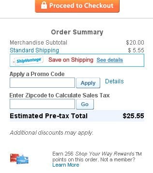
Place Coupon Codes Reasonably
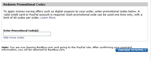
If you are using promo codes, it's nice to think about their placement in the check-out process. You may notice web stores placing them either at initial or at final step. But none of the options is ideal. If you put it right in the beginning you may get a risk of losing a customer who's gone looking for the better offers and discounts.
If you offer the promocode field in the end of the check-out process, you may make discount owners nervous about where on earth they could finally place their codes. Besides, you should forget that some of them may just be checking the code validity. So making them filling out all stuff for this purpose seems ridiculous. The best option would be to hint about the place or link where you offer to enter the promotional code.
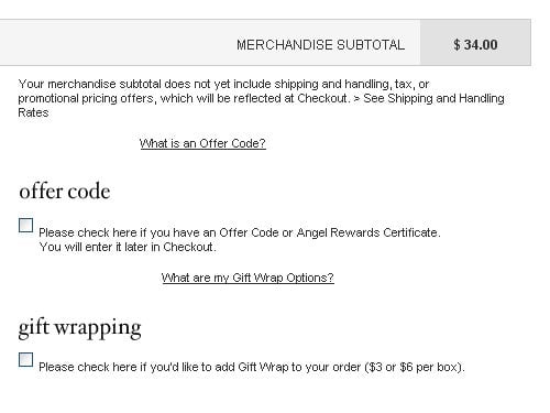
Or you may ask visitors to enter it after 1-2 steps of checking-out like BestBuy.com:
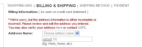
Ensure The Client Does Not Provide His Information Twice
This rule is pretty simple - don't make your customers fill out any information twice. That's really irritating. Besides, you are to think over the presentation of forms for the billing and shipping addresses not to make users put the same address twice in case they have similar destination. When users go to the previous screen and forward again, their data should still stay there.
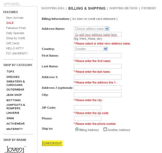
Forever21 offers either Billing Address or Another Address option to confirm if billing and shipping addresses are the same. But in case any errors occur after you fill out the form, all the previous information is being erased.
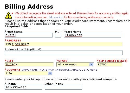
BestBuy.com saves all the information in turn:
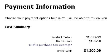
Show up Taxes If There Are Any
Information about the taxes should be presented before customers reach their very last page of the checkout process:
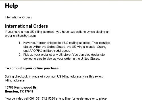
Provide Info On International Orders
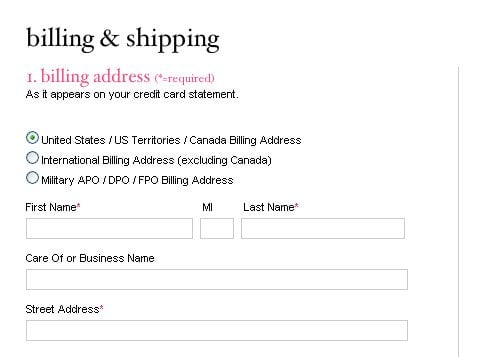
Please provide information whether you accept orders from customers standing from foreign countries. Indicate the rules of completing international orders, specify the countries you ship goods to and currencies you work with. Can't help mentioning one more thing - address fields in the shopping cart should be consistent with the conventions of the customer's country.
Clear Up Privacy Policies
We all have a fear of fraud or theft of personal information. So it's highly recommended to place privacy policies right next to all form fields that require customers' trust like email. You may offer some explanations of your privacy policy and its merits. The other way of increasing trust is placing phone number meaning that clients are able to reach your company, representative at any time.
Display a Progress Indicator
It's not a secret that people like to be guided. Such feature as a checkout progress indicator will help customers to orientate themselves in the flow of actions they need to take to complete an order.
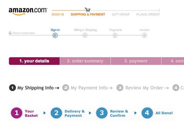
Amazon.com, PetNetDirect.com, HMV.com, Blockbuster.com, Game.co.uk in course in top-down presentation
Use Clear English
Try to select simple and understandable words to clear up error messages or guidelines you place throughout the shopping cart. E.g. in case you need customers to put all 16 characters of the credit card number make it clear by some note next to the field.
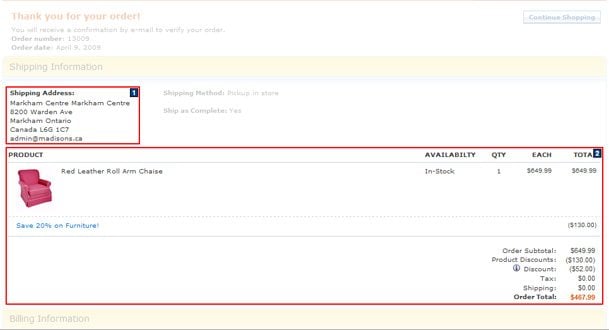
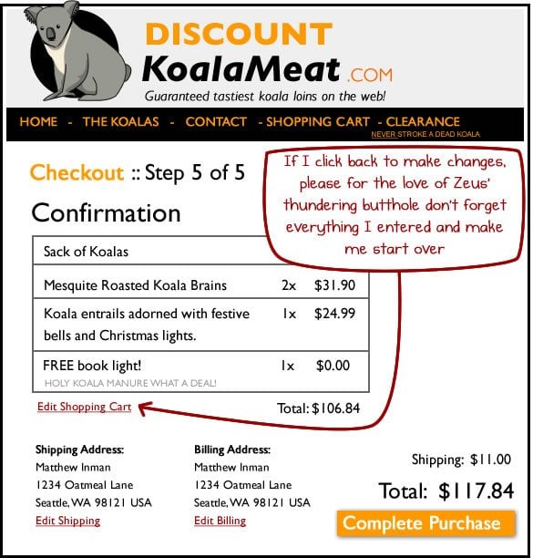
Always Show Up Confirmation Screen
The customer should get impression of the complete result of the checkout process through the confirmation screen. The screen should contain information about the products they buy, their shipping and other personal information as well as taxes.
Make Cross-Selling Unobtrusive
The best way to make cross-selling offer unobtrusive is placing it somewhere at the initial steps of the checkout and not repeating it each next step. Otherwise, your customers may get a negative impression about the store policy.

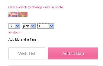
If product items are out of stock people should know it earlier, not when when they are confirming the purchase at final step.
Make it Simple
Simplicity is a basis of any efficient design! Display everything in a clear way so that the customers didn't have to worry about the special formats they need to use for filling out your form fields.
* * *
In general, user experience is known to be subjective in its nature reflecting human feelings about systems. But knowing tips above will help you to predict and eliminate many unwanted reactions. Besides, you should remember the dynamic nature of user experience design and follow the latest tricks used for its improvement.
You may find more helpful and humorous info on UX for shopping carts visiting the following educational and humorous resources:

Helga Weber is an experienced columnist, enthusiastic about web design and digital arts. Find her on Flickr
Get more to your email
Subscribe to our newsletter and access exclusive content and offers available only to MonsterPost subscribers.

Leave a Reply
You must be logged in to post a comment.