Making Category Pages that Sell – Examples, Critical Review, and Enhancements
Category pages of the eCommerce shops are perhaps one of the most complex pages as they embrace a huge amount of information, product specifications, and even some useful tools for customers. Online store business owners spend so much money designing their category pages and driving shoppers to them, so they therefore need to make sales from these pages. Nevertheless, there are a lot of mistakes website builders make when developing a category page.
Many sales catastrophes simply appear because of category page not providing enough information. In this article we will go behind the scenes of some most popular apparel eCommerce stores and represent you the list of usability standards for category pages that sell and increase the engagement level of online shoppers.
A well-built eCommerce page must include certain key elements. Many of the most successful online retailers share these very similar category page functionalities and practices. So, the implementation and proper handling of the following aspects can play a great role in changing how long customers stay on your eCommerce category pages and how many of them eventually proceed to certain product page and make a purchase.
- Offer different layout options for the category page and let customers choose.
- Make sure you achieve design simplicity and charm.
- Keep the category product page clean and easy to navigate.
- Incorporate multiple search filters and browsing refinements.
- Use visual navigation cues.
- Use properly-sized and sharp quality product images that tell a story.
- Avoid requiring clicking if you want your customers to stay.
- Offer product quick view option.
- Consider layering (when all the information is available, yet it is one click away to be shown on the same page).
- Provide enlarged images and alternative views which can be quickly viewed without leaving the page.
- Let visitors perform easy graphic manipulation actions like zooming, panning, or rotations.
- If possible, show the scale of a product and its context of use.
- Write creative and descriptive product titles that highlight the benefits.
- Make the price easy to find.
- Shout about cost-savings.
- Create contrast through size, alignment, color, shape, and other opposites.
- Mix font styles and font variations.
- Allow multiple color views on hover.
- Say about product availability and sizes.
- Include star ratings and product reviews to earn trust with the visitor.
- Integrate a prominently displayed call-to-action: 'Buy Now' button, 'Add to Cart' or 'Proceed to Checkout' buttons.
- If possible, display the delivery cost or other delivery details.
- State the lead time or show the countdown clock to create urgency in the customer’s mind.
- Provide clear path to follow.
The list is far from complete, however all these things are critical to netting sales. If you include these elements once, you will reap their benefits for years to come. Yet you have to decide how best to integrate them into your design. Again, we've been looking around for examples of excellent category pages from eCommerce apparel sites to analyze them and help you. The following optimization discussion contains just about everything you need to know about the good category pages. However, when designing and developing your category page, please avoid the pitfalls the analyzed examples made.
Note that today goes the first part of this post covering initial 5 examples, check out the part 2 of this article.
* * *
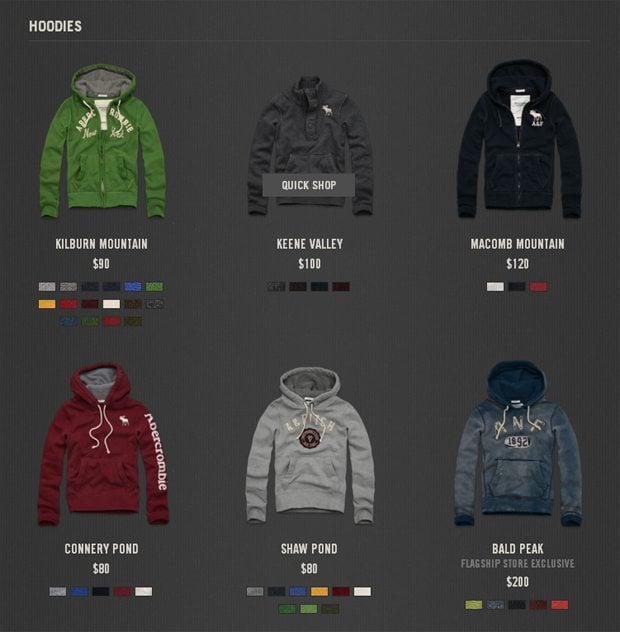
Abercrombie
What's good
- Clean style: this retailer keeps their category page clean and easy to navigate, so there’s enough white space to make the page and especially product variety, which is available under this category, easy to digest.
- Color options: users can choose between several colors, and it takes a click to change the product coloring (all that remaining on the same page). What I also like is the arrangement of the color options – small color bars are centered and horizontally aligned, which makes the page look slick and uncluttered.
- Quick shop: that’s obviously great that Abercrombie store presents a quick look preview from the category page. Upon clicking on the ‘quick shop’ button (that appears with hovering) shoppers can see short product information with additional options like available sizes, quantity, name of the colors, add to bag button, brief shipping info, and a link to full product information.
- Font: another redeeming feature is the font choice and a consistency of its usage. We can see titles, store exclusive signs, and the price displayed with the same font, this certainly favors legibility. The text is all caps, yet thanks to a nice kerning (adjusting the space between two letters) the info is easy to read and perceive.
- Product image: the picture is good quality, properly sized, detailed, and free of visual distraction. And notice the way of how it is incorporated into the layout – the item is displayed directly on the site’s background, seamlessly blending with the design. That’s stylish and surely encourage to buy.
Things to Change
- Absence of search filters: Abercrombie store is totally deprived of search filters. Customers therefore cannot customize information by size, availability, popularity, price, or whatever. Thus, the findability suffers greatly as users aren’t able to narrow and refine the broad variety to a smaller range of custom results.
- Font colors: I would say there’s lack of contrast in presenting the textual info. Viewers can scarcely distinguish the difference in price once there’s a cost saving offer. The same with store exclusive items – this attribute should call for attention but instead it’s poorly visible and achromatic. The title and price should be also colored differently to let the mind instantly perceive and discern these two vital attributes.
- Product title: it’s counterproductive, because the name of the item should be descriptive. The retailer must use all the tricks to net the sale, and in this case a brief product description in the title is essential to encourage shoppers to make a purchase.
- Product displaying: consider that there are no alternative views with different angles, mouseover enlarge, or enlarge pop-up. When viewing a category page, customers can hardly verify that the product on the page is what they are looking for. All because they are deprived of chances to perform easy graphic manipulation actions like zooming, panning, or rotations. That can probably cause sales catastrophe.
* * *
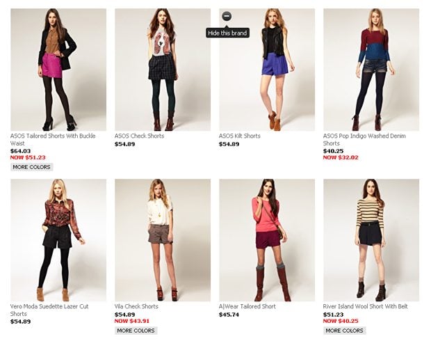
Asos
What's good
- Clean minimal style: some e-stores have their category pages crowded with a plethora of items. Well, that can possibly clinch a deal, still simplicity remains to be the key to effective category page. Here we see that Asos’ page layout is not overloaded with graphic elements, they made it appealing to the shoppers and at the same time very simple to use.
- Lots of attributes to refine search: being able to search an eCommerce site with different filters is a fundamental component of the visitor's experience. Here we can find product type, color, price range, brand, and other parameters used to refine the query. So, the store offers multiple ways to quickly sort the product listings and generate pages of items that include attributes the customer is searching for.
- Mixing font styles: what seize the attention on Asos’ category page is the combination of grayish colored font, bold font style, and all caps for additional attributes. Though rendered with similar proportions, we can admit that font diversity is fully embraced. Overall, the text for different important attributes is composed to create a readable, coherent, and visually satisfying whole.
- Black-red contrast for difference in price: Asos website owners have made the sale price incredibly easy to find. I think you will agree that is much more difficult to convince shoppers to buy something if they can’t figure out how much it will cost comparing to initial price. In this example the prices are made bolder, but the sale offer is highlighted with a red color. Being surround by sufficient whitespace the offer stands out perfectly.
- Hide this brand option: this attribute lets users narrow refinements. The shoppers can actually choose to eliminate brands they are less interested in. When scrolling the category page the option is hidden, it becomes slightly visible only when the product image is being hovered on. If to put a mouse cursor over the icon, it turns black and reveals the option with a navigation pointer – this offers the viewers clear visual feedback.
- Mix and match option: that is a great attribute to boost cross-selling. At Asos store they have found a way to relate products effectively on the category page. They simply made it convenient for store visitors to find what other products of the same style are available and might be interesting for them. The technique is sure to increase sales.
Things to Change
- A whole outfit without focus on a category product: that’s great to show the whole outfit to help customer define what other items can ideally go with this particular product. On the other hand, it is tricky as we have lack of focus on the main product that is being displayed under this category. Shoppers should be able to see some tiny details or assess a texture – that would make them more confident in the item they want to buy.
- ’More colors’ option is one click away: it is better to avoid requiring clicking if you want the store visitors to see the color combinations of the product. Shoppers simply think that upon clicking on the option their category browsing will be interrupted. Thus, they most often decline to click on the ‘one-click-away’ option being worried that it might take them away from the current page.
- Lack of product close-up view: product photos that do not offer users the ability to enlarge the image close-up view are unacceptable on an eCommerce sites. The retailers need to not only let customer zoom in or open an enlarged image, but also offer shots from multiple angles.
* * *
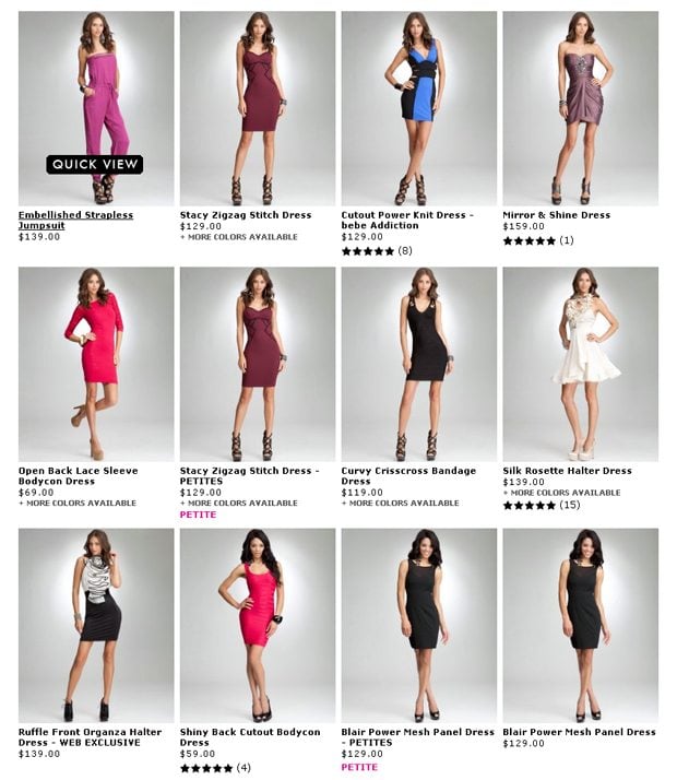
Bebe
What's good
- Product photography: in Bebe store we see models (‘real’ people) presenting the product line. This is a good way to resonate better with the customers as well as build instant trust and goodwill with the online store. With an excellent quality and superb lighting, the product photos are shown in a highly appealing way.
- Descriptive product titles: here the titles indicate certain specifications of each product in this category. Thus, the customers can easily tie these unique features to the benefits and eventually proceed with a purchase.
- Bold font style: setting the product titles in heavier, darker fonts, they create contrast and emphasize. With that’s being done, such phrases stand out from surrounding text and force user’s eye to really take in the words more carefully. Also the font highlighted with bold ensures sufficient contrast between the text and the background and facilitates scanning.
- Distinctive cost saving offers and availability details: inscriptions like ‘petite’, ‘just a few left’, ‘now $ price’ are enhanced with a bright pink color. When typography is mostly black and in some cases in shades of gray, adding bright color to emphasize certain parts can work really well. Besides they mix bold and all caps styles within the same fonts and get the look of perfectly mixed typefaces.
- Quick view colored upon mouseover: coloring the quick view button with bright color eliminates misclicking and appearing on the wrong page. What’s also good is that the pop-up window contains extra options including but not limiting to view angles, write a review option, Facebook like button, product specifications, and more.
- Rich faceted navigation: with multi-attribute filtering (sizes, colors, sort for new releases, favorites, top rated, low-high/ high-low prices), it is made easier for users to navigate through vast amounts of product, and get them more quickly to the precise item they are looking for. Besides, this can expose users to some products they may not have known exists.
- User reviews and star rating attribute: these options surely help shoppers make a decision about the product they're viewing. Customers can see stars appointed to particular product and also can easily proceed to check out the feedback information.
Things to Change
- Colors availability is one step away: that would be better to avoid requiring clicking if one wants users to read or check out something. People usually are worried that it might take them away from the product page.
- No enlargement or alternative views: overall the imagery isn't very excessive. Though it does well with product displaying, yet none of additional views are provided. Having the way to zoom the product, either without leaving the page or opening a pop-up window, rotate it, quickly view different angles would be more helpful.
- Similarly colored attributes: it’s good to stick to colors either in the same hue or saturation level, yet different styles, colors, and font decorations can change the priority and importance of different typographic elements. They should try a bit more color variation for the best end-result.
* * *
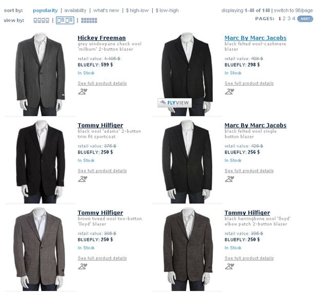
Bluefly
What's good
- Page layout options: there’s a perfect set of different layout options for users’ custom browse experience – list view, detail view, and grid view. These options are available to add diversity and visual interest to the various products on this category page. Note that upon different styles some product attributes become invisible.
- Brief product description: what I especially like about Bluefly's category pages is the presentation of short descriptions along with every product title. It’s an effective conversion booster, because it gives customers a tantalizing, detail rich taste of the product describing the basic features that people might be interested in.
- Fly view: upon hovering over the product image, a fly view button will appear. Once clicked, it allows the customer to examine an item in relative detail without leaving their current page. Apart from including pricing, description and the ever important add to cart button, this example presents size and fit info, add to wish list option, and also offers extended list of product details through tabbed navigation (active and passive states are highlighted by color contrast).
- Colored product availability attribute: basically this attribute is one of the most useful entities assigned to products as it clearly indicates whether the product is in stock or is running out of stock. Lack of information about ship date and availability really lowers willingness to buy. So, with such colored phrases like ‘in stock’ or ‘only 2 left’, the retailer provides relevant info and removes the necessity to go through next step to discover that.
- My Fly closet option: with this option we can kind-of hang certain product to our My Fly closet. That’s similar to adding to wish list and sounds to be an interesting step in giving this attribute a broader appeal. Such target lists are important since people use them to store items, they come back to edit or view them. For the sake of viral marketing, it is also essential to allow users share their lists with others.
- Search filter ‘switch to more items per page’:by using this filter we can quickly widen our search to a greater amount of product results being displayed on a page. This lets you search within one page without distracting and is also useful for brief comparing products.
- More links to product page: if your goal is to get more links to product page that’s a good way to do it. Through adding something link-worthy elements to category page (here there are link to product page from product title, product image, and ‘see full product details’ option), retailer makes it easy for visitors to navigate the site and fill up the shopping carts, plus it will carry even more weight with the search engines.
- Font styles for cost saving offers: at Bluefly they achieve a nice look of mixed typography for this offer. All smalls and price strikethrough versus all caps and bold elements clearly communicates to the visitors that the product is on sale. In addition, it prevents possible confusion between sale prices and regular prices.
Things to Change
- '+ More colors' option indistinct: what we have here is a blurred wording. Coloring doesn't seem to be any good at all against that illegible phrase that is besides too small to click on.
- Mixed typefaces but similarly colored: the retailer added some shades of gray to de-emphasize certain parts among the attributes. They play on font weight, all caps style, underlining elements, but I feel shortage of color variations. Similar colored typography elements are tricky.
* * *
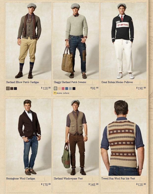
Rugby
What's good
- Reverse side of the product on hover: if to move a mouse over a product image, it is being replaced with another image that illustrates the back of the product item in a close-up style. This gives more product information and instant enlargement from just a move. So by showing front and back views on one image, you can help customers experience the product better and feel more confident in the purchase.
- Switching to new style with color change: when you try to change the color of the product to match your liking, you’ll notice that the whole outfit of the model is changed. Thus, the retailer make visible many clothing styles and options, available in this particular store, and significantly facilitate cross-selling. Smart enough.
- Title and price on the opposite sides: the price appears not just below the product title (as it is done on many category pages), but is placed distantly, on the opposite side of the item presentation area. As a result, we see these two attributes playing against one another to give emphasis to their specifics.
- Heavier and bolder font for price: it is definitely good to emphasize font’s weight a bit more to make the price distinguished for the viewer. Besides, in this particular case the price font isn’t identical in scale and proportion if compared with the font for the product title. I would say it is creative and funny. The overall typography effect looks and feels right.
Things to Change
- No search filters: it is clear that search filter leverage the structure of content, especially in eCommerce sites where there’s wide range of products. Without such a useful tool, users cannot quickly find what they need and are probably less satisfied with their site experience. Online merchant should therefore think about how to make filters effective navigation mechanisms for repurposing the assortment of products according to customers’ queries.
* * *
When improving the category pages of your online store, the only thing you need to remember about is the convenience for your customers – simply make them feel comfortable when buying from you and adhere to the principles we’ve given in the beginning of the post. Keep in mind, there is a sea of choices the shoppers can wade through to make an online purchase. If you want to sell, make sure your category page is properly thought-out, easy to use, and simple to buy from.
Next week we'll publish the sequel of this post with 5 other excellent examples of eCommerce category pages to be covered, so stay tuned! In the meantime, you may want to check out 40+ Best Examples of Shopping Cart Page Designs. The showcase also includes the top tips to help you create a usable eCommerce shopping cart.
Get more to your email
Subscribe to our newsletter and access exclusive content and offers available only to MonsterPost subscribers.

Leave a Reply
You must be logged in to post a comment.