Form Design – 20 Usability Tips and Best Practices
A web form is an entrance, a phase transition from sheer interest to turning into an actual customer. Therefore, it is reasonable to make the form design inviting and user-friendly.
The process of filling out a form should be as easy as putting two and two together, since people to who face some issues and get failures more likely associate it with your brand. And your reputation instantly looses its balance. So believe it or not, but one tiny form can mess up your brand reputation. You don't want that, do you?
How to avoid such a fail? First of all you are to remember that any form is a business card of your brand, a face of your company. It is the very first step in your interaction with your potential clients, and it should look easy, warm and inviting.
20 Tips To Make Forms Rock!
Today we are offering you some tips to help avoid the epic fails and unconveniences associated with your web forms.
- Make forms visible and easy-accessible. Don’t hide them.
- Make them short – ask for essential info only. Avoid asking for unnecessary information not to distract the customers. Get the ball rolling with the really important data you need to know to get messages from clients or sign them up. You may ask something like “How did you know about our company?” on further stages.
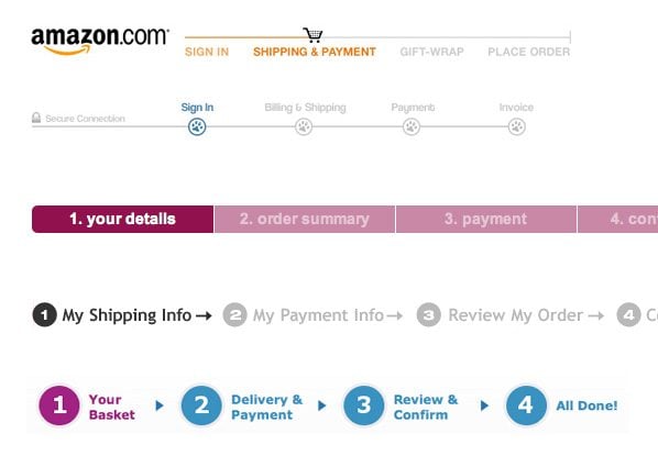
- Make up a status bar to set clear expectations. People want to know how much time it's going to take them to complete the form, and a progress bar would be a great advantage in this case. At least display the info like "Step 1 of 3", but the best thing would be to keep it short enough to be at one little form.
- Explain why clients need to sign up or fill out a contact form: specify the benefits they get. And offer bonuses like free trials or discounts for filling out the form.
- Make it clear and consistent, avoid chaos. The layout should be logical, symmetrical and brief. Eliminate any excess sections in the web form layout.
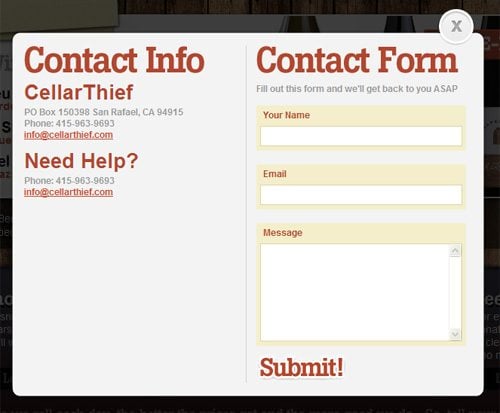
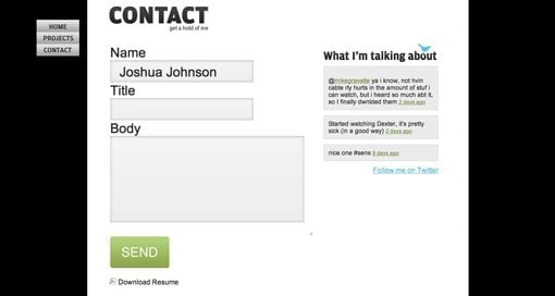
- Consider the conveniences of the one-column form. It is easy to fill out and doesn't look cluttered. You may give any highlight or background color to all fields and labels to better associate them with each other. If you need several fields on a line, it's better to place them so that they look unified.
- Mark some fields as required and explain the way you mark them on top. Use some explanatory text to clear up the label meaning in your form (e.g. an asterisk) and make them visible at once.
- Number fields/questions. This rule concerns longer and detailed forms where you can easily get lost – just like multi-page surveys and questionnaires.
- Avoid asking for the name at first. You need just to set up interaction with customers, so nickname and e-mail at the initial step would be enough. The name could be found out later.
- Use the prefilled answers. Use list boxes and drop-down menus for the fields with the predictable info like country, city or sex.
- Use the font of 11 pixels and larger for representing text in the form areas and fields. Emphasize all important info with the bold type.
- Make call-to-action buttons large enough while avoiding using more than 2-3 words. Consider the encouraging colors. Speaking of sizes, we'd recommend you to use large fonts on buttons.
- Apply warm and friendly colors for the general form layout. We'd recommend you to use not more than 5 color tones for the single form.
- Avoid using links to anything else within the form itself. You may push the navigation bar down/aside or to the footer not to distract the eye from the form. Unnecessary links take customers away from the form page, and surely there's nothing good in this transition. Make just the “complete”/“submit” button clickable.
- Use the check boxes/radio buttons to unify and standardize the answers.
- Do your best to avoid captchas in your form. SEOmoz analysis states that captchas may cause the loss of 3.2% of your potential clientele. So if you find this small group of people considerable for your budget, try to get rid of captchas at all.
- Include specific needs among the other form fields. This feature is great for the customers who already know what they are opting for. And there should be a way to specify these specific items or services.
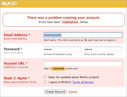
- Explain errors and make it easy to recover from them. Let it be a clear one-step process to fix errors that occur during the form submission.
- Apply marketing strategy. This may imply a list of specific questions about your customers. This feature would be helpful for your website traffic analysis and its further promotion. You may inquire about the company name and your client's profession, an address (for sending out catalogues or coupons), a cell phone number (for SMS-strategy), a fax number (for sending out fax marketing materials), about the ways your clients have heard about your company etc.
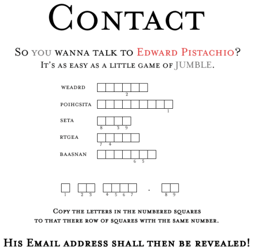
- Make it look unique. It's never enough to make up an ordinary web form. You should give it an exclusive and memorable look, add some zest. Just use imagination and play with symbols, icons, colors, web form position or size to create an interesting design solution!
You may view a couple of great examples below:
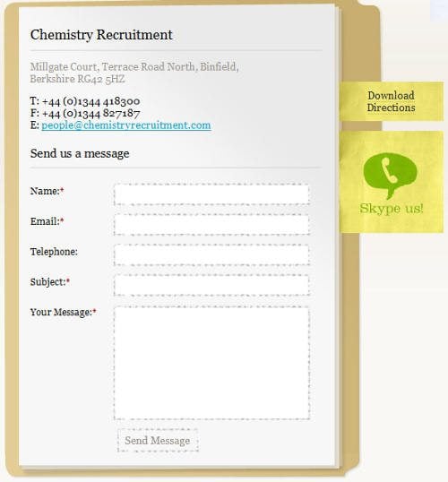
***
***
Additional content we suggest in case you want to dig deeper into forms design:
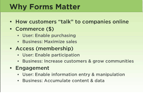
Form usability presentation from Slideshare. It covers all aspects of building a form in a simple and straight-foward way.
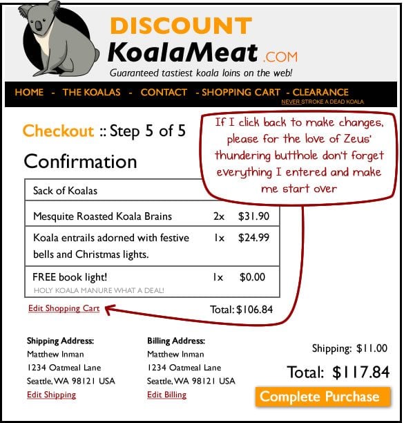
Usability Comics from Theoatmeal.com
Don’t miss out these all-time favourites
- The best hosting for a WordPress website. Tap our link to get the best price on the market with 82% off. If HostPapa didn’t impress you check out other alternatives.
- Website Installation service - to get your template up and running within just 6 hours without hassle. No minute is wasted and the work is going.
- ONE Membership - to download unlimited number of WordPress themes, plugins, ppt and other products within one license. Since bigger is always better.
- Ready-to-Use Website service is the ultimate solution that includes full template installation & configuration, content integration, implementation of must-have plugins, security features and Extended on-page SEO optimization. A team of developers will do all the work for you.
- Must-Have WordPress Plugins - to get the most essential plugins for your website in one bundle. All plugins will be installed, activated and checked for proper functioning.
- Finest Stock Images for Websites - to create amazing visuals. You’ll get access to Depositphotos.com to choose 15 images with unlimited topic and size selection.
- SSL Certificate Creation service - to get the absolute trust of your website visitors. Comodo Certificate is the most reliable https protocol that ensures users data safety against cyber attacks.
- Website speed optimization service - to increase UX of your site and get a better Google PageSpeed score.

Helga Weber is an experienced columnist, enthusiastic about web design and digital arts. Find her on Flickr
Get more to your email
Subscribe to our newsletter and access exclusive content and offers available only to MonsterPost subscribers.

Leave a Reply
You must be logged in to post a comment.