Warm Website Design VS. Cool Which is the Most Pleasant?
Whether we like it or not, it is impossible to deny the fact that warm website design arises different emotions. We can’t control this process, it happens on the level of subconscious.
There is a theory that the connection of colors and emotions is laid at the gene level. From ancient times it was vitally important for people to understand the language of colors. Usually, the most poisonous and dangerous animals are brightly colored. It’s a kind of warning, a message on Esperanto, clear to everybody.
It’s a well known fact that colors are divided into two main categories: warm and cool. The division is very intuitive. Traditionally we associate warm colors with the sun, as it is the source of life and warmth for all alive on our planet. So, warm colors are: red, yellow and orange. If we recollect cool shadowy forests or snowy mountain peaks, we get the cool hues: green, blue and violet. Red, yellow and blue are so-called primary colors, all the variety of other hues is achieved by mixing of these three.
Let’s try to puzzle out the dependence of colors and emotions on the example of some common hue.
 Red is traditionally associated with blood, it produces the strongest emotional response. The impact of red is dual; it symbolizes such positive emotions as love and passion or negative feelings like rage and malice.
- Orange is perceived as a color of cheer and hilarity. It is so snazzy and loud that the user takes notice of orange elements against his will.
- Yellow is not a definite color. On the one hand, we all imagine the yellow sun drawn by the child’s hand on a white sheet wrested from the album. On the other hand, yellow is a color of sickness, cowardice and betrayal.
 Green is the most pleasant color for our visual receptors. It symbolizes serenity, growth and freshness. But another side of the coin is guilt, envy and jealousy.
- Blue is the hue of peace, tranquility and security. It is extremely good for business companies providing financial services, as due to the color visitors feel confidence and reliability. Blue also creates the optical illusion of space.
- Being a blend of red and blue, purple is normally associated with quality, royalty and mysticism.
- Black hasn't very positive historical background, as in ancient times it was connected with fear, grief and death. Today, the situation has changed: our inner perception couples black hues with power, elegance and classic.
It’s a great piece of luck that we all live in a color rich world; just imagine how dull would be our being without all those hues. Colors and their harmonious combinations are powerful marketing tools in the hand of an experienced designer. A proper skillful usage of hues can affect the user’s mood and arouse required emotions, which helps to convey the initial message in the most comprehensible and intelligible way. Depending on color scheme used in design, you can either attract or kick away the customers.
Let’s find out how colors affect our shopping habits and what is the palette of successful marketing.
Reds and oranges encourage people to buy quickly. Colors influence men and women in a different way. Usually, men prefer cool colors like blues and greens, while weaker sex tends to warmer reds and oranges. Selecting colors, a designer should be guided not by his personal preferences, but by the tastes of targeted buyers. The text should be easy to read and the colors shouldn’t be harmful for eyes. It’s a bad practice to use too many colors, three are enough. Red and black colors have erotic undertone, that’s why they are frequently used on adult websites.
Large blocks painted in bright primary colors will help to sell toys, books and various stuff for children. Cultural differences should be considered as well. As all of us have different temperaments, our reaction on colors may also vary. Impulse shoppers can be pushed by red-orange, black and royal blue. Screwy shoppers who plan and stick to budgets show better reaction on pink, teal, light blue and navy.
Traditional buyers respond to pastels – pink, rose, sky blue. The choice of colors may also depend on season or holidays in the targeted area. Here is a link to color psychology infographic, brightly illustrating the dependence of our shopping habits from colors.
Now we know the meaning of colors and their impact on customers’ psychology. So, we can arrive at the conclusion, that color scheme should support the content and match the general design idea. It’s better not to mix warm and cool hues as it confuses the user.
Warm colors better suit websites demanding visitor’s quick mental activity. Cool and neutral colors are great for business companies, and websites containing spacious information which can’t be read on the run and should be comprehended in comfortable restful atmosphere.
Let’s trace how the conventional marketing rules are realized in particular templates.
Red - Warm Website Design
Seoico - SEO & Digital Marketing WordPress Theme
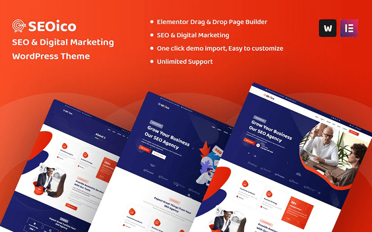
SEOico is an SEO and digital marketing one page and multi-page WordPress theme. The SEOico theme was designed specifically for all kinds of SEO & digital marketing agencies, including corporate and business websites.
Technology & IT Solution Services WordPress Theme
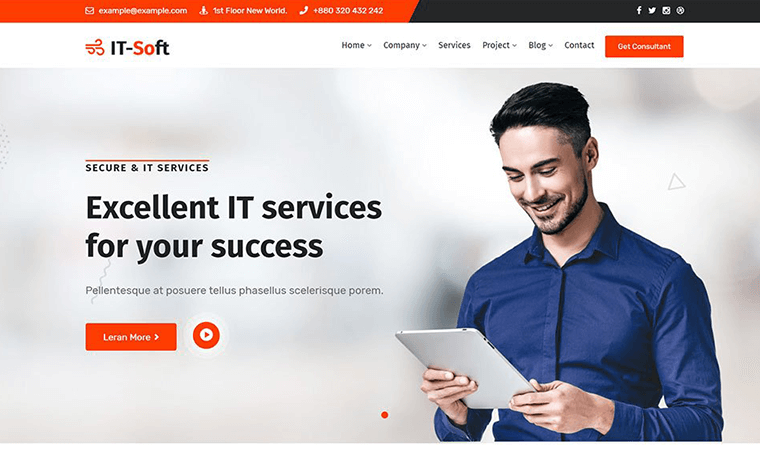
It-Soft is a business WordPress theme designed for startups, apps, and all kinds of IT services. The It-Soft theme comes pre-packed with Elementor builder that will help you make all the necessary design and layout changes.
Zoom Express - Delivery MotoCMS Landing Page Template
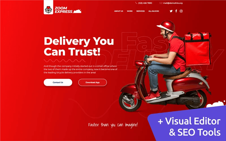
Zoom Express is a stylish delivery company landing page powered by MotoCMS page builder. The template will fit various other purposes, especially startups, events, products preordering, promos, etc.
Orange - Warm Website Design
OuiOui - Multi Vendor MarketPlace Elementor WooCommerce Theme
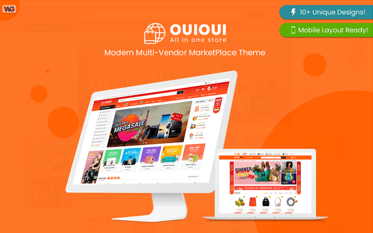
Built with 10+ beautiful and modern homepage designs, all layouts of the themes are 100% mobile-ready. The multi-vendor support and many eCommerce features make OuiOui a great choice for any shopping store or multi-vendor marketplace.
Worky - Architectural Bureau Multipurpose Modern Elementor WordPress Theme
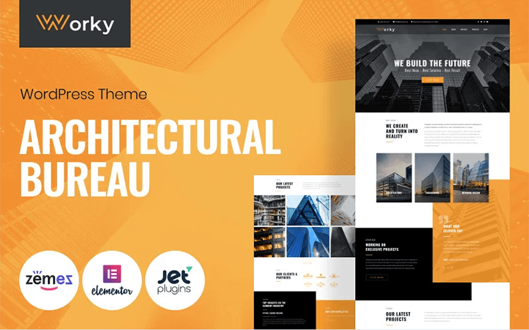
The Worky WordPress theme is a perfect fit for any architectural bureau, an engineering company, or a design studio. The theme has a modern design and incredible functionalities on-board. With Worky, you will create high-quality websites quickly and easily since it's mated with Jet plugins bundle for Elementor page builder.
Context - Construction and Architecture Responsive WordPress Theme
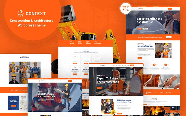
The Context -is a construction and architecture one page, multi-page WordPress theme. It's the best choice for construction, building, and any kind of corporate and business website.
Yellow - Warm Website Design
SkIllum - Online Courses Elementor WordPress Theme
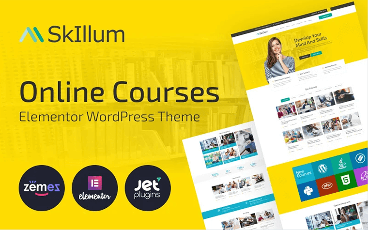
Having a website built with a SkIllum theme, you will be able to inform your potential students about your educational programs in a stylish way. Engage more people in your online courses with a bright design of the theme. With the help of the Elementor builder, you'll customize layouts of pages and represent the content stylishly. The theme is equipped with a powerful Jet plugins bundle for Elementor page builder.
Adverting - Advertising Agency Responsive Elementor WordPress Theme
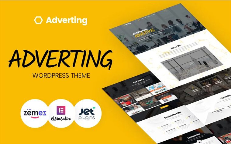
Do you need a perfect theme for your online advertising agency? We have a solution for you! Try our Adverting WordPress theme; it was crafted with care to boost your business to the top! Adverting comes with a fully responsive and clean design. Therefore, your clients will enjoy a great site's performance on any modern device and will easily stay focused on the full range of your services.
Printile - Print Shop Ecommerce Template PrestaShop Theme
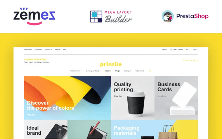
Most print businesses are growing rapidly; with this Print Shop eCommerce template, which is designed for printing companies, you will be able to present your company online in a decent way and on screens of all possible devices. The bright and colored design of the theme is a distinctive point for such kind of store.
Green - Warm Website Design
Govnet - City Government and Municipal Responsive WordPress Theme
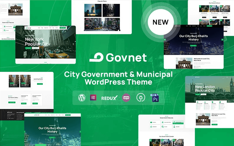
The Govnet WordPress theme was designed for City Government and Municipal portals. Apart from that, our theme will fit various municipalities' websites, government departments or agencies, corporate businesses, local government sites, and town or city portals. It is flexible enough to support.
Cleanmaster - Cleaning Service Responsive WordPress Theme
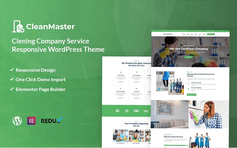
The CleanMaster is a cleaning company WordPress Theme that will be a 100% fit for cleaning websites such as Labor services, House Cleaning, Apartment Cleaners, Industry Cleaning, Painter, Handyman, Washing services.
KIDZCARE - Children Day Care Academic Multipurpose Responsive HTML5 Website Template
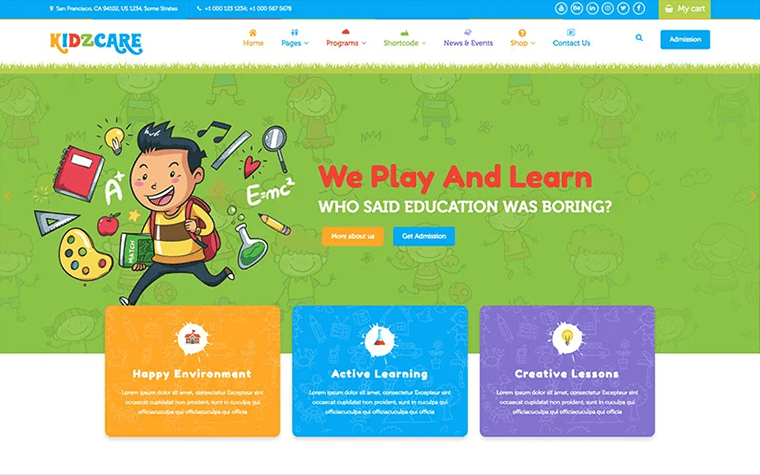
The KIDZCARE HTML5 template can be used for preschool and daycare institutions, children groups, playschools, kindergartens, and kids stores.
Blue - Cool Website Design
Intech - IT Solution And Technology Services WordPress Theme
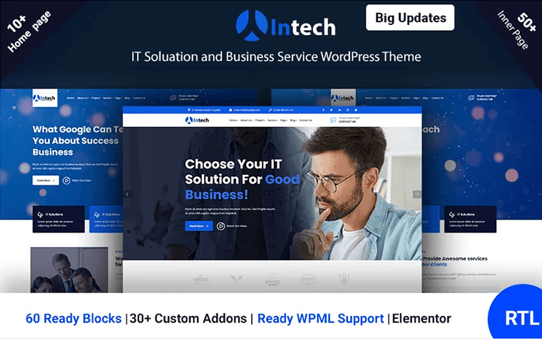
The Intech WordPress theme is a powerful solution for all kinds of web agencies, SEO agencies, marketing agencies, landing pages, and much more.
Newshive- Creative, Flexible Magazine, News Portal & Blog WordPress Theme
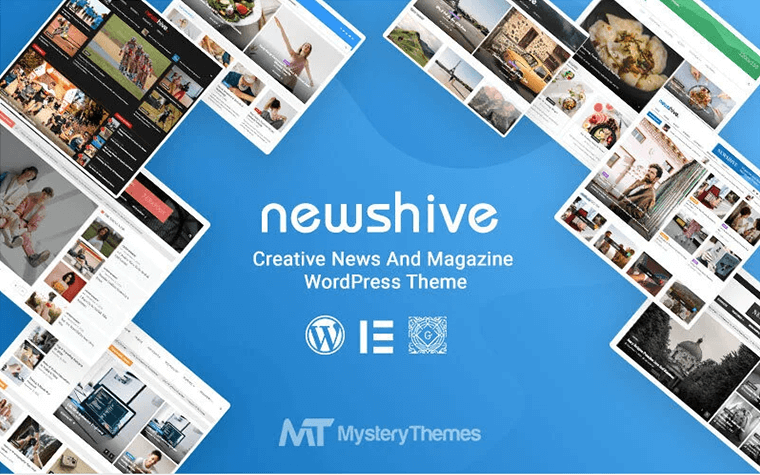
The Newshive WordPress theme is a well-designed and lightweight magazine theme with seamless integration of an Elementor page builder. This fully responsive theme works well for the magazine/news and blog sites based on any niche.
Atlantis - Bootstrap 4 Dashboard Admin Template
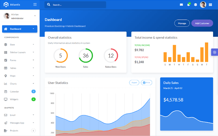
Atlantis is a beautiful and elegant Bootstrap 4 admin dashboard designed to manage and visualize data about your business. Atlantis admin dashboard has 9 layouts, 26 plugins, and many UI components to help developers create dashboards quickly and effectively to save development time and help users make the right and fast decisions based on existing data.
Purple - Cool Website Design
Themex - Multipurpose Responsive WordPress Theme
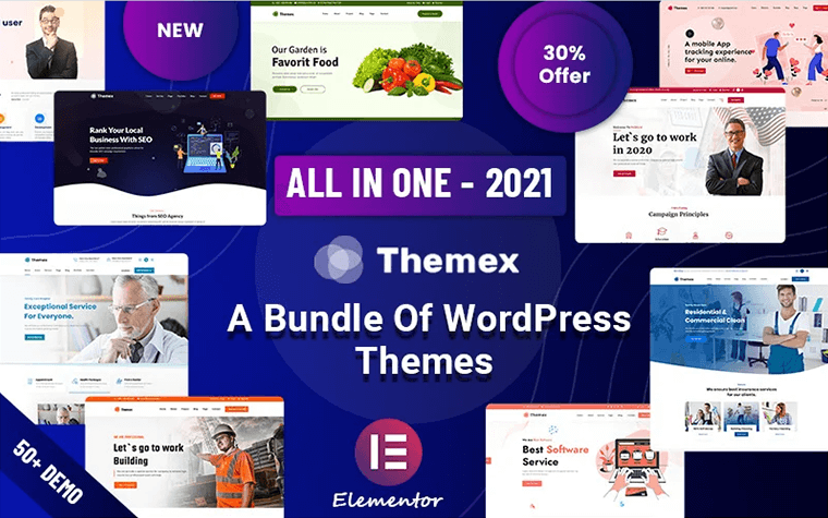
The Themex WordPress theme is a clean, flexible, and powerful option for your website. It offers many possibilities and a unique layout, which will help you create a beautiful, stunning and unique website. We have developed this comprehensive WordPress theme to deliver everything you are looking for from a website.
BeClinic - Multipurpose Medical WordPress Theme
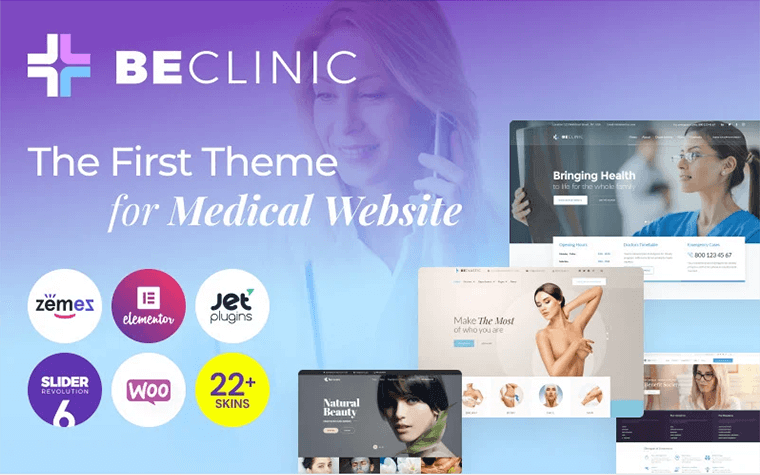
This medical WordPress theme is aimed to satisfy all of your demands! Ther BeClinic theme is a starter pack of ready-to-use pre-built page templates, and it is waiting for you. Assure the visitors of your website of the reliability of your medical clinic.
Cyber - IT Solutions & IT Startup WordPress Theme
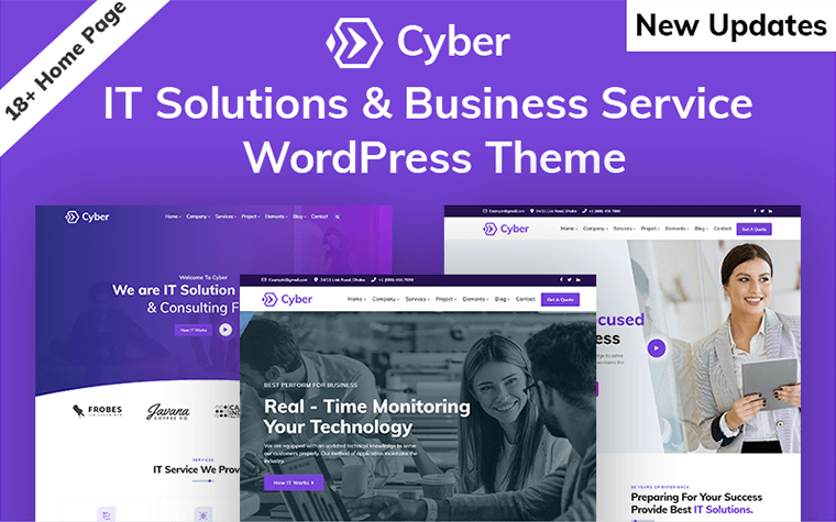
The Cyber multipurpose WordPress Theme includes 10 home page designs & 17+ carefully-built inner pages with elements you need to build a perfect website.
Black
Hazel - Clean Minimalist Multi-Purpose WordPress Theme
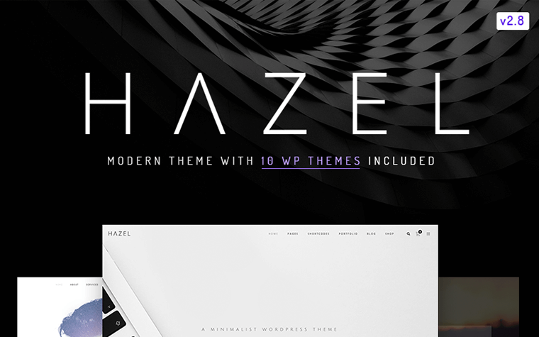
The Hazel WordPress theme is a minimal, clean, and modern solution for your website. It's packaged with awesome premium plugins, a mega menu, and WooCommerce design integration. The Hazel theme also includes multiple page options, portfolio types, and styles. The theme is WPML and translation ready, the robust admin panel with hundreds of options to make it your own, tons of useful visual page builder elements, and tons of pre-configured layouts!
Webion - Minimal Elementor Multipurpose WordPress Theme
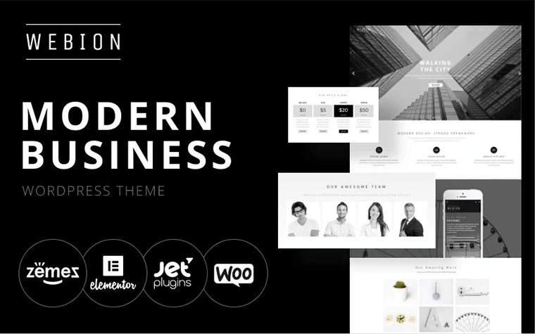
This Webion WordPress theme is a modern design, which includes everything for a great presentation. When you scroll the home page, you can see many widgets like icon list, tab, images layout, etc. We used them together to create a modern business cool website design.
Lexicon - kitchen Accessories Store OpenCart Template
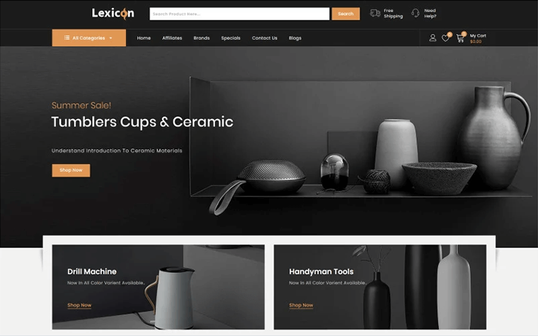
Lexicon is a professional minimalist Responsive Opencart Theme built to create a modern, powerful, and eCommerce-ready website. Lexicon Opencart Theme is SEO optimized to be friendly with the most popular search engines.
Don’t miss out these all-time favourites
- The best hosting for a WordPress website. Tap our link to get the best price on the market with 82% off. If HostPapa didn’t impress you check out other alternatives.
- Website Installation service - to get your template up and running within just 6 hours without hassle. No minute is wasted and the work is going.
- ONE Membership - to download unlimited number of WordPress themes, plugins, ppt and other products within one license. Since bigger is always better.
- Ready-to-Use Website service is the ultimate solution that includes full template installation & configuration, content integration, implementation of must-have plugins, security features and Extended on-page SEO optimization. A team of developers will do all the work for you.
- Must-Have WordPress Plugins - to get the most essential plugins for your website in one bundle. All plugins will be installed, activated and checked for proper functioning.
- Finest Stock Images for Websites - to create amazing visuals. You’ll get access to Depositphotos.com to choose 15 images with unlimited topic and size selection.
- SSL Certificate Creation service - to get the absolute trust of your website visitors. Comodo Certificate is the most reliable https protocol that ensures users data safety against cyber attacks.
- Website speed optimization service - to increase UX of your site and get a better Google PageSpeed score.

Experienced writer passionate about highlighting all the topics related to web, design, marketing, SEO, and more. Follow Helga on Quora.
Get more to your email
Subscribe to our newsletter and access exclusive content and offers available only to MonsterPost subscribers.

Leave a Reply
You must be logged in to post a comment.