Responsive Advertising: When One Size Fits All
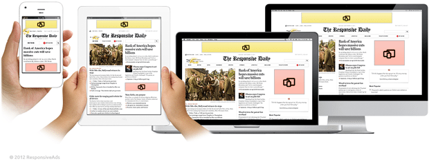
Nowadays responsive layout is a "supernova" of web design; everyone tries to implement this technology into the web resource because today a huge segment of traffic is mobile. Great amount of website owners earn their millions of dollars money from the advertising.
But what happens to the ads when your website shrinks to 320px? They simply disappear or twist your "shrinked version".
These are the key issues that responsive advertising has faced:
- large number of sites rely on the advertising;
- ad units are fixed and have standardized sizes; (most of them do not fit multiple layout options)
- they are sold and created on the basis of their size and position on the page;
- the ads types are rich including takeovers, video, pop-overs, flyouts and interactions (most of them are not supported by mobile platforms).
Judging by the key points mentioned above there comes out the necessity to make ad blocks compatible with the responsive layout. By now there are several ways how you can do it. The easiest way is to adjust the ad with some HTML and Javascript (best used for static ads, below you will find out how to do it) or using the responsive ads framework that is one of the most effective solutions by now.
* * *
Responsive web-design is still a child of tender years some time will pass till a conventional approach to making ads responsive will appear. Surely we can use services like the one mentioned above that make it easier for publishers to advertise by displaying a single ad per page which is usually unobtrusive and can be styled to fit most screen resolutions and sizes.
But, online magazines, big news websites and other publications require larger advertising campaigns to be run prefer bigger ad sizes. Advertisers will often prefer to buy a bigger ad format. The most popular is 300×250px format.
Starting with the smallest size possible (usually 320px wide) and then going up to 1382px wide makes a lot of sense - especially when you think about advertising. If you can successfully integrate advertising into your website design at 320px wide, doing the same at a bigger resolution shouldn’t be a problem—it’s a matter of shuffling things around and positioning ads carefully. Planning your advertising strategy will definitely save headaches.
Possible solutions:
- Traffic redistribution
- Responsive HTML ad using Javascript interface
- Flexible Responsive Ad Framework
Big ad formats as 300x1050px or 970x250px do not fit the iPhone screen, for example, though it is possible to hide these huge ads and reveal them only for those who browse from a desktop computer. Even if we use display:none function the code of the ad will be loaded, this does not resolve the issue but creates more problems.
Way more effective would be to use Javascript for detecting the screen width and then to prevent certain section of div from loading, JS can be turned off by the user, nevertheless most ads are shown with its help.
Traffic redistribution
The best possible solution, you may not believe it, but its better planning! Think it over, when you sell an ad campaign on your responsive website, what is the first factor to be considered? Of course it’s the volume of the traffic, which is why from this point of view you can do the following.
Having a vast flow of traffic you can divide your inventory, selling separate (for mobile devices, tablets, PCs) campaigns for advertisers. That will be easier for both the seller and buyer. For large web resources this sounds like an impressive opportunity to create awesome advertising experience for advertisers and users.
Responsive HTML ad using Javascript interface
This method is good only for static ads, it does not solve the problem with rich media and ad server implementation but the plus is that it isn’t hard to execute. The ad is being built with HTML; each ad is simply a static image. Instead of embedding the responsive logic in media queries you can add a JavaScript interface, the configuration portion of which looks like this:
1 2 3 4 5 6 7 8 9 10 11 12 13 14 15 16 17 18 19 20 21 | // Ad config var ads = { leaderboard: { width: 728, height: 90, breakpoint: false, url: '728x90.png' }, rectangle: { width: 300, height: 250, breakpoint: 728, url: '300x250.png' }, mobile: { width: 300, height: 50, breakpoint: 500 , url: '300x50.png' } }; |
This lets you define your responsive campaign with some settings and then the JavaScript does the rest. This uses the window.matchMedia method, which currently is only available in Chrome, Firefox, and Safari.
Flexible Responsive Ad Framework
In the same way that designers have approached RWD with different frameworks for development and laying out different designs for different views, another approach is to use a framework to manage ads direction and network party ad tags across the website.
* * *
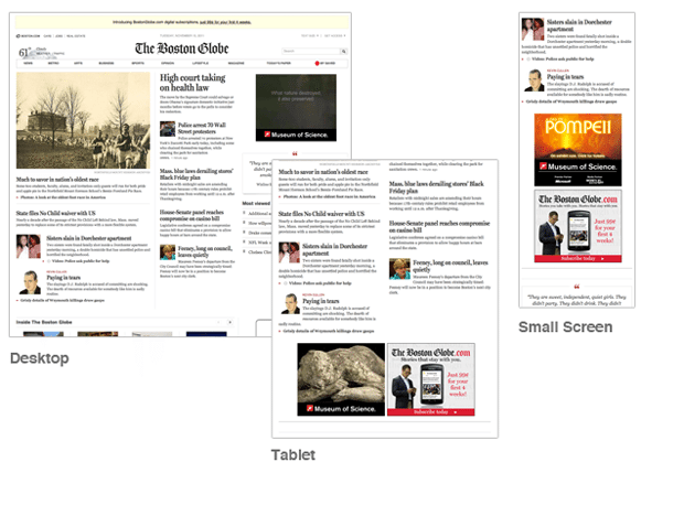
The best example of responsive ads implementation is The Boston Globe website they’ve incorporated an MMU ad unit. They’ve done this by fixing the width of that column and have the ad unit occupy that space as the viewport is reduced down to a single column. It is not a simple task to approach but highly efficient.
* * *
Speaking of a perfect solution we need it as fast as possible, because the responsive layouts may be abandoned by the harsh business reality, due to their inability to host a specific ad in various layout options. There is a necessity for a lightweight but effective tool that will adapt those ads and will make advertising not-so-hard-to-do. No need to panic because the design community does not sit idle, those guys will bring a solution that will satisfy everyone’s needs.
If you have more ideas considering responsive advertising feel free to express your opinion in the comments section.
Don’t miss out these all-time favourites
- The best hosting for a WordPress website. Tap our link to get the best price on the market with 82% off. If HostPapa didn’t impress you check out other alternatives.
- Website Installation service - to get your template up and running within just 6 hours without hassle. No minute is wasted and the work is going.
- ONE Membership - to download unlimited number of WordPress themes, plugins, ppt and other products within one license. Since bigger is always better.
- Ready-to-Use Website service is the ultimate solution that includes full template installation & configuration, content integration, implementation of must-have plugins, security features and Extended on-page SEO optimization. A team of developers will do all the work for you.
- Must-Have WordPress Plugins - to get the most essential plugins for your website in one bundle. All plugins will be installed, activated and checked for proper functioning.
- Finest Stock Images for Websites - to create amazing visuals. You’ll get access to Depositphotos.com to choose 15 images with unlimited topic and size selection.
- SSL Certificate Creation service - to get the absolute trust of your website visitors. Comodo Certificate is the most reliable https protocol that ensures users data safety against cyber attacks.
- Website speed optimization service - to increase UX of your site and get a better Google PageSpeed score.
Get more to your email
Subscribe to our newsletter and access exclusive content and offers available only to MonsterPost subscribers.


Leave a Reply
You must be logged in to post a comment.