Everyone who deals with design or designing, faces the term Intuitive pretty constantly. But seriously how can the Interface be intuitive, this "trait" can’t be referred to the soulless/brainless "thing".
The word intuitive derived from the “Intuition” human-only ability to acquire knowledge without inference or the use of reason. Intuitiveness of the interface depends much on how deep the knowledge of a person is. We are not going to offend anyone but everyone possesses different knowledge, skills, abilities, motivation, interests, values, beliefs and cognitive styles. Depending on the amount of knowledge one has, the easier it is for him to figure out “how stuff works”.
A successful user interface is one that is transparent to the user. It takes them where they want to go, when they want to go - allows them to build an intuitive comprehension of the space they are in. This sense of trust is invaluable - it engenders loyalty.
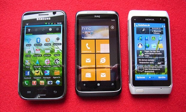
A good example is when user change his smartphone. If he was addicted to Symbian and later went on to Android, the first couple hours may seem a bit hard, but that he understands that it’s not that hard to deal with new OS, since Android is one of the most “intuitive” operating systems. Here is where mental model enters the arena.
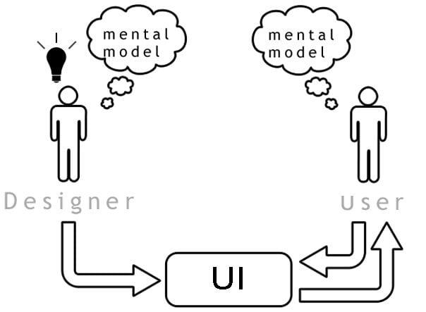
In UI design mental model is a representation of something (real world, device, software etc.) that user has on mind. Mental model is a reflection of the reality. One creates mental model very quickly even before user faces the UI. Mental model is formed from the previous experience with similar UIs, assumptions they have, things they’ve heard others say, videos watched on YouTube, and also from their direct experience with the product or device (if they had it). Users refer to mental models to predict what the system, software, or product is going to do, or what they should do with it.
To understand why mental models are so important when designing UIs we need to understand what’s a conceptual model. This is an actual model that is given to the user through the interface of the product. Going back to the Android/Symbian example, you have a mental model about what Android OS is since you definitely have a friend and even one who has a ‘Droid OS powered smartphone, and you understand how it will work and, what you can do with it. But when you sit down with a Galaxy, the “system” will display what the conceptual model of the smartphone actually is. There will be screens, and buttons, and things that happen. The actual interface is representing the conceptual model. Someone designed a user interface and that interface is communicating to you the conceptual model of the product.
Here is the right moment to say: “Why do I need to care about these models?!” And here are the reasons why you should. Everything you face in the sphere of interfaces deals with “matching” and “mismatching” between user’s mental models and the conceptual model of an interface.
Some examples to clear up the ideas presented above:
- When user’s mental model does not match the conceptual model of the design, user will get puzzled over the interface;
- During the designing process user’s mental model was not taken into consideration this will result into the user’s misunderstanding;
- When multiple user group is using the interface is designed for a specific conceptual model users with another model may find interface pretty hard to comprehend;
- If the conceptual model was not really designed, then the conceptual model will not match the user’s mental model, and users will find the device hard to learn and use.
- Sometimes you know that the mental model of one or more user groups will not fit the conceptual model, and you want to change the user’s mental model so that it matches the conceptual model you have designed.
We would like to provide you a minimal set of guidelines for designing the UIs for devices with the view to ease as much as possible for users the understanding of all primary functions and primary information contents of devices.
***
We will start from a very simple rule - the UI has to be simple. To be simple, the types and number of UI elements must be minimal; all UI elements and their combinations must be intuitively understandable for everyday users; and there must be consistency among all UI elements and their combinations. Further, the minimum and intuitiveness guidelines must be applied consistently throughout the UI design.
Minimal
As the number and types of features increases, it is easy for UI designers to increase the number and types of UI elements. The number and types of UI elements must be kept to a minimum. Specifically, the number of symbols, icons, labels, font styles, font sizes, text colors, background colors, modalities, the number of items and depth of the menu hierarchy, etc. should be kept to the minimum. If some redundancy is to be built in, it must be done in very careful consideration of the business requirements. The following explains what it means to minimize various UI elements.
Intuitiveness
All labels, symbols, icons, words, phrases and sentences on many devices and on the menu are often difficult to comprehend intuitively. Sometimes, words, phrases, and sentences that only engineers can understand appear on the menu especially in the “Setup” sub-menu. Users need to consult manuals to be able to operate the devices or navigate the menu. However, sometimes even the menu doesn’t help to figure out the problem, because they are written in non-human-friendly-language.
Consistency
Consistency cuts across all aspects of every UI element. Once a particular symbol is chosen for a particular function, it should be applied consistently throughout the UI. This should certainly be done within a particular device, and preferably also across devices of different types that happen to share the same function.
Principles of Consistency:
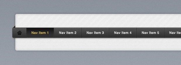
- The menu layout, navigation and selection of menu items should be consistent.
- The selection of the font style, font size, colors, etc. should be consistent.
- The selection of icons, symbols, and labels should be consistent for the same or similar functions.
Appealing to Aesthetics & Emotions
One of the most important dimensions in user interface that refer to user interface elements and appeal to the aesthetics and emotions of the users. These dimensions apply both to the physical and non-physical aspects of the user interface. There are five aspects, corresponding to the five sensory functions of the human. In practice, though, only three aspects are relevant.
Visual aspect:
- Color, brightness, contrast, etc.;
- Shape, size, arrangement of the PUI and NPUI user interface elements;
- Graphics, images, animation, video, symbols, etc.;
- Design and appearance of a device.
***
Once you get across the problem of intuitiveness you need to make serious brainstorming considering whether your ideas will be understood by all users. As always the only thing that will help you is testing, test as often as you can, and the most important thing you need to engage as many people as you can. Because all people perceive interfaces in different ways, somebody may think that it’s easy as a pie, others may think that it’s bloody difficult. Following these four rules you’ll be able to overcome misunderstanding gap and making all users use your UIs with great pleasure.
***
Don’t miss out these all-time favourites
- The best hosting for a WordPress website. Tap our link to get the best price on the market with 82% off. If HostPapa didn’t impress you check out other alternatives.
- Website Installation service - to get your template up and running within just 6 hours without hassle. No minute is wasted and the work is going.
- ONE Membership - to download unlimited number of WordPress themes, plugins, ppt and other products within one license. Since bigger is always better.
- Ready-to-Use Website service is the ultimate solution that includes full template installation & configuration, content integration, implementation of must-have plugins, security features and Extended on-page SEO optimization. A team of developers will do all the work for you.
- Must-Have WordPress Plugins - to get the most essential plugins for your website in one bundle. All plugins will be installed, activated and checked for proper functioning.
- Finest Stock Images for Websites - to create amazing visuals. You’ll get access to Depositphotos.com to choose 15 images with unlimited topic and size selection.
- SSL Certificate Creation service - to get the absolute trust of your website visitors. Comodo Certificate is the most reliable https protocol that ensures users data safety against cyber attacks.
- Website speed optimization service - to increase UX of your site and get a better Google PageSpeed score.
Get more to your email
Subscribe to our newsletter and access exclusive content and offers available only to MonsterPost subscribers.


Leave a Reply
You must be logged in to post a comment.