How to Build a Fully-Responsive Image Slideshow Widget
The idea of mobile responsive web content has been prevalent for a couple of years now. The industry is adapting rapidly as more users are picking up smartphones for the first time. Trends always flow in waves, and we can see this one appearing very quickly. In this tutorial I would like to go over the basics for setting up a responsive photo slideshow.
You may notice these widgets as popular staples for companies, startups, and blog homepages. Sliding photo widgets allow webmasters to display featured content along with caption text and further related links. This is an excellent method for driving more traffic deeper into the website.
I am using the popular jQuery plugin called ResponsiveSlides.js. The plugin is completely open source and you may grab the code off Github. This is my favorite library because it has such a wide range of support for older legacy browsers, and the responsive traits work beautifully even on smartphones. Check out my small demo below to see a live preview in action.
Live Demo - Download Source Code
Setting Up the Document
At first we need to include all of the recommended files out of the repository. Download a copy from Github and grab two of the internal source files responsiveslides.min.js and responsiveslides.css. The former is required to actually build the slideshow, and the latter styles the image box with navigation and caption text.
Many of these CSS styles I have copied over into my own stylesheet. This is certainly possible in your own project, if you'd like to reduce the amount of independent CSS files. Just be sure to not overwrite the properties later in the document. Now along with the 2 plugin documents we also need a copy of the latest jQuery library. I have included the Google CDN copy, but you could download a local version instead.
Before moving into the JavaScript code I want to bridge together what we need in the HTML. The plugin looks for an unordered list element to hold each image object. The slides are then split up and revolve based on your plugin settings. Here is the sample code from my body text.
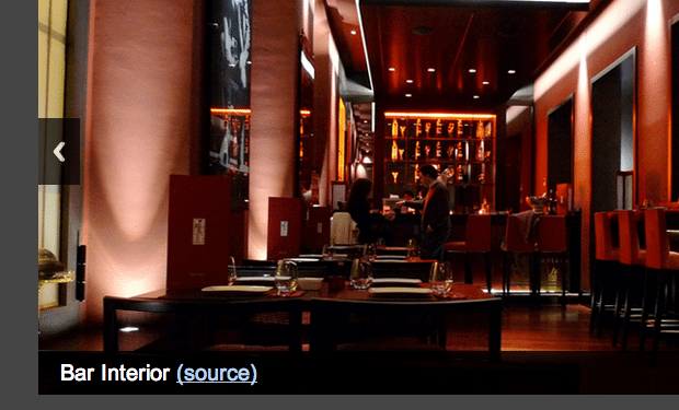
1 2 3 4 5 6 7 8 9 10 11 12 13 14 15 16 17 18 19 20 | <div class="callbacks_container"> <ul class="rslides" id="slider"> <li> <p class="caption">Bar Interior <a href="http://www.flickr.com/photos/55935853@N00/4422772185/" target="_blank" rel="noopener">(source)</a></p> </li> <li> <p class="caption">Preparing dinner in the house<a href="http://www.flickr.com/photos/xmacex/3202147422/" target="_blank" rel="noopener">(source)</a></p> </li> <li> <p class="caption">James Madison mansion<a href="http://www.flickr.com/photos/tizzie/6278887870/" target="_blank" rel="noopener">(source)</a></p> </li> <li> <p class="caption">Some nice leather couches<a href="http://www.flickr.com/photos/quitepeculiar/4396392472/" target="_blank" rel="noopener">(source)</a></p> </li> </ul> </div> |
You could make this a lot simpler by using just the
1 | <strong><img src=""></strong> |
tags instead. I have included the captions because we can set this up inside the jQuery plugin method. Let's jump into that code now.
ResponsiveSlides jQuery Call
To get the widget animating properly we just need to run a single method from the plugin. There are some additional parameters we may include, but starting with the basics is always easier. This is the small code snippet you will find on the ResponsiveSlides.js website.
1 2 3 | $(function() { $(".rslides").responsiveSlides(); }); |
Note they are using the class .rslides for the slideshow container. For my demo page I have updated to use an ID attribute named #slider. This should be updated to any value targeting your specific unordered list element in the page. But to get things a bit messy, let's delve further into some of the parameters you may customize. Please note that you do not need to include every one of these options at the same time. This is merely the full list as pointed out in the documentation page.
1 2 3 4 5 6 7 8 9 10 11 12 13 14 15 16 17 18 | $(".rslides").responsiveSlides({ auto: true, // Boolean: Animate automatically, true or false speed: 500, // Integer: Speed of the transition, in milliseconds timeout: 4000, // Integer: Time between slide transitions, in milliseconds pager: false, // Boolean: Show pager, true or false nav: false, // Boolean: Show navigation, true or false random: false, // Boolean: Randomize the order of the slides, true or false pause: false, // Boolean: Pause on hover, true or false pauseControls: true, // Boolean: Pause when hovering controls, true or false prevText: "Previous", // String: Text for the "previous" button nextText: "Next", // String: Text for the "next" button maxwidth: "", // Integer: Max-width of the slideshow, in pixels navContainer: "", // Selector: Where controls should be appended to, default is after the 'ul' manualControls: "", // Selector: Declare custom pager navigation namespace: "rslides", // String: Change the default namespace used before: function(){}, // Function: Before callback after: function(){} // Function: After callback }); |
The last two parameters are callback functions. These will fire events which happen before and after some type of animation within the widget. You may use this to customize other areas in the page, update links, reorganize content, etc. This is a very active plugin which allows for a great depth and breadth of possibilities.
Some of the more interesting options can be found towards the top of the list. You may adjust the slider speed, timeout, and the style of navigation(if any). ResponsiveSlides has two main styles of navigation using side-arrows for panning left/right, and a bottom toolbar for button-oriented navigation. Both methods are fantastic and work flawlessly on mobile devices.
Putting It All Together
All the code above should work perfectly by default. However you may need to edit some of the CSS properties for things to fit properly along with the rest of your content. Especially true if you have updated the UL item using a newer class name.
1 2 3 4 5 6 7 8 9 10 11 12 13 14 15 16 17 18 19 20 21 22 23 24 25 26 27 28 29 30 31 32 33 | /* slider styles */ .rslides { margin: 0 auto 40px; } .rslides_tabs { list-style: none; padding: 0; background: rgba(0,0,0,.25); box-shadow: 0 0 1px rgba(255,255,255,.3), inset 0 0 5px rgba(0,0,0,1.0); -moz-box-shadow: 0 0 1px rgba(255,255,255,.3), inset 0 0 5px rgba(0,0,0,1.0); -webkit-box-shadow: 0 0 1px rgba(255,255,255,.3), inset 0 0 5px rgba(0,0,0,1.0); font-size: 18px; list-style: none; margin: 0 auto 50px; max-width: 540px; padding: 10px 0; text-align: center; width: 100%; } .rslides_tabs li { display: inline; float: none; margin-right: 1px; } .rslides_tabs a { width: auto; line-height: 20px; padding: 9px 20px; height: auto; background: transparent; display: inline; } .rslides_tabs li:first-child { margin-left: 0; } .rslides_tabs .rslides_here a { background: rgba(255,255,255,.1); color: #fff; font-weight: bold; } |
This is a copy of my CSS styles which are added into the core stylesheet. Of course my demo example is a little plain, so yours may not follow this setup exactly. But the ResponsiveSlides.js website also provides a CSS template for getting started. And while we are looking at the demo codes I have also copied my example JS snippet below:
1 2 3 4 5 6 7 8 9 10 11 12 13 14 15 16 17 | <script type="text/javascript"> $(document).ready(function(){ $("#slider").responsiveSlides({ auto: true, pager: false, nav: true, speed: 450, namespace: "callbacks", before: function () { $('.events').append("<li>before event fired.</li>"); }, after: function () { $('.events').append("<li>after event fired.</li>"); } }); }); </script> |
All-in-all I would highly recommend using ResponsiveSlides.js for any website project. Image sliders are difficult to come across, but web developers have been releasing open source code more frequently than ever before. And this plugin has to offer some of the most important traits which are useful in a variety of layouts. In addition to the Github info page, I have copied over the list of tested & supported web browsers for this amazing plugin.
- Internet Explorer 6,7,8,9
- Firefox 3,6,8,11
- Safari 5,5.1
- Chrome 15,20
- Opera 11,11.6
- iOS Safari
- Symbian 3 Webkit
- Opera Mobile 10.1
- Opera Mini for iOS
- IE7, IE9 Mobile
- Firefox Mobile
- Android 2.3+
Live Demo - Download Source Code
Final Thoughts
I hope this material can be useful to web developers looking to accomplish this task. I know it can be difficult building your own code library from scratch. Sometimes building off already-existing open source solutions is the quickest way to scale your website.
Responsive Slides is an excellent plugin and worth some attention. If you are considering building any web projects which require a responsive design, consider adding these codes into your template. Additionally feel free to grab a copy of my source code which contains our demo page. It's not a very flashy example, but I do provide the bare-bones basic codes needed to get this up and running on your site.

First it was design, then writing, and now affiliate marketing. Over a period of 6-7 years he wrote a lot of content for many websites. You can reach Jake on Twitter.
Get more to your email
Subscribe to our newsletter and access exclusive content and offers available only to MonsterPost subscribers.

Leave a Reply
You must be logged in to post a comment.