Emarketing, Positioning and Social Networks. The Decalogue of Web Design
We've got used to the designs of American and European companies, very sober, corporate, clean and functional, but sometimes lacking a bright variety of colors and design elements.
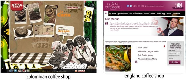
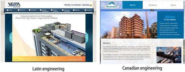
In fact, this form of design is completely respectable and efficient, and it is also a way to honor the traditions of each culture or country. The designs of Spanish-speaking countries are totally different: they are more colorful, full of details and graphics, which are used moderately and responsibly. They are created to make the end-users’ experience more enjoyable.
Columbian Coffee Shop England Coffee Shop
Latin Engineering Canadian Engineering
Of course, a law company website is not the same thing as a kindergarten site. We should always remember about our target visitors.
Another thing to remember is that there are people of flesh and blood behind any website. That will help you ‘humanize’ design. People do not want to talk to robots and machines; they want to interact with a peer. Today the number of human contacts has declined dramatically because of telecommunications and the Internet and that’s why it is important that we redeem the warmth that we can certainly express via color and design.
NOTE: A design can be considered user-friendly not just because of being full of friendly phrases and signs and well written; it is more a matter of color. We should look for an ideal mix of design, functionality and programming, as when you meet a beautiful woman, but then you find out that she has nothing in her head. An ideal website is the one that is beautiful, functional and what is even more – the one that offers friendly and pleasant experience (the same is with women as you know).
The success of any web project, in my humble opinion, is based on these elements and I will call them the decalogue of web design.
1. Dedication to detail: I have always believed that success is in details and in the time you spend to perfect them. Do not put off the improvement of the details. Never say ‘I’ll finish them later’, because your visitors will always find first those details that are unfinished and pending. Usually they do not even notice the elements that cost you days of programming, and it’s absolutely unfair, but they always notice those that lack your attention.
2. A very good use of space and color: as I said at the beginning of this post, people like warm, friendly and funny designs. It is important to follow the tendency of adaptive design for mobile devices, but without sacrificing moving details and animations that give extra color and warmth to your design. I always taught that wherever there is a link, there must be some kind of behavior. There is nothing more boring than a navigation bar that does not change when I mouse over, for example. And there is nothing better than new applications of jQuery and CSS3 to achieve this. I think the era of Flash has come to its end.
3. Functionality above all: we cannot sacrifice this element at the expense of beauty. Your project needs to be functional. Deliver everything your customer may be looking for quickly and efficiently. There is no need to forget about the programming and the databases in order to highlight the graphic design.
4. Social networks: look, social networks are a kind of complement: a page cannot turn around them, quite the opposite, social networks should turn around it, being a kind of addition. It is essential to maintain constant communication with those who visit us and spend their time on writing messages and comments. There are lots of forms to do this: for example, you may occasionally reward them with some kind of discount or simply keep up or follow them. As an example of an excellent management of social networks I’d like to mention our faithful friend TemplateMonster and their famous promo codes for the followers on Facebook. Let’s follow the example of TemplateMonster!
5. Well-defined metadata may guarantee the positioning of your project in search engines. As they say in my country, if something can’t be found in Google – it does not exist. At this point I will not write a lot as it is a topic for another post, entirely independent. It is an art, I would say, to make your website visible via Google without spending a single penny.

IMPORTANT: Do not sacrifice the image of your company by sending mass mailings to mail accounts that are not subscribed to your newsletters and flood the Internet with advertising that very likely will not reach your target customer. It's like paying a boy to hand out flyers offering legal advice next to some circus. Just think – maybe only 2 or 3 out of those 2000 fliers, may reach your potential customers. But what about the other 1997? People will think that both the child and the company he represents are in the wrong place.
7. Deliver timely information of high quality: visitors do not like reading boring and long blocks of text, 80% of our visitors are always in a hurry and count seconds (not minutes!), that’s why the best solution is to provide the information they seek graphically, timely and efficiently. Notice the highlighted word ‘graphically’. And of course there is no need to mention that tipos are just bad form.
8. Do not deceive your customers. Do not pretend that your business is a multibillion-dollar corporation of 100 employees if you are a free-lancer working at home. Provide only truthful information to your visitors, show yourself as you are. You will notice that they will appreciate your honesty and most likely will be interested in the service or product you offer. Many customers prefer local small companies as billion-dollar corporations are interested only in selling. Cheating to sell your services or products is not selling, it's just cheating.
9. Modernization: we cannot spend one and sometimes up to two years, without implementing a design change and improvement of our portal. Trends in design and programming elements improve every day and we cannot stall because of the fear of exploring new technologies and new design proposals, which ultimately will be appreciated by our visitors. There is nothing better than opening a page visited constantly and finding a fully redesigned site that looks much better than two years ago. These are sites that people frequent and revisit and sites that offer more than we expected.
10. The last thing but not the least important is what I like to call ‘something special’. Think of the product you offer, even if it’s an innovative, extraordinary and unique one, most likely someone else is offering it on the other side of the world. If we were sheep, and we would like to enter the yard of the internet, where there are millions of other sheep, we would dye our wool red to stand out from the others. This element is a thing that makes businesses grow. Imagine that you are a customer: can this product or service offer you something that can’t be found elsewhere?

The article was translated from Spanish.
Get more to your email
Subscribe to our newsletter and access exclusive content and offers available only to MonsterPost subscribers.


Leave a Reply
You must be logged in to post a comment.