How to Code a Header Navigation with Centered Logo
Some website layouts will take advantage of a big header and use this to fit a logo design. Generally you can place text above or below banners or logo images. But for specific layouts we can actually design a single header bar with the navigation and logo items side-by-side.
In this tutorial I will demonstrate the CSS and HTML required to build a centered logo header design. The webpage body is fairly bland since we are focusing on the core header. But definitely check out my live demo example to get an idea of what we are trying to build. The best solution is to incorporate transparent PNG images for your logo design, which will provide no background and sits directly in the middle of navigation links.
Live Demo - Download Source Code
Helpful Resources
To begin I want to share a reference to the freebie PSD kit I will be using. This is called the Kitchy UI Kit and it is a free download on Blugraphic. The PSD includes a series of buttons, dropdowns, forms, and other helpful interface features. But more specifically we can find a rounded logo banner which would be perfect in our functional layout.
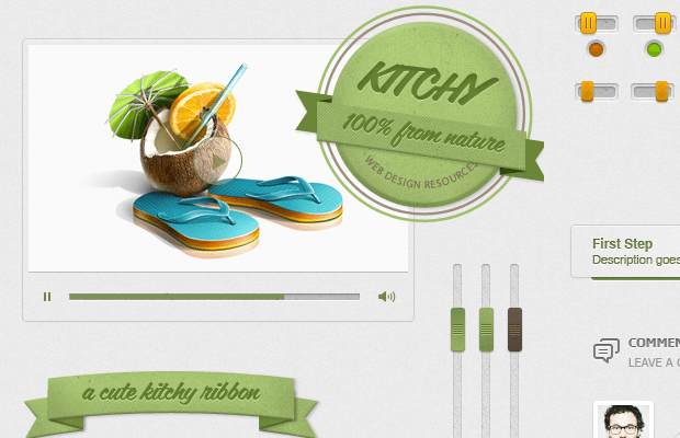
You do not need a full copy of the UI kit since my downloadable source code will have the logo cropped into a PNG. But if you want to check out their full set I definitely recommend it. There are lots of cool free items you may customize and setup with very little understanding of Adobe Photoshop.
Building the Content
We can start in the base file index.html where I have put together the full layout codes. The file is written in HTML5 doctype with a few custom Google Web Fonts.
<meta content="text/html;charset=utf-8">
<meta content="Jake Rocheleau">
<link rel="shortcut icon" href="https://www.templatemonster.com/favicon.ico">
<link rel="icon" href="https://www.templatemonster.com/favicon.ico">
<link rel="stylesheet" href="css/styles.css">
<link rel="stylesheet" href="http://fonts.googleapis.com/css?family=Montserrat+Alternates:400,700">
Also the HTML5shiv document contains JavaScript code to properly render new HTML5 elements in older versions of Internet Explorer. Any browsers running IE8 or earlier may have trouble with elements like header, footer, article, and section. But this is a quick fix and even hosted on Google's servers.
In the actual body we only need a few more containers to house the main heading. I will be using absolute positioning on the logo but using a percentage will allow for a fluid-width design. This is tough though, because you need to determine exact specifications for the navigation links as well.
<div id="w"><header id="top">
<h1><a href="index.html">Kitchy Food & Recipes</a></h1>
<ul id="nav">
<li><a class="sel" href="#">Homepage</a></li>
<li><a href="#">About</a></li>
<li><a class="midsection" href="#">Utensils</a></li>
<li><a href="#">Our Recipes</a></li>
<li><a href="#">Learn to Cook</a></li>
<li><a href="#">Contact Us</a></li>
</ul>
</header></div>Notice how the <h1> header tag actually comes before the full navigation list. This is important for SEO markup where search engine bots will crawl your page to scan for website info. The headings generally appear at higher levels than the regular content, so this pattern is beneficial in keyword rankings. Also the header text will not display on the page, although it will display when being crawled by web bots.
Styling with CSS
The most important part of getting this to work properly is having the right syntax on each item. I want to look over the header section considering this is where a lot of the codes tend to be focused.
#top {
  display: block;
  padding-top: 125px;
  position: relative;
  margin-bottom: 45px;
}

#top h1 a {
  display: block;
  width: 200px;
  height: 176px;
  position: absolute;
  top: 25px;
  left: 320px;
  margin: 0;
  padding: 0;
  z-index: 9999;
  text-indent: -9999px;
  background: url('../images/logo.png') no-repeat;
}

#nav {
  display: block;
  width: 100%;
  list-style: none;
  padding: 0 10px;
  font-family: 'Montserrat Alternates', Helvetica, sans-serif;
}
#top is the very outermost container attached onto the HTML5 <header> element. We need to use relative positioning so this becomes the new container for internal elements with absolute positions. Namely the h1 logo which is specified in the same chunk of code.
We can easily hide the internal text with text-indent: -9999px attaching a negative value. The z-index property will ensure the image always stays on top of the other elements. This includes navigation links, and internal page content which may overlap the header.
#nav li { display: inline; line-height: 1.56em; }

#nav li a {
  display: block;
  float: left;
  font-size: 17px;
  font-weight: 700;
  text-transform: none;
  color: #777c7f;
  text-shadow: 1px 1px 0 rgba(255,255,255,.85);
  text-decoration: none;
  margin-right: 13px;
  padding: 9px 8px;
  -webkit-border-radius: 4px;
  -moz-border-radius: 4px;
  border-radius: 4px;
}
#nav li a:hover {
  color: #64802c;
}
#nav li a.sel {
  color: #64802c;
  background: #d4e1b5;
}
#nav li a.sel:hover {
  border-bottom: 0;
  background: #c0d392;
  color: #566b2b;
}

#nav li a.midsection {
  margin-right: 220px;
}
The actual navigation settings are fairly rudimentary and certainly nothing advanced for a CSS enthusiast. I have attached a .sel class onto anchor links which should be denoted as the currently active webpage. Plus we use the class .midsection to define which link will split the center area and make room for our logo image. Notice how this could be updated in a responsive design if links need to change places.
But explained simply, any fixed website layout can easily implement this same concept by tweaking just a few pixel values. The absolute positioning for the logo is something worth taking into account. Similar to which navigation link will need the midsection class for everything to appear even. But of course you should take a look at my demo codes if the concept is still fuzzy.
Live Demo - Download Source Code
Final Thoughts
I hope this tutorial will prove useful to other frontend web developers. The techniques used in this demo can surely be applied into almost any similar website layout. Additionally the CSS classes are quickly portable into another file, so you may copy and paste my own codes without a struggle. If you have additional questions or comments feel free to share with us in the post discussion area below.
Create a Logo!
Need an attractive logotype for your website, but have no way out? Professional web designers from MotoCMS will help you.
Our team will come up with the best solution for your brand according to your personal requirements. If the logo doesn't sit with your requests, we will redesign it up to 3 times.


First it was design, then writing, and now affiliate marketing. Over a period of 6-7 years he wrote a lot of content for many websites. You can reach Jake on Twitter.
Get more to your email
Subscribe to our newsletter and access exclusive content and offers available only to MonsterPost subscribers.

Leave a Reply
You must be logged in to post a comment.