There have been a lot of articles and full pages of documentation written about the HTML5 fullscreen API. This allows developers to control bits of content and force the page into a fullscreen view. Granted this can only be supported in newer browsers where HTML5 is commonplace. But thankfully that is a majority of the current market, and it is growing rapidly every month.
In this HTML5 fullscreen mode tutorial I want to present a brief demonstration of how we can utilize the fullscreen effects. Typically this will require JavaScript as a means to access the framework. HTML5 can support displaying a webpage element in fullscreen but we need a way to access the API. Since we want to save a bit of development time I will be using the jQuery FullScreen plugin which is a free open source project for accessing the HTML5 fullscreen mode.
Live Demo - Download Source Code
Getting Started
First we need to create a basic HTML5 template for the page. I will be including a copy of the jQuery library hosted on Google's servers. Aside from the typical styles.css stylesheet I linked to a copy of the Autour One webfont, also hosted by Google. Then the last thing we need is a copy of the jQuery FullScreen plugin.
<!doctype html>
<html lang="en-US">
<head>
<meta charset="utf-8">
<meta http-equiv="Content-Type" content="text/html">
Click-to-Expand Paragraphs - Template Monster Demo
<title>Click-to-Expand Paragraphs - Template Monster Demo</title>
<meta name="author" content="Jake Rocheleau">
<link rel="shortcut icon" href="http://static.tmimgcdn.com/img/favicon.ico">
<link rel="icon" href="http://static.tmimgcdn.com/img/favicon.ico">
<link rel="stylesheet" type="text/css" media="all" href="css/styles.css">
<link rel="stylesheet" type="text/css" media="all" href="http://cdnjs.cloudflare.com/ajax/libs/font-awesome/4.1.0/css/font-awesome.min.css">
Unchanged:  <script type="text/javascript" src="js/jquery-1.11.1.min.js"></script>
</head>
You can download the necessary fullscreen JS file off the official Github page. This is updated with bug fixes and updates whenever the developer pushes out a new version. Currently it supports all HTML5-compliant browsers including Chrome, Safari, and Firefox 10+. We just need to add this script into the header along with jQuery and it's good to go.
I will outline some of the common document elements and then show how we can use this plugin to call a fullscreen function on the page wrapper. Similarly there is a callback property for handling a new function call on each screen change event. This means we can update practically anything on the page using the proper logic.
Internal Page Content
Inside the page wrapper div I have added a small button with the ID #fullbtn. This will initially display by itself along with some heading text. Naturally when you click this button an event listener will trigger the fullscreen display. All of this is handled through jQuery, so I have left out any external HREF value so this link will not go anywhere.
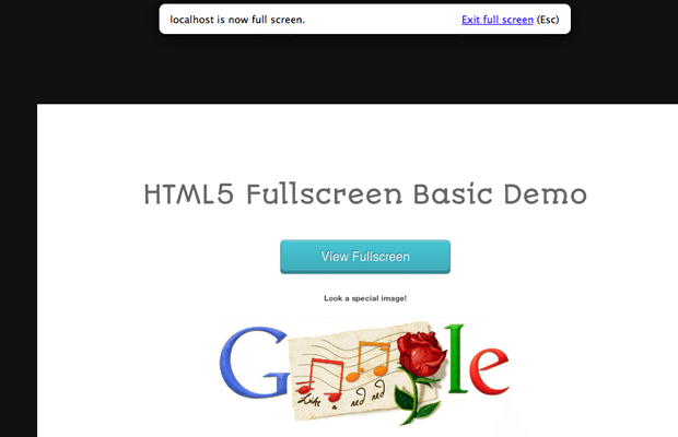
Inside the .onlyfull div we find a bit of text with a container image. This will only become visible after your first time entering fullscreen mode. Then once you exit it will stay visible until the page is refreshed. I want to show how we can manipulate many various page elements to really customize how the fullscreen mode changes vs typical webpage views.
.btn {
	position: relative;
	width:220px;
	height:40px;
	text-align:center;
	color:#FFF;
	text-decoration:none;
	line-height: 43px;
	font-size: 16px;
	font-family: Helvetica, Arial, sans-serif;
	display: block;
	margin: 30px;
	text-shadow:-1px -1px 0 #2C7982;
	background: #3EACBA;
	border:1px solid #379AA4;
	-webkit-border-radius:5px;
	-moz-border-radius:5px;
	border-radius:5px;
	background-image:-webkit-linear-gradient(top, #48C6D4, #3EACBA);
	background-image:-moz-linear-gradient(top, #48C6D4, #3EACBA);
	background-image:-ms-linear-gradient(top, #48C6D4, #3EACBA);
	background-image:-o-linear-gradient(top, #48C6D4, #3EACBA);
	background-image:linear-gradient(top, #48C6D4, #3EACBA);
	-webkit-box-shadow:0 1px 0 rgba(255, 255, 255, .5) inset, 0 -1px 0 rgba(255, 255, 255, .1) inset, 0 4px 0 #338A94, 0 4px 2px rgba(0, 0, 0, .5);
	-moz-box-shadow:0 1px 0 rgba(255, 255, 255, .5) inset, 0 -1px 0 rgba(255, 255, 255, .1) inset, 0 4px 0 #338A94, 0 4px 2px rgba(0, 0, 0, .5);
	box-shadow:0 1px 0 rgba(255, 255, 255, .5) inset, 0 -1px 0 rgba(255, 255, 255, .1) inset, 0 4px 0 #338A94, 0 4px 2px rgba(0, 0, 0, .5);
}
.btn:hover {
	background: #48C6D4;
	background-image:-webkit-linear-gradient(top, #3EACBA, #48C6D4);
	background-image:-moz-linear-gradient(top, #3EACBA, #48C6D4);
	background-image:-ms-linear-gradient(top, #3EACBA, #48C6D4);
	background-image:-o-linear-gradient(top, #3EACBA, #48C6D4);
	background-image:linear-gradient(top, #3EACBA, #48C6D4);
	color: #fff;
}
.btn:before {
	background:#f0f0f0;
	background-image:-webkit-gradient(linear, 0% 0%, 0% 100%, from(#D0D0D0), to(#f0f0f0));

	-webkit-border-radius:5px;
	-moz-border-radius:5px;
	border-radius:5px;

	-webkit-box-shadow:0 1px 2px rgba(0, 0, 0, .5) inset, 0 1px 0 #FFF;
	-moz-box-shadow:0 1px 2px rgba(0, 0, 0, .5) inset, 0 1px 0 #FFF;
	box-shadow:0 1px 2px rgba(0, 0, 0, .5) inset, 0 1px 0 #FFF;
	position: absolute;
	content: "";
	left: -6px; right: -6px;
	top: -6px; bottom: -10px;
	z-index: -1;
}

.btn:active {
	-webkit-box-shadow:0 1px 0 rgba(255, 255, 255, .5) inset, 0 -1px 0 rgba(255, 255, 255, .1) inset;
	top:5px;
}
.btn:active:before{
	top: -11px;
	bottom: -5px;
	content: "";
}
The code above is my snippet for the CSS3 button style. You can find a copy on this CSS Deck project page which also includes the source code. Now aside from these styles everything else is fairly typical. You can overwrite settings based on the .fullScreen class which I have done on the wrapper container. But otherwise everything else can be managed from within JS code.
Working with jQuery
Typically the HTML5 API works by running over normal JavaScript functions. You can naturally start a fullscreen API access call by using the requestFullScreen() method. But this process is verbose, somewhat confusing, and ultimately unnecessary when working on top of a library such as jQuery. The following code is located at the bottom of the page before my closing </body> tag.
$(function(){
  $('#fullbtn').click(function(){
    $('#w').fullScreen({
      'callback': function(fullScreen){
	  $(this).css('background', '#363a3c');
	  $('div.onlyfull').css('display', 'block');
          if ( !fullScreen ) {
	    // when exiting fullscreen set a new BG color
	    $('body').css('background', '#506b9d');
          }
      }
    });
    return false;
  });
});
This block is all fairly easy to understand once you have worked with the plugin for a while. Initially we are placing a click event handler onto #fullbtn which triggers .fullScreen(). This will force all the wrapped page elements into a fullscreen window, then it will apply the extra class .fullScreen onto the wrapper div. In my CSS stylesheet I can update the position of the content section only when in fullscreen mode:
#w.fullScreen  {
  margin-top: 150px;
  padding: 90px 40px;
}
Now the callback parameter can be used any time you run this function. The easiest method is to run another function passing in the fullScreen object. You can see inside I am running the jquery .css() method on a couple page elements. This will force the background to be much darker when in fullscreen while also forcing a hidden image to display.
The logic statement if (!fullScreen) checks against this parameter to see if we are currently in fullscreen or not. If no then I am re-updating the background color to be a darker shade of blue. Realistically this does not provide a lot of usage, however it does offer a blueprint you can follow in any real-world example for a similar detailed callback function.
Live Demo - Download Source Code
Final Thoughts
I do hope this HTML5 fullscreen mode tutorial can demonstrate a solid introduction for developers new to the HTML5 trends. Fullscreen properties are much more useful when concerned with image galleries or video players. Over time we may witness a greater change to these technologies which then allows for more support & newer features. Website user interfaces can start applying fullscreen mode into common editing pages or web applications. Feel free to download a sample copy of my source code and toy with these features in your own projects.

First it was design, then writing, and now affiliate marketing. Over a period of 6-7 years he wrote a lot of content for many websites. You can reach Jake on Twitter.
Get more to your email
Subscribe to our newsletter and access exclusive content and offers available only to MonsterPost subscribers.

Leave a Reply
You must be logged in to post a comment.