How to Make a Responsive Slide-Down Navigation [CSS3 + JavaScript]
There are plenty of CSS3-based responsive navigation menus which are great for general content websites. The only problem is that not all browsers support native CSS3 transition effects.
Using JavaScript as an alternative helps when applying the sliding animation effect onto responsive layouts. But CSS3 media queries are also very important towards the final product.
In this tutorial I want to demonstrate how we can build a very simple responsive navigation using the Responsive Nav script. This is open source and free to use on any project. It also comes along with its own stylesheet for automated customizations. I really like this script because it does not require any dependencies like jQuery, plus the styles are easy to customize and fit into any working layout. Check out my live demo to get an idea of what we are making.

Live Demo - Download Source Code
Getting Started
The first step is to download a copy of Responsive Nav which is linked right on the homepage. You can also download a copy directly from Github if that is easier. Inside this .zip archive you will find a copy of the JS script along with some extra CSS styles.
<!doctype html>
<html lang="en-US">
<head>
  <meta charset="utf-8">
  <meta http-equiv="Content-Type" content="text/html">
  <title>Responsive Slide-Down Navigation Menu</title>
  <meta name="author" content="Jake Rocheleau">
  <link rel="shortcut icon" href="https://images.templatemonster.com/images/favicon.ico">
  <link rel="icon" href="https://images.templatemonster.com/images/favicon.ico">
  <link rel="stylesheet" type="text/css" media="all" href="css/styles.css">
  <link rel="stylesheet" type="text/css" media="all" href="css/responsive-nav.css">
  <script type="text/javascript" src="js/responsive-nav.min.js"></script>
</head>
I setup the internal body content using the recommended ID of #nav. You can change this to anything you like, but it also will not get targeted by the default styles unless you update responsive-nav.css. All of the style declarations target this same nav ID expecting an internal unordered list element.
<div id="nav">
<ul class="clearfix">
<li><a>Homepage</a></li>
</ul>
<ul class="clearfix">
<li><a>About Us</a></li>
</ul>
<ul class="clearfix">
<li><a>Services</a></li>
</ul>
<ul class="clearfix">
<li><a>Blog</a></li>
</ul>
<ul class="clearfix">
<li><a>Contact</a></li>
</ul>
</div>
Since the anchor links are rendered using fluid widths I had to float them all next to each other. In order to keep the outer UL element at a fixed height I've also added the CSS .clearfix class. Now it is worth noting that you can update the internal elements to include sub-menus and more complicated styles like background icons.
However the script itself can only handle the sliding and responsive transitions - you'll need to update the CSS on your own to get everything styled properly. I would recommend building a prototype HTML/CSS version first, and then incorporating the Responsive Nav script.
Designing with CSS
My own custom stylesheet is very basic including a number of resets along with the page formatting. At the top you will find a CSS @import rule for including a remote Google Web Font. This helps to style the page headers and give the layout some uniqueness.
@import url(http://fonts.googleapis.com/css?family=Finger+Paint);

html, body, div, span, applet, object, iframe, h1, h2, h3, h4, h5, h6, p, blockquote, pre, a, abbr, acronym, address, big, cite, code, del, dfn, em, img, ins, kbd, q, s, samp, small, strike, strong, sub, sup, tt, var, b, u, i, center, dl, dt, dd, ol, ul, li, fieldset, form, label, legend, table, caption, tbody, tfoot, thead, tr, th, td, article, aside, canvas, details, embed, figure, figcaption, footer, header, hgroup, menu, nav, output, ruby, section, summary, time, mark, audio, video {
  margin: 0;
  padding: 0;
  border: 0;
  font-size: 100%;
  font: inherit;
  vertical-align: baseline;
  outline: none;
  -webkit-font-smoothing: antialiased;
  -webkit-text-size-adjust: 100%;
  -ms-text-size-adjust: 100%;
  -webkit-box-sizing: border-box;
  -moz-box-sizing: border-box;
  box-sizing: border-box;
}
html { overflow-y: scroll; }
body {
  font-family: 'Helvetica Neue', Helvetica, Arial, sans-serif;
  font-size: 62.5%;
  line-height: 1;
  padding: 0 14px;
  padding-bottom: 30px;
  background: #3d3d3d url('irongrip.png'); /* http://subtlepatterns.com/iron-grip/ */
}

br { display: block; line-height: 1.6em; }

article, aside, details, figcaption, figure, footer, header, hgroup, menu, nav, section { display: block; }
ol, ul { list-style: none; }

h1 {
  font-family: 'Finger Paint', Helvetica, sans-serif;
  font-size: 3.0em;
  line-height: 1.6em;
  color: #565656;
  margin-bottom: 10px;
}
h2 {
  font-family: 'Finger Paint', Helvetica, sans-serif;
  font-size: 2.4em;
  line-height: 1.5em;
  color: #777;
  margin-bottom: 10px;
}
Of course, the script does not support exactly how I want the navigation to look so I've written a number of extra styles. These target the navigation when it is rendered in full, and when in a responsive mode. Plus there is a small open/close menu link which appears after turning responsive. This element uses the ID #nav-toggle which I have also re-styled.
/* page content */
#w {
  display: block;
  min-width: 260px;
  max-width: 800px;
  margin: 0 auto;
  background: #fff;
  height:550px;
}

#content { padding: 0 15px; }

#nav {
  display: block;
  margin-bottom: 10px;
}

#nav-toggle {
  font-size: 1.2em;
  font-weight: bold;
  padding: 3px 9px;
  margin-left: 15px;
  text-decoration: none;
  -webkit-border-radius: 3px;
  -moz-border-radius: 3px;
  border-radius: 3px;
  color: #fefefe;
  background: #4c7ab6;
  margin-bottom: 15px;
}

#nav ul { list-style: none; }
#nav ul li { }

#nav ul li a {
  display: block;
  padding: 10px 9px;
  width: 100%;
  font-size: 1.5em;
  font-weight: normal;
  background: #4c76ae;
  color: #cad7ea;
  text-decoration: none;
}
#nav ul li a:hover {
  background: #6588b6;
}

@media screen and (min-width: 600px) {
  #nav ul li a {
    display: block;
    float: left;
    width: auto;
    background: none;
    padding: 11px 15px;
    font-size: 1.55em;
    font-weight: normal;
    text-decoration: none;
    color: #444;
  }

  #nav ul li a:hover {
    background: #4c76ae;
    color: #cad7ea;
  }

  h1 { font-size: 4.1em; line-height: 2.0em; }
}
Another interesting piece in the script's CSS file is all the default code obtained from the Responsive Nav repository. This includes typical resets for margin/padding on the navigation, plus a fitted width of 100%. Granted when the navigation pulls down into responsive mode this is exactly how the menu should appear.
#nav ul {
  margin: 0;
  padding: 0;
  width: 100%;
  display: block;
  list-style: none;
}

#nav li {
  width: 100%;
  display: block;
}

.js #nav {
  clip: rect(0 0 0 0);
  max-height: 0;
  position: absolute;
  display: block;
  overflow: hidden;
  zoom: 1;
}

#nav.opened {
  max-height: 9999px;
}

@media screen and (min-width: 40em) {
  .js #nav {
    position: relative;
  }
  .js #nav.closed {
    max-height: none;
  }
  #nav-toggle {
    display: none;
  }
}
If you notice the media query at the bottom of this file it is checking when the screen width is larger than the typical responsive cutoff point. If so, then we do not need to see the toggle menu link and it is hidden using display: none. Overwriting these styles in your own code is not a long process. Especially if you already have a wireframe/mockup coded. But there are also beneficial codes in this default stylesheet which are worth copying over into your own, or merely including as a separate file.
Initiate with JavaScript
If you are a developer interested in this script I would recommend reading over the usage instructions, if you have the time. There are a number of custom options which I have not included here, to keep the tutorial light and focused. But these function parameters may be passed in as key:value pairs within the function call itself. Let's take a look at my example first.
var navigation = responsiveNav("#nav");You can find this code at the very bottom of my index.html page. This will initiate the script running on the #nav element. Now you can obviously change this value to be anything. All you need to remember is running your own default styles both responsive and full-view.
Since we are looking at the JS codes it is worth glancing over the default example using parameter options. There are really only 2 function parameters - the ID along with an object array of the different options. You may choose none of them or any number but there are no required options. Here is a copy of the sample code from the official homepage:
var navigation = responsiveNav("#nav", { // Selector: The ID of the wrapper
  animate: true, // Boolean: Use CSS3 transitions, true or false
  transition: 400, // Integer: Speed of the transition, in milliseconds
  label: "Menu", // String: Label for the navigation toggle
  insert: "after", // String: Insert the toggle before or after the navigation
  customToggle: "", // Selector: Specify the ID of a custom toggle
  openPos: "relative", // String: Position of the opened nav, relative or static
  jsClass: "js", // String: 'JS enabled' class which is added to el
  init: function(){}, // Function: Init callback
  open: function(){}, // Function: Open callback
  close: function(){} // Function: Close callback
});
The final three options are callback functions which trigger after the navigation has initiated, or been opened/closed by the user. This is a great place to write your own codes for animations or updates on the page. These options are ideal for advanced frontend developers who need to expand JS functionality. But digging into a script and getting your hands dirty is also the best way to learn.
Live Demo - Download Source Code
Zemez Responsive Navbar JavaScript
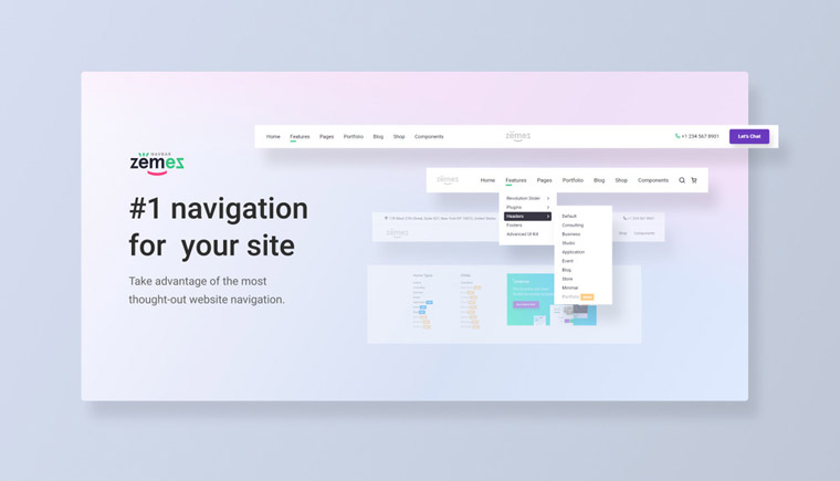
People come to the site to get information, not to spend time figuring out the features of its navigation and structure. From the usability point of view, good navigation is clarity, ease of use, and minimal sense of frustration. Stop your choice on Navbar JavaScript by Zemez to make sure you have #1 navigation for your website.
Zemez Navbar JavaScript offers full customization and 100% responsiveness on all popular devices. You will be able to express your creativity with 8 different layouts. Dropdowns and megamenus are available in 2 color schemes - dark and light ones. Zemez responsive Navbar Script works without issues and does not require any specific skills.
More features:
- Flexbox-based
- Single code for all devices
- SASS
- jQuery 1.11+/jQuery Easing 1.1+ are required
- 24/7 support
Final Thoughts
I do hope this tutorial can help some developers who are struggling with their own responsive navigation. The use of media queries is easy enough to understand, but how do you go about creating a natural sliding effect? There are still many other ways to handle this problem but Responsive Nav is small & efficient enough for the task. Additionally if you have any questions or ideas on the script feel free to share with us in the post discussion area.

First it was design, then writing, and now affiliate marketing. Over a period of 6-7 years he wrote a lot of content for many websites. You can reach Jake on Twitter.
Get more to your email
Subscribe to our newsletter and access exclusive content and offers available only to MonsterPost subscribers.

Leave a Reply
You must be logged in to post a comment.