Understanding Minimalist Design: A Misconstrued Term
The term minimalism is used to describe a trend in design and architecture wherein the subject is reduced to bare essential and necessary elements. It is not a new phenomenon with its roots tracing back to the post–World War II.
Architect Ludwig Mies van der Rohe adopted the expression "Less is more" to describe aesthetic tactic of arranging the numerous necessary components of a building to create an impression of extreme simplicity to serve multiple visual and functional purposes.
Well, the gen-next web designers have embraced the concept of minimalism and this design movement seems to be getting stronger and stronger in the modern era with every passing day. However, before you jump on the minimalist bandwagon, it is important to understand that less in not always better.
Minimalism in Web Design: What is the Buzz About?
The sudden rise in minimalist web design has resulted in reckless use of the term. Designers are carelessly throwing around the term and coming up with black and white websites devoid of content. Is this what minimalism is all about? Certainly not. Mindless chopping of content and functionality in the name of simplicity is certainly not the answer.
Minimal web design usually means faster load times and enhanced front-end web performance. This is mainly due to the fact that a minimal web design need less HTML elements, CSS rules, and images. However, fewer codes does not necessarily mean minimalism is easier compared to other form of designing. Minimalism requires equal amount of efforts like any other type of web design. In fact, it may require more effort and thought from the designer.
Before you get started with minimalist design clearly define objective of your website and your goals. This will eliminate confusion from the word go. By defining a purpose early on, you will be keep your design on track. Remember, any element that you add should strengthen your site's existence and should not weaken or distract users from the site.
Here are Some Common Misconceptions About Minimalism
- It is all about black and white:
Black and white as a color palette is a thing of past. Don't be afraid to experiment with colors and embrace the power of vibrant images. Select colors that best represent your brand. Remember everything needs to be in sync with your brand. However, avoid overuse of colors as it defeats the core purpose of simplicity and adds elements of distraction.
- You can toss usability for the sake of minimalism:
Do you recollect what the great Steve Jobs once said “Design is not just what it looks like and feels like. Design is how it works.” Designers simply can't afford to risk usability in the name of minimalism. Your site should be easy to use because minimalism puts equal emphasis on both look and functionality. It is not limited to white space and typography, but also considers navigation and content accessibility. Your design should not appear as incoherent site with skeleton information and almost unusable elements on an empty page. You are very likely to confuse and scare the user away. While you are experimenting with new styles, don't take the fundamentals of usability for a ride.
- It works for everyone:
Certainly not. Remember that you need to assess your business goals and target audience before you embark on minimalist design. This approach certainly won't work for sites that heavily rely on advertising. Some industries simply need to display every bit of information about their business and services offered to clients in order to win their trust. In such cases, minimal layout may come down as a basic site/company lacking advance features.
- Minimalism adds mystery:
Many designers consider minimalism as a tool to add mystery to the brand and heighten curiosity and interest level among visitors. But beware, minimalism is not about creating confusion or chaos. In fact, minimalism embraces clarity and usability. Avoid ambiguity and arbitrary designing as there are many effective ways to increase interest level in your brand.
Your ultimate goal in employing minimalist designs should be to improve readability, ensure seamless navigation and usability, improve brand awareness, and create best user experience possible.
Minimalist Website Design Best Practices
Open space rules all the way. Many designers confuse minimalism with white space. It does not have to be white always. Key elements for effective minimalist design is effective use of open space irrespective of the color and a lack of clutter in your design. Clutter often acts as a major source of distraction for visitors giving them a tough time to focus on the most important parts of a page. Open space makes the contents of the page easier to scan and decipher.
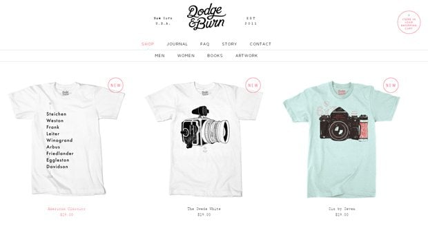
#1 It is hard to imagine an ecommerce site would embrace minimalism to such a perfection. Look at the impressive use of open space giving the site breathe of fresh air.
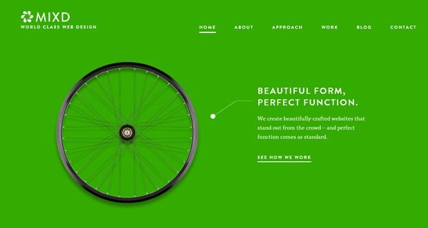
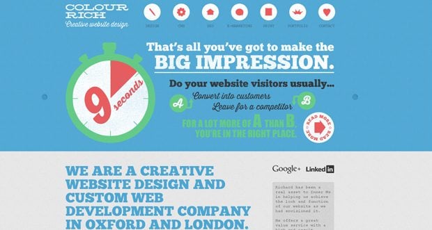
#2 Minimalist website of Mixd defies the black and white only phenomena and makes elegant use of vibrant colors. Note how colors infuse interactivity into the website ultimately attracting eyeballs and keeping users engaged.
* * *
Background images. Minimal web design rarely use background images such as patterns or textures. Solid backgrounds compliment vibrant content whereas plain colors easily guide the readers and make content easy to scan.
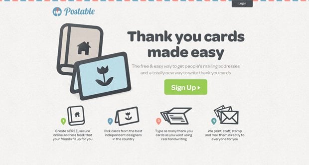
Postable effectively uses textured background and colors to fill whitespace in a subtle manner. This perfect amalgamation of colors, style, textured background holds the interest of users and keeps them glued to the site.
* * *
Effective typography. Creating an appealing website with few images could be a challenging task for website designer. Effective use of typography can help overcome this roadblock as typography compensates for the missing benefits of images. Careful and strategic selection of font size, color, and style could accentuate the importance and draw user's attention towards content making other areas less conspicuous.
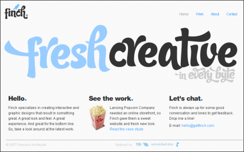
This example is floating all over the internet. I believe this is one of the best examples of how typography can accentuate content. Effective use of unique fonts makes design look lot more interesting and appealing.
Seamless integration of form and content. Minimalism needs a perfect balance between a form and text. Remember, in minimalist website design, both have a big role to play and one can't be sacrificed for another, rather images used and the text should qualify each other.
* * *
Don't try too hard. Minimalism begins with clarity of purpose and your design should translate to your brand message also. But what happens if you try too hard to impress your users? You are likely to commit mistakes and ultimately alienate your customers. Once you solely focus on design elements, its relevance to the overall purpose and the user experience everything else will fall in place.

* * *
Wrapping up. If you are planning to opt for a minimal web design just for the look and feel or because it is considered cool by experts, you are on the wrong side. Minimalism aims at reducing elements that create clutter. Not only will it make intelligent use of open space and striking typography, it will also consider navigation and content accessibility.
Don’t miss out these all-time favourites
- The best hosting for a WordPress website. Tap our link to get the best price on the market with 82% off. If HostPapa didn’t impress you check out other alternatives.
- Website Installation service - to get your template up and running within just 6 hours without hassle. No minute is wasted and the work is going.
- ONE Membership - to download unlimited number of WordPress themes, plugins, ppt and other products within one license. Since bigger is always better.
- Ready-to-Use Website service is the ultimate solution that includes full template installation & configuration, content integration, implementation of must-have plugins, security features and Extended on-page SEO optimization. A team of developers will do all the work for you.
- Must-Have WordPress Plugins - to get the most essential plugins for your website in one bundle. All plugins will be installed, activated and checked for proper functioning.
- Finest Stock Images for Websites - to create amazing visuals. You’ll get access to Depositphotos.com to choose 15 images with unlimited topic and size selection.
- SSL Certificate Creation service - to get the absolute trust of your website visitors. Comodo Certificate is the most reliable https protocol that ensures users data safety against cyber attacks.
- Website speed optimization service - to increase UX of your site and get a better Google PageSpeed score.

A creative writer with a deep-rooted passion for both mobile and web technologies. You may follow Sebastian on LinkedIn.
Get more to your email
Subscribe to our newsletter and access exclusive content and offers available only to MonsterPost subscribers.

Leave a Reply
You must be logged in to post a comment.