Designing Home Page Layout. Photoshop Tutorial
This is the first of a two-part series on designing a home page layout. Here you will learn how to make not just a design element, but a whole website design. This will be a kind of experiment, or a challenge if you like. The tutorial will be useful for Photoshop starters, especially if you're just trying to comprehend Photoshop. I am sure you will do your best. I have therefore divided the tutorial into two parts as there is a whole bunch of descriptions and screenshots. Part 2 will describe the finale steps.
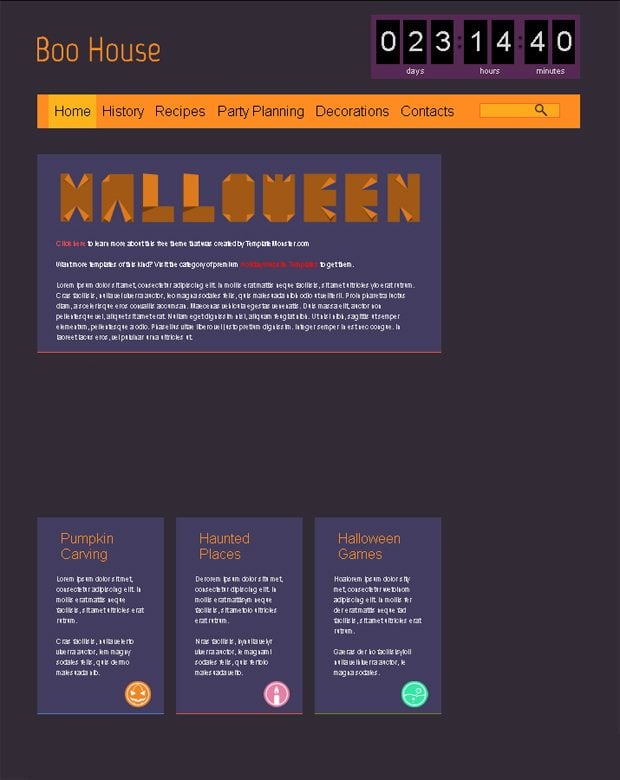
So... We are going to celebrate Halloween in a short period of time, and you have probably seen our Free HTML5 Theme shared this Monday. If you want to know how we created it, just follow the following steps to discover how the template was designed.
Start your engines, gentlemen, and let's rove.
Step 1. First of all we need to create a new document. Our Halloween Homepage layout has following size: 1600x1322px. Now choose the color #322b36 and fill in the background.

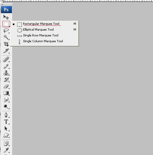
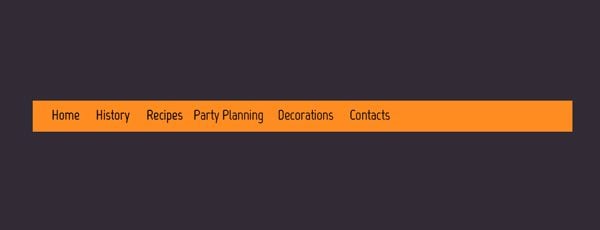
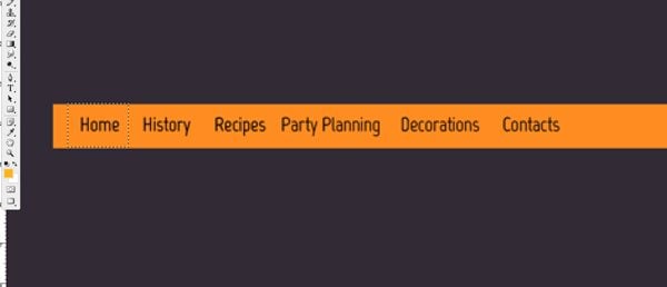
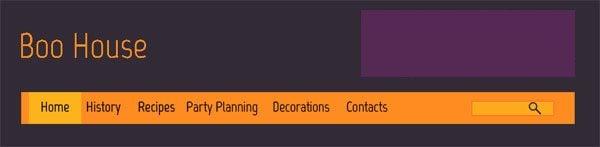
Step 2. Our design is flat. This means there will be no over-complicated elements. Flat design combines simplicity and ability to please everyone with attractive solutions. You will see it for yourself right now. Create a new layer Shift+CTRL+N, choose Rectangular Marquee Tool and draw your top horizontal bar navigation. Fill it with the color #fe8c21 (ALT+Backspace).
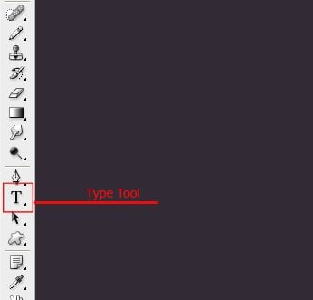
Step 3. Give names to your navigation buttons using the Type Tool and Marvel Font. Color #000000. Marvel Font: regular, sharp, 24pt.

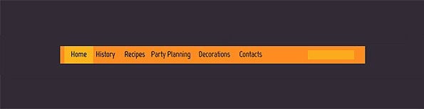
Step 4. Now we need to show the highlight which indicates active menu button. Required actions will be similar to those we've already done in the Step 2. Create a new layer, choose Rectangular Marquee Tool and draw the button. Fill it with the color #fcb31b (ALT+Backspace).
Step 5. Now you can also draw the search option (the same principle and in the previous step and also the same color #fcb31b). But this time I offer you to change your opacity, so it will be a bit more restricted. Make the opacity 79%.
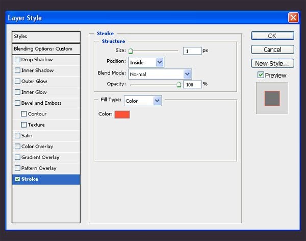
Step 6. Right-click the layer with your search bar and choose Blending Options. We need to add stroke, color #ff5136. Add following parameters:
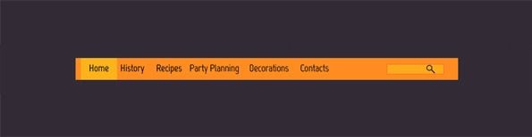
Step 7. Add Magnifier Custom Shape which you can find here. You will get following result:
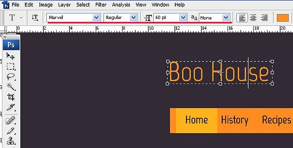
Step 8. Let’s finish our Header. Just write “Boo House” with the color #fe8c21 using the Type Tool. Font Marvel: regular, none, 60pt.
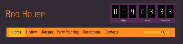
Step 9. And now create the square block where you will place your Countdown. Create a new layer, use Rectangular Marquee Tool, color #8a2680, opacity 41%.
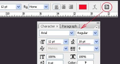
Step 10. The words: days, hours, minutes are written with the Arial Font: 14pt, sharp, color #d5d5d5.
Step 11. The jQuery Countdown Timer you can download it here.
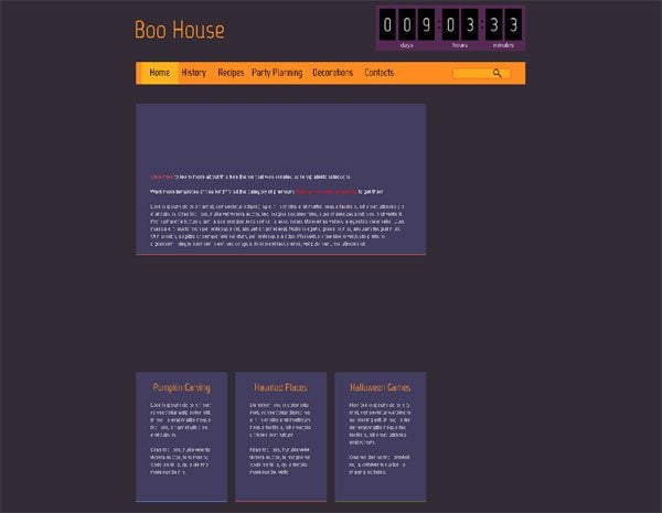
You are welcome to download it for free. That is the result we have at the moment:
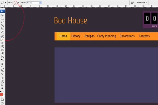
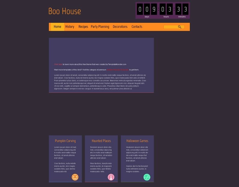
Step 12. It is the very time to start the content part creation. We will do it again by means of Rectangular Marquee Tool. Draw the section you suppose to use for the text representation. Create a new layer and fill it with the color #423d60.
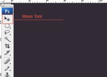
Step 13. Now we are to create a new layer. Take the Pencil Tool, set the size to, 1px and draw the line with the color #e85441. If you need to put the line upper or lower you can do this with the Move Tool. That is the reason I advise you to draw the line on another layer, so you can place it wherever you like.
Step 14. Naturally content text is written with Arial Font. I did this with this font color #d5d5d5, none, 12pt. The most meaningful textual parts can be highlighted with another color.
Step 15. Now I propose you to design three blocks. The design principle is the same. Lines are done with the use of the following colors #e85441, 5b93f2, 738a17. The main text is written with Arial Font: 14pt, sharp, color #d5d5d5. Headlines are written with Marvel size 24, regular, sharp, color #fe8c21.
Step 16. Several nice Halloween icons are waiting for you here. Download them and add to the Halloween blogs we have just created. Press CTRL+T and modify their size.
Step 17. Now you need to download the font Typogami we are going to use it for the word Halloween.
* * *
This is the first of a two-part series. I do hope the steps were easy to follow. Next week we are going to continue our Photoshop tutorial. Take care and stay tuned!
Layout is an essential part of any well-structures and semantically-rich website. In HTML, layouts are built by means of <table> tag. Tables are made up of columns and rows, which can be organized in literally any way one needs. The process of creating a website layout suggests the activity of placing various design elements on a web page in a way that everything looks appealing and feels easy-to-follow. Most of the websites available on the Internet feature structures that are similar to the way magazines and newspapers are structured. The most popular tags used in HTML layouts include, <table>, <div> and <span>, which are modified by means of styles.
The most common layout structure of the majority of contemporary websites and blogs is the one featuring a header, footer, navigation bar, sidebar, and the main content area.
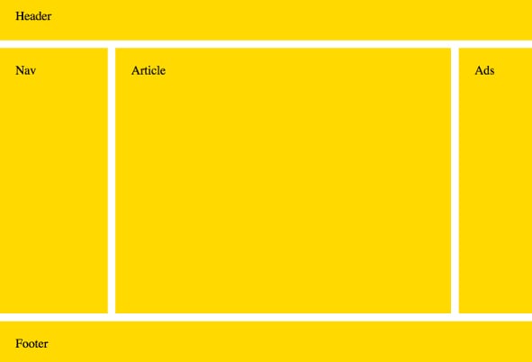
Each of these areas is set to be defined by a separate element:
-
-
<header> to present the header of a document/section; -
<article> for an article; - <summary> to define summary for the details element.
-
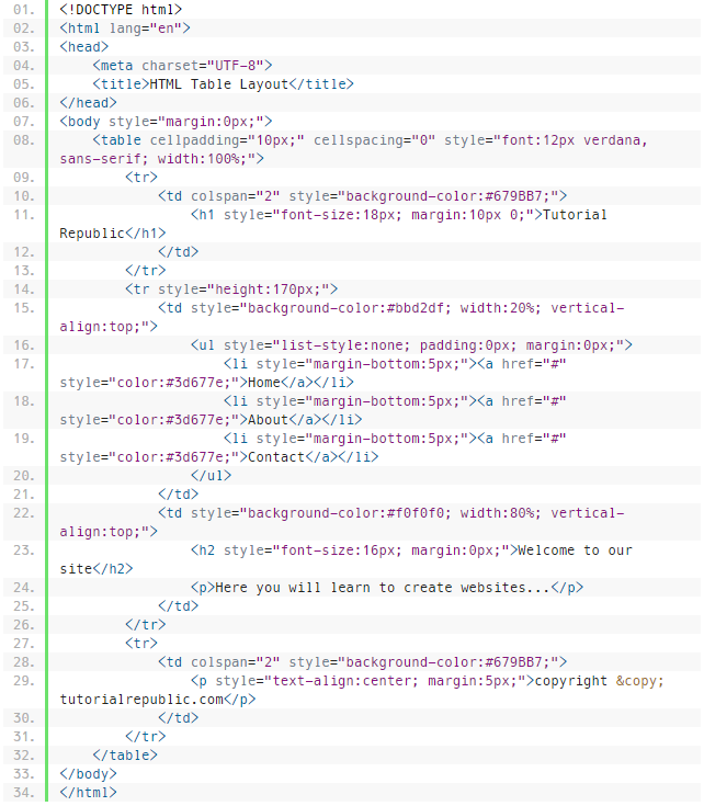
HTML Layout Using Tables
As said earlier, tables are the most widespread and simplest ways to create layouts in HTML. This involves the process of arranging all content from the page into rows and columns. Consider the following example of a layout with 3 rows and 2 columns:
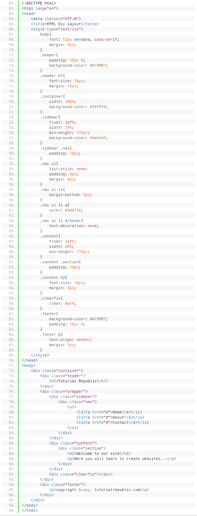
HTML Layout Using Div & Span
In HTML, <div> element is applied to mark out a block of content within a web page. It can further contain other div elements, however, it cannot be part of an inline element.
The <span> element, in its turn, is used to mark out sections within other inline elements.
The following example, you can see how to create multiple column layout with <div>:
Responsive Layout
There is a growing tendency of the web users accessing the web content from their handheld devices. With the intention to make every piece of data provided on a web page adjust to all screen sizes automatically, webmasters opt for responsive layouts. These suggest that that one and the same version of a website will look differently on the screens of tablets and smartphones, when opposed to the default PC version.
The HTML layout can be modified depending on the screen it's being viewed on. To achieve this, add a media query to test for the screen size. If the screen size is smaller than a specified width, this is the signal that a new layout should be displayed.
Related terms: HTML, browser, CMS.
References:

Ivy is a creative writer and experienced web designer at TemplateMonster. You can find a lot of awesome templates in the TemplateMonster inventory. Follow her latest updates on Twitter.
Get more to your email
Subscribe to our newsletter and access exclusive content and offers available only to MonsterPost subscribers.

Leave a Reply
You must be logged in to post a comment.