Implement a Dynamic Animated Slider Using Glide.js
Most web developers should be familiar with the concept of rotating slideshows. These are prominently found at the top of a website just underneath the header. Slides might include text, videos, images, or a mixture of these elements. The goal is to capture people's interest and draw them further into the site.
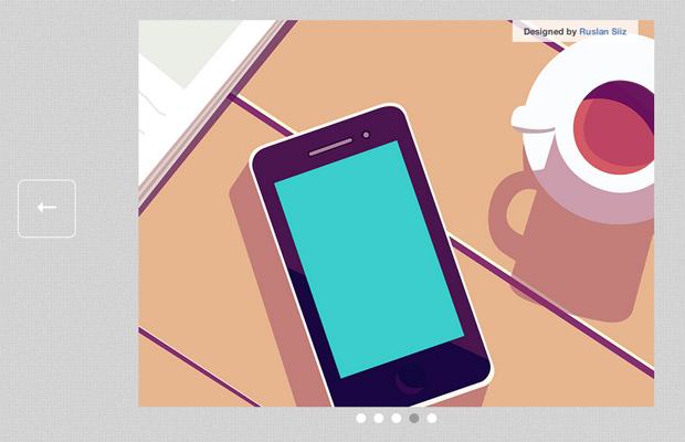
For this tutorial I want to look at building a simple version of these rotating sliders. Glide.js is open source, responsive, and perfect for any layout. You have the ability to customize colors and UI elements within the slider. It also provides a number of jQuery options for manipulating the user interface. Take a peek at my live sample demo below.
Live Demo - Download Source Code
Getting Started
The first step is to download a local copy of Glide.js directly from Github. I copied over jquery.glide.min.js into a /js/ folder. You'll also want to download a local copy of jQuery and store this in the same folder.
<!doctype html>
<html lang="en-US">
<head>
  <meta charset="utf-8">
  <meta http-equiv="Content-Type" content="text/html">
  <title>Glide.js Content Slider Demo - Template Monster</title>
  <meta name="author" content="Jake Rocheleau">
  <meta name="viewport" content="width=device-width,initial-scale=1.0,user-scalable=no">
  <link rel="shortcut icon" href="https://www.templatemonster.com/favicon.ico">
  <link rel="icon" href="https://www.templatemonster.com/favicon.ico">
  <link rel="stylesheet" type="text/css" media="all" href="css/styles.css">
  <script type="text/javascript" src="js/jquery-1.10.2.min.js"></script>
  <script type="text/javascript" src="js/jquery.glide.min.js"></script>
</head>
I've created my own styles.css stylesheet to restyle the whole page. Glide.js comes with its own stylesheet and I copied those over into my new file. This way everything is consolidated together and much easier to edit. Since the plugin is responsive I've also setup the meta viewport tag for handling tablets and smartphones.
Glide is really easy to setup in the basic sense. You will need to redefine some of the CSS styles before moving onto anything else. But first let's take a glance over my page structure.
HTML Elements
This plugin works by attaching onto a container element which holds an internal unordered list of items. Each list item behaves as a new slide in the slideshow. Here is a sample bit of code from the Github documentation:
<div class="slider">
<ul class="slides">
<li class="slide"></li>
<li class="slide"></li>
<li class="slide"></li>
</ul>
</div>
I kept most of these same class names to simplify the process. But you could rearrange things to use specific ID names, or even different classes running different options. Most websites do not need more than 1 or 2 of these sliders and that's why using an ID on the container might be a better solution.
Designed by Adam Record
My tutorial breaks this down a bit more including entire image figures within each list item. The figure element contains an image along with a figcaption to provide the original source link. This container is required so everything inside the list item can be centered, without displacing the scrolling arrows on each side.
Updated CSS Styles
My redefined CSS code has been touched up in order to provide a better solution for newcomers. The class names are all default but could easily be changed if needed, so please keep this in mind when porting codes to your own website.
.slider {
  position: relative;
  width: 100%;
  height: 500px;
  overflow: hidden;
}

.slides {
  height: 100%;
  overflow: hidden;
  /**
   * Prevent blinking issue
   * Not tested. Experimental.
   */
  -webkit-backface-visibility: hidden;
  -webkit-transform-style: preserve-3d;

   -webkit-transition: all 500ms cubic-bezier(0.165, 0.840, 0.440, 1.000);
   -moz-transition: all 500ms cubic-bezier(0.165, 0.840, 0.440, 1.000);
   -ms-transition: all 500ms cubic-bezier(0.165, 0.840, 0.440, 1.000);
   -o-transition: all 500ms cubic-bezier(0.165, 0.840, 0.440, 1.000);
   transition: all 500ms cubic-bezier(0.165, 0.840, 0.440, 1.000);
}
Using width:100% allows for a responsive nature while keeping a fixed height in place. You can change this number to be either larger or smaller - it should fit exactly into your layout. All of the CSS3 transitions should be left in place as these are used by Glide.js between each slide.
.slide {
  height: 100%;
  float: left;
  clear: none;
}
.slide figure {
  display: block;
  position: relative;
  text-align: center;
}
.slide figure figcaption {
  position: absolute;
  right: 20%;
  font-size: 1.1em;
  font-weight: bold;
  padding: 8px 14px;
  color: #464646;
  background: rgba(255,255,255,0.8);
}
.slide figure figcaption a {
  color: #5a7fbc;
  text-decoration: none;
}
.slide figure figcaption a:hover { text-decoration: underline; }

.slide figure img {
  max-height: 480px;
}
These styles were manually added to contain the image and the caption label. The outer figure element is positioned relatively to allow for absolute positioning of the label. Percentages are the best solution when using a mobile-responsive plugin so everything works as best as possible.
.slider-arrows {}
.slider-arrow {
position: absolute;
display: block;
margin-bottom: -20px;
padding: 20px;
font-family: 'Alegreya Sans', 'Trebuchet MS', sans-serif;
text-decoration: none;
font-weight: 900;
font-size: 3.0em;
color: #fff;
border: 1px solid #fff;
border-radius: 8px;
-webkit-transition: all 0.2s linear;
-moz-transition: all 0.2s linear;
transition: all 0.2s linear;
}
.slider-arrow:hover {
background: #ddd;
color: #aaa;
}
.slider-arrow--right { bottom: 50%; right: 30px; }
.slider-arrow--left { bottom: 50%; left: 30px; }
.slider-nav {
position: absolute;
bottom: 0px;
}
.slider-nav__item {
width: 12px;
height: 12px;
float: left;
clear: none;
display: block;
margin: 0 5px;
background: #fff;
-webkit-border-radius: 7px;
-moz-border-radius: 7px;
border-radius: 7px;
}
.slider-nav__item:hover { background: #bababa; }
.slider-nav__item--current, .slider-nav__item--current:hover { background: #999; }
The left/right arrows you notice on the side can be updated using jQuery. These styles are built around the default classes assuming you don't care to override them. It's probably best that you don't unless you've already structured the design using other class names.
These ideas are also true of the bottom slide nav link buttons. For each list item Glide.js will append one new dot which behaves like an index. We have the ability to customize the hover/active states along with the currently-selected nav item.
Activating Glide.js
If we have the plugin and jQuery included within the document, all that's left is to initialize. It could literally be as simple as $('.slider').glide(), but this uses all the defaults. I'm going for a bit more customization than that. Glide.js has a big list of plugin options which you can read at the Github documentation.
$('.slider').glide({
    autoplay: 3500,
    hoverpause: true, // set to false for nonstop rotate
    arrowRightText: '→',
    arrowLeftText: '←'
  });
autoplay can be set to false if you don't want auto-rotating slides. Otherwise the numeric value is defined in milliseconds between each slide transition. hoverpause is another great option which automatically pauses the slider when a user is hovering. If you don't like this feature it's pretty easy to disable.
Also the arrow text defaults to the words "next" and "prev". This looks kind of strange, and so I've changed them to HTML arrow entities. Now they appear on the page sort-of like buttons which are much more user-friendly.
Live Demo - Download Source Code
Closing
There are some other handy slideshow plugins out there, but very few are built in a responsive manner offering so much customization. Likewise the Glide.js core often utilizes CSS3 transition animations which are smoother in modern browsers. I do hope this tutorial can get developers started on the right track. Additionally if you have any questions or suggestions please share with us in the comments below.

First it was design, then writing, and now affiliate marketing. Over a period of 6-7 years he wrote a lot of content for many websites. You can reach Jake on Twitter.
Get more to your email
Subscribe to our newsletter and access exclusive content and offers available only to MonsterPost subscribers.

Leave a Reply
You must be logged in to post a comment.