Beginner’s Guide to the CSS Clip Property
The obscure CSS clip property is rarely used on any website. It gets tacked onto a fixed or absolutely positioned object to show/hide aspects of the element(ie. to "clip" the element). It's been around since older versions of CSS but still isn't used all that often.
I want to demonstrate how to use this property and what the syntax looks like. It does tend to be somewhat confusing and will not always provide a significant purpose on web projects. However as a CSS developer it's good to know how this work in case you get some neat ideas down the road.
Live Demo - Download Source Code
Getting Started
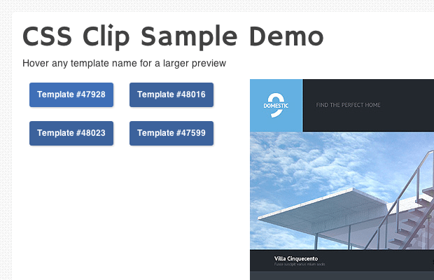
My example just uses an external stylesheet named styles.css along with some image screenshots downloaded from Template Monster. Each link goes out to that template's external page on the website, so this behaves much like a very basic animated gallery. To keep things simple I want to explain how the HTML works in unison with CSS.
The container div #previews is positioned relatively with internal links for the templates. Each link is immediately followed by an image which is positioned absolutely on the page. This is all contained within the previews div and each image will align in the top right corner. Since we can only see one image at a time this effect works pretty well.
Clipping Elements
I'd like to jump into the clip syntax and how this works on a typical HTML element. clip: auto is the default value which does nothing. clip: inherit will pull the property value from a parent element. But to actually use the effect we need to pass in a CSS function which shapes the clipping effect.
This function is rect() which needs four coordinates. Much like the CSS margin/padding/border properties, the numbers range from top-right-bottom-left in a clockwise fashion. Modern browsers require comma-separated values while older versions of IE actually support the clip function using spaces.
1 2 3 4 5 6 7 8 9 10 11 12 13 14 15 16 17 18 19 | #previews { display: block; position: relative; } img.hiddenclip { position: absolute; right: 15px; top: 5px; display: block; clip: rect(350px, 0, 0, 430px); -webkit-transition: all 0.4s ease-out; -moz-transition: all 0.4s ease-out; transition: all 0.4s ease-out; } .tbtn:hover + img.hiddenclip { clip: rect(0, 430px, 350px, 0); } |
The first image clip isn't displaying anything on the page. Once a user hovers onto a button we can display the related image using CSS transitions. clip: rect(0, 430px, 350px, 0) will animate the final element to 0 offset on the top and left, while expanding it out 430px wide and 350px tall.
This is slightly different than what you'd find in most jQuery scripts. CSS is still a working model with sequential updates from the W3C. Try this out in different browsers and locate any bugs where the effect isn't working.
Another solution to expand a clipped element is to use the auto keyword for a numeric value. This translates to 100% which is fitted dynamically based on the image size.
I could have used rect(0, auto, auto, 0) to build the CSS effect instead of pixel values. Since my thumbnails are perfectly fitted into the page it's easier to control the width/height of each image. Just remember auto is a nice workaround for images of varying sizes, but it's not always the best solution.
Handling Legacy IE
Internet Explorer 8 is the first browser to support clip's comma-based syntax. To handle this I've written an IE conditional statement into the HTML of the page. If the user is browsing on IE7 or below then we include the older syntax separating values by spaces.
1 2 3 4 5 | <!-- [if lt IE 8]> <style type="text/css">img.hiddenclip { clip: rect(350px 0 0 430px); }</style> <![endif]--> |
Most of the other web browsers have supported CSS clip() for a while. It's just never caught much attention into the mainstream development community because it provides a very bizarre effect without a tremendous demand.
Live Demo - Download Source Code
Final Thoughts
Although clip() isn't exactly crucial for web development, there are some powerful tricks to pull with this property. Understanding how it works and why it works is the first step. I'd encourage anyone with a curious mind to download a copy of my tutorial code and see what else you can build. The more you play around and see what's possible the more you'll understand.

First it was design, then writing, and now affiliate marketing. Over a period of 6-7 years he wrote a lot of content for many websites. You can reach Jake on Twitter.
Get more to your email
Subscribe to our newsletter and access exclusive content and offers available only to MonsterPost subscribers.

Leave a Reply
You must be logged in to post a comment.