How to Design Your Website for Visually Impaired Users?
According to researchers, 53.2 million Americans aged 45 or older have some form of visual impairment, and nearly 18 percent of them are legally blind. If you look at the global report, you will find 285 million visually impaired people globally. And despite their visual impairment, the majority of them use the internet every day. And it is for sure that they face difficulty handling the web pages.
So have you designed your website keeping the visually impaired people in mind? If you are still thinking of the same, here is the right time for you. Check out my blog post and get some of the most important principles for redesigning your site especially for the blind people.
Design and layout
Layouts should be clear and simple with recognizable patterns of headings, specific information, and numbering systems. Remember, generous margins for pages of text help reading easily. Also if the text is set in columns, make sure that there is enough space in between them. Use the vertical rule if space is limited. In addition, provide’ navigational aids’ for the reader such as rules to separate unrelated sections or content list for the multi-page document.
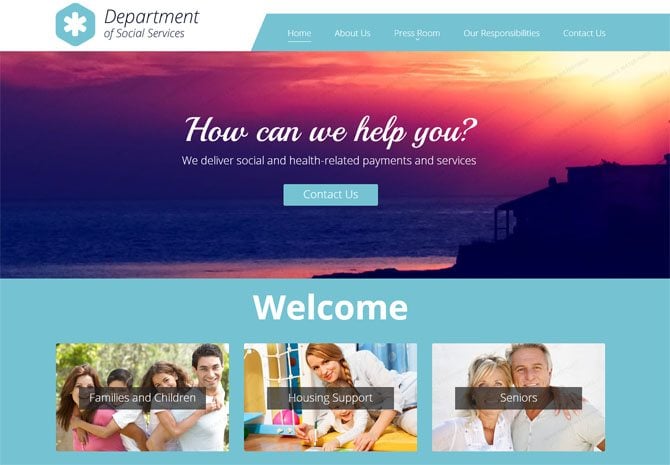
Also, it is equally important to optimize the layout for the mobile version of your website. Simplify the elements, focus on text to make it less confusing for the blurred vision or difficulties with colors and contrast. However, avoid using large amounts of JavaScript and AJAX functionality, as these are not appropriate for blind users who access your web via screen reading technology.
Better color combination
There is one simple rule to follow when it comes to creating the best color combination for them. The background should be clear and muted enough as doesn’t create any noise. In simple words, the font should be a solid color with a respectable amount of contrast. Similarly, the video background needs a little more effort. The best part about the video is that it can differentiate the noise levels and atmosphere through changing scenes. However, to counter this, consider the varied scenes that change throughout the videos.
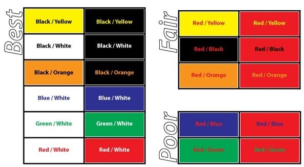
One more point where the use of color should be given full attention is the action items. When designing buttons and notices that need the caller’s attention and require direct interaction, avoid using a color combination that is confusing for the colorblind users. Red, Blue, Green, and Yellow are ideal colors. Make sure that the direct actions elements contain clear visible iconography and text that makes it easy for them to access your website.
Keyboard shortcuts
Keyboard shortcuts can make site navigation for visually impaired users much easier. With the addition of keyboard commands, it is easier to navigate site especially with the use of arrow keys and few keystrokes, and completely eradicating the need to follow mouse cursor across a screen as well as the need to keep shifting visual focus.
This technique reduces eye strain and frustration as most of the visually challenged person surf web on large monitors which actually lead to a lot of head and eye movement, mainly at shorter focus distance. The less time the users have to spend following the cursor, the better it is for them. It is therefore important that
- The tab order is logical
- The focus indicator is visible
- All parts of the website are accessible using the keyboard.
Allow enlarged text
Large text size is often suggested. However, consider offering alternate stylesheet with large font size and unbreakable layouts when the text-only zoom is enabled in the browser.

It has been observed that the majority of the visually impaired users will want to zoom in on the text without changing the layout of the entire site. This could lead to difficulties in scrolling and tracking text over long lines.
Typography is an integral part
The font should be first optimized before being used on the web. With the aim to make type more readable on the web, here a few important factors to consider:
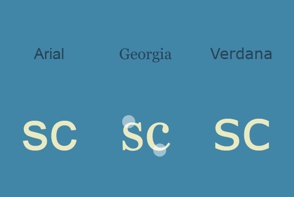
Type size and weight
For the partially sighted, 9-12 pt type is suggested. For the general reader, type size between 8 to 10pt are frequently used. Similarly, medium or semi-bold type weight is more legible. Avoid weights of fonts that appear very light.
Italic
Italic type should not be used for continuous text for any group of readers. It is only used as a means to emphasize important phrase or words. However, this is particularly important if the body text is in a semi-bold form.
Word spacing
It is recommended to use ‘even’ word spacing for visually impaired users.
Capital letters
Text in capital letters is much harder to read than normal-case continuous text. Capital letters are suitable for labels.
Headings
Headings should be clearly differentiated from the main text using a combination of type size, space, and weight. Capitals should not be used for headings. Bold headings are clear as long as there is plenty of contrast between the weight of the text and that of the heading. Extra space around headings helps to differentiate them from the main text.
Paragraphs
Always leave space between paragraphs. There should be more space between paragraphs than between lines.
Line length and line ending
Line length and line ending should be in the range of 50-65 characters. Strictly avoid splitting words at the ends of lines. Visually challenged individuals prefer shorter lines.
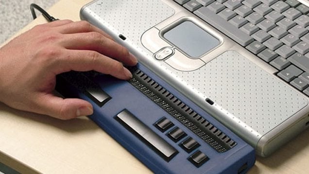
Typography can also be translated to Braille.
Make your image accessible
Although someone cannot see, yet they want to know what the images are and whether they are relevant. When they use the screen reader, the images encounter simply say something along the lines of graphics.

In order to add a brief description of what the image is all about, add the ‘alt’ attribute to the image tag. So instead of only hearing graphics, the users can hear the description as well. This is especially helpful with a page with many graphics and brings relevance to the users.
Also if you want to include links to the images, you can incorporate the name of the link into the ‘alt’ attribute of the image.
The HTML5 animation or Flash media

Active flash can be very distracting for visually impaired users. To access flash, one needs to click on icons or on buttons. But buttons says nothing to a blind person. However, there are alternative flash players which are coded to label these buttons so that when a screen reader users use the button, instead of saying ‘button’ it will say something like ‘full-screen button’. YouTube uses the same technique and this can be great accessibility for any site.
* * *
Nothing is perfect in this world. But if you address certain areas of life that can be changed and accommodate accordingly, you can actually resolve many of your critical issues.
Don’t miss out these all-time favourites
- The best hosting for a WordPress website. Tap our link to get the best price on the market with 82% off. If HostPapa didn’t impress you check out other alternatives.
- Website Installation service - to get your template up and running within just 6 hours without hassle. No minute is wasted and the work is going.
- ONE Membership - to download unlimited number of WordPress themes, plugins, ppt and other products within one license. Since bigger is always better.
- Ready-to-Use Website service is the ultimate solution that includes full template installation & configuration, content integration, implementation of must-have plugins, security features and Extended on-page SEO optimization. A team of developers will do all the work for you.
- Must-Have WordPress Plugins - to get the most essential plugins for your website in one bundle. All plugins will be installed, activated and checked for proper functioning.
- Finest Stock Images for Websites - to create amazing visuals. You’ll get access to Depositphotos.com to choose 15 images with unlimited topic and size selection.
- SSL Certificate Creation service - to get the absolute trust of your website visitors. Comodo Certificate is the most reliable https protocol that ensures users data safety against cyber attacks.
- Website speed optimization service - to increase UX of your site and get a better Google PageSpeed score.

Eric Haskell has over 15 years of experience in web development, programming, e-commerce, and business strategy experience. He also contributes articles for MonsterPost. He focuses on solutions that merge current technologies, applications, and concepts together to help each client meet their goals with success.
Get more to your email
Subscribe to our newsletter and access exclusive content and offers available only to MonsterPost subscribers.

Leave a Reply
You must be logged in to post a comment.