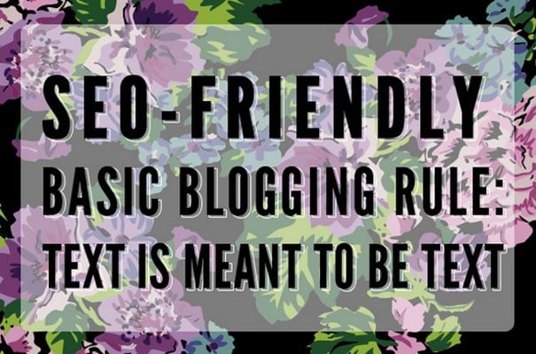
Design superiority effect occurs when you combine text and visuals together to enhance audience retention of your message. Although not every visual needs to utilize text, text, especially, in stand-alone presentations can enhance a slide, add value to the cohesive look and communicate a more impacting message. The pattern of blending text with images or text on top of background images can provide contextually rich and emotionally engaging experience.
Few years back, web designers had the constraints of using smaller images because of bandwidth issues, however, with the advent of new technologies, connection speeds and screen densities have rapidly improved, and now they’re much more opened to use larger images along with texts.
Design decision associated with this method is important to consider, and therefore, developing best practices to govern this technique is imperative to produce high-quality design. To prevent images being lost or text becomes muddled, or both, let the words state and images express properly. Let us find out how text and images can be harmonized to balance the readability of both.
Balancing contrast by color and brightness

Using images that have significant contrast with text or vice versa is important. For instance, darkening images with filters or using darker images with lighter text, or overlay elements can be effective ways to utilize contrast in your design. To achieve the perfect balance of color and brightness, following are some of the important tips to remember
- Contrast does not always means dark versus light; even complementary colors can also provide soothing and natural contrast
- Use overlay or edit an image if it is complex and fully in focus. These techniques will likely be the most effective option
- The contrast is probably off, you can’t see the letterforms.
Try the visual flow
The visual flow of an image is an important part when it comes to working with text and images. Here are a few steps to follow while working with visual flow
- Never put text over important parts of an image including main action in a photo, product you’re trying to showcase or main action in a photo.
The above example is a typical bad example for placing text over image.
The text finds its ideal space in the above example.
- Look for ideal space for text where the subject of the image would fit.
Balance contrast through positioning and sizing
If you want to improve the contrast of an image in relation to a text, adjusting the color is not the only thing that can help. The right size and position of the text with relation to the focused elements of the image is important. This is essential for better readability of text. For instance, if your image comprised of a large sky, where you have adequate area to place the text, a much readable position of the text would be obviously in the sky rather than in the center of the image where the skyline appears.
Use of color cast
Using color casting is an effective way for images to allow for text placement. Color cast enable you to opt for color that has high visual interest. This is used to balance the overlay color transparent for the image to show through, but not so transparent that the text becomes difficult to read.
Utilize depth of field for better readability

You must choose those images that utilizes depth of field. This technique allow a smoother backdrop for placing the text, and most importantly increase readability. To obtain the best results, place your text on the ‘out-of-focus’ portion of the image and ensure that the text color contrasts well with the primary color of the out-of-focus area.
When there is one concept, one image without any space
You might have a relatively busy image you’d like to use in your slide. There is no specific detail in the image that can be showcased. What will be your next step to blend text and image perfectly?
- Adjust the brightness and exposure of the image and place one large word over the picture. This method might work well with a typeface like Intro, but might not work well with a typeface that has a thinner weight
- Add some appropriate shadow to differentiate the text from the background
- Adjust the opacity of the text
- If you want to use a font with thinner weight, you need a supporting shape that helps you place a shape behind the text. This is an option to blend the text and image.
Choosing the right image subject

Choosing generic imagery is of no help when you want to communicate something important to the audiences. Consider the following factors while using images
- Consider the emotional elicitation and context of the image. This relates to the tone of the message that the image want to convey
- Ignore images that have weak point of focus
- Clarity of the image is important. If the image is more of conjuring feeling and less about the details, you can use filters or heavy overlays without losing the effectiveness of the image
- Choosing images that show a full sentence is essential. This help users’ see the image subject clearly and understand the action that the image want to portray.
Put text in the background

Background plays a crucial role than the foreground when it comes to placing the text and image. Typically backgrounds are less busy and easier to work when placing the text. Most importantly, backgrounds often have single color, creating an ideal location where text color is easy to figure out and easier to read. Background provides a natural looking placement that does not require you to make much alterations to the main image. Subtle shading effects for text placement adds an element of depth to the image.
Besides, it is important to use simple typography and a straightforward image for the best outcome. Your image should get highlighted without any obstruction and your text should be clearly readable.
Don’t miss out these all-time favourites
- The best hosting for a WordPress website. Tap our link to get the best price on the market with 82% off. If HostPapa didn’t impress you check out other alternatives.
- Website Installation service - to get your template up and running within just 6 hours without hassle. No minute is wasted and the work is going.
- ONE Membership - to download unlimited number of WordPress themes, plugins, ppt and other products within one license. Since bigger is always better.
- Ready-to-Use Website service is the ultimate solution that includes full template installation & configuration, content integration, implementation of must-have plugins, security features and Extended on-page SEO optimization. A team of developers will do all the work for you.
- Must-Have WordPress Plugins - to get the most essential plugins for your website in one bundle. All plugins will be installed, activated and checked for proper functioning.
- Finest Stock Images for Websites - to create amazing visuals. You’ll get access to Depositphotos.com to choose 15 images with unlimited topic and size selection.
- SSL Certificate Creation service - to get the absolute trust of your website visitors. Comodo Certificate is the most reliable https protocol that ensures users data safety against cyber attacks.
- Website speed optimization service - to increase UX of your site and get a better Google PageSpeed score.

Diving into debts of web design is my real passion. Getting along with new tools and finding useful tricks is more than just a hobby. Let me lead you through the website design ways.
Get more to your email
Subscribe to our newsletter and access exclusive content and offers available only to MonsterPost subscribers.

Leave a Reply
You must be logged in to post a comment.