A Well Designed Interface … What Should It Look Like?
Some of our readers will imagine a user-friendly interface straight off. It’s really not complex. The key element of any awesome interface is its simplicity. Such approach works well both for business and users.
Today, the term of UI is frequently related to user experience or UX. These ties are impossible to break as UI and UX are interdependent (if we are talking about really good UI which brings high conversion to site owner and enjoyment to the customer).
Do we need to write the definition of user experience design? Sure, no problem.
UXD is the process of enhancing customer satisfaction and loyalty by improving the usability, ease of use and pleasure provided during the interaction between the customer and the product. In fact, UXD includes content, usability, UI design and user interaction design. While users interface design (UID) is a process of visually guiding the user through the product’s interface via interactive elements and across all sizes/platforms. UID is aimed on brand’s strong points and visual assets transference to product’s interface as to best enhance the user’s experience.
There are several common myths around UX and UI. Why not busting some of them right now? This info will help you create UIs for the customers, UIs that sell.

- As you see from the above mentioned UX & UI are not the same.
- Site owner and site user are absolutely different people, with different tastes, preferences, mentality, goals and so on. Here comes the conclusion: things that make you happy won’t do the same to your customer. On the contrary, they may even irritate or scare them away.
- When user enters your site they not necessarily know what they want. It’s your chance – prompt the idea!
- UX doesn’t come to an end when the user leaves your site. They continue to test the purchased product or service for a certain period of time after that. If the items meet their requirements, people become your loyal customers, which is the goal of any company.
- UX practices that work for one group of people very often don’t fit another. It’s important to target your design efforts, then they will be much more profitable.
- Even UX gurus don’t know everything. Each case is unique, so you’d better experiment and find your own strategy.
- Don’t put all your hopes on SEO. SEO is a way to bring visitor on website, but they will leave if the website doesn’t hold them. Design and behavior of a website are musts if you want to sale more.
Now, here is the next step: some practical ideas on how to create a user-oriented interface.
User Interface and User Experience Design Tips
- Collect as much information as possible about the targeted customer.
- The world is changing so quickly, the users are changing too. You should never forget about that. Design your interface to be convenient for sensor surfaces (big buttons, infinite pages, simple forms, readable fonts, etc.).
- Use self-learning techniques for your appliances, don’t make the user learn.
- Clear content architecture is a sign of good interface. Guide user’s attention, involve them unobtrusively, leave clear notions of what they are to do next.
- Wireframing is essential. You won’t go travelling without a map, will you? Just make a plan and follow it. This will save your time and help reach better results.
- Prototype your interface and test it on all your friends, relatives or unsuspecting strangers who suit your targeted group criteria. Prototyping is cheap and quick, however, it will show all the interaction flaws.
- Front-end design should look appealing and convey the corporate feel.
- Always apply user testing and fine tuning instead of gut feeling.
- Search for patterns in facts and figures of analytical reports.
- Merge similar functions instead of fragmenting the UI. Don’t put a strain on your customers as the more UI fragmentation there is the higher learning curve they will have to deal with.
- Don’t blur styles of your clickable / selected actions (links, buttons, chosen items). They should be distinct from the plain text and applied consistently across the interface. Use visual styling such as color, depth and contrast to help people understand the fundamental language of navigating your interface.
- Fewer form fields. Remember that each field you ask for increases the risk of making your visitors give up.
- Avoid inserting too many links. It’s better to keep your visitor focused. Keep in mind that trying to meet all customers’ needs at once is impossible and all those links not only affect SEO badly, but take the visitors away from what you’ve been hoping them to do.
- It’s better to use task based action buttons for interface areas not requiring to be that convincing and use benefit buttons (the benefit can also be placed close to the action button) to boost conversions.
- Asking visitors to perform the task through which something of value is demonstrated is much better than asking for immediate sign up. Once users see your product’s value, they become more inclined to sharing their personal information.
- Decrease the amount of learning people have to go through as they use your interface or product, stick to consistency in UI design.
Just let this sink in for a minute … And bust a few more, this time UI myths, ad interim

- UI is not a decoration; all its elements serve some purpose.
- Everything not necessarily should be above the fold. If the content is interesting, users scroll down willingly.
- Believe us – shortcuts don’t always work. So, maximal distance to any information on site shouldn’t be three clicks only.
- Home page is important, but this doesn’t mean that you can neglect other pages design.
- Auto movements are not always good. When the user interacts with website’s elements, it adds interest and the chances to involve them into further browsing.
OK, let’s continue our story on efficient user interface design principles
- Always start the design from small screen. More and more people use their mobile phones to surf the internet, so placing mobile approach first is a smart solution.
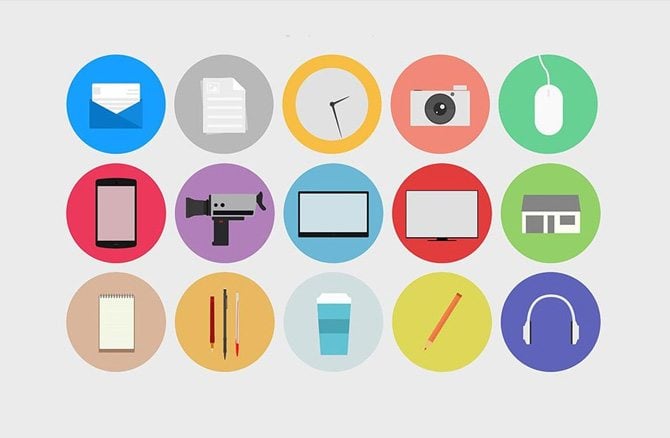
- It’s a well-known fact that Microsoft metro interface with its bold effort to create one style that fits either desktop computers or touch screen devices can be called a revolution in web design. People like these flat colored blocks with sketchy icons that respond each user’s action and are so easy to navigate. Why not to use metro-style as a source for inspiration, improve, modify it?
- Google with its material design concept has become a web fashion trend setter. We recommend you to study its interaction standards.
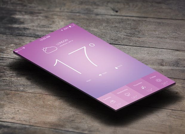
- Skeuomorphic interfaces today seem rather odd to modern generation. Minimalism, flat elements, circles, outlined images look much more natural.
- Big typography that is easy to read, huge quality photos, noticeable social media buttons are serious trends worth taking into consideration.
- HTML 5 powered designs will suit for every device, that is, provide the needed responsiveness to your website.
- Use interactive videos, unusual loading techniques, storytelling, annotations, responsive infographics, parallax effect to make the user’s trip over your site unforgettable.
Have you heard enough advice for now? Then, let’s wrap it up!
Which details are crucial for decent interface design? Give your visitors moments of delight through micro interactions. Choose colors thoroughly – hues and tints influence user’s mood greatly and create the atmosphere on site. Mind the typography – it helps to convey main company message, corporate feel and style. Making animations and transitions intuitive and natural (the objects shouldn’t spring out like monsters in horror movies). Think well how to communicate main idea through visual elements as picture is worth a 1000 words. Focus on usability as no matter how beautiful your interface is, it makes no sense until it’s not a piece of cake. Don’t forget about content strategy touchpoints such as notifications, social media presence and others.
If you have more helpful tips, life hacks, comments or additions on fine interface design, please leave them at the feedback section below.
Don’t miss out these all-time favourites
- The best hosting for a WordPress website. Tap our link to get the best price on the market with 82% off. If HostPapa didn’t impress you check out other alternatives.
- Website Installation service - to get your template up and running within just 6 hours without hassle. No minute is wasted and the work is going.
- ONE Membership - to download unlimited number of WordPress themes, plugins, ppt and other products within one license. Since bigger is always better.
- Ready-to-Use Website service is the ultimate solution that includes full template installation & configuration, content integration, implementation of must-have plugins, security features and Extended on-page SEO optimization. A team of developers will do all the work for you.
- Must-Have WordPress Plugins - to get the most essential plugins for your website in one bundle. All plugins will be installed, activated and checked for proper functioning.
- Finest Stock Images for Websites - to create amazing visuals. You’ll get access to Depositphotos.com to choose 15 images with unlimited topic and size selection.
- SSL Certificate Creation service - to get the absolute trust of your website visitors. Comodo Certificate is the most reliable https protocol that ensures users data safety against cyber attacks.
- Website speed optimization service - to increase UX of your site and get a better Google PageSpeed score.

Experienced writer passionate about highlighting all the topics related to web, design, marketing, SEO, and more. Follow Helga on Quora.
Get more to your email
Subscribe to our newsletter and access exclusive content and offers available only to MonsterPost subscribers.

Leave a Reply
You must be logged in to post a comment.