A Worthy Guide To Create Ravishing Typography With jQuery And CSS3
With the ever fluctuating web trends, keeping a website design well-updated is not an easy pie. But since, it is essential to have a riveting design for attaining a sustainable success in the industry, web designers usually consider multiple aspects like logo design, navigation, tone of the site, and so forth, however, end up overlooking their websites' typography.
The significance of a visually appealing web design is not hidden from anyone now. To make a website highly usable and readable, designers are required to emphasize on various design aspects, including typography. This is so because the majority of web content includes text. Therefore, to improve the legitimacy of a site, it is imperative to work on web fonts and make them attractive and easily readable.
Further, the latest technologies – CSS3 and jQuery have enabled designers to embrace aesthetic typography effects without compromising on the design usability. By appropriately using these technologies, one can efficiently create a captivating look and feel.
In this post, I will include a thorough guide that exposes the ultimate way to implement jQuery and CSS3 for creating stunning typography effects. Let's explore.
Beginning with The HTML
First things first, you will need to create a basic HTML markup structure with a div element, including anchor tag, to wrap up a desired headline. For this you can use implement the following lines of code. This is a basic markup that doesn't include any styling.
Code Snippet for HTML:
1 2 3 4 5 | <div id="letter-effects" class="letter-effects"> <h3> <a href="#">Lovely Effects</a> </h3> </div> |
How to add animation effects to typography
There are methods available with which you can add desired animation effects in your typography. These are CSS3 Keyframe Animations and a jQuery plugin. Let's delve deep into the implementation of both the methods.
1. CSS3 Keyframe Animations
Also popular as CSS3 @Keyframe Rule, CSS3 Keyframe Animations allow web designers to efficiently breakthrough the real-time designing issues. With this approach, you can create keyframes to easily handle the middle steps of the animation sequences. This method, thus, helps webmasters to design smooth and flawless animation effects. Unlike conventional techniques, this method doesn't offer script-driven animation effect. Therefore, you can use this methodology to smoothly transform typography from one form to another.
@Keyframe rule
For implementing this method, first you will need to create @Keyframe rule and give it a name. Using this rule, you can define the animation code and transform a CSS sequence to another with a flair.
Here is the syntax of @rule.
1 2 3 | @keyframes effects{ /* rule sets go here … */ } |
Keyframe Selectors
If you want to embed additional rules within your @Keyframe rule, the Keyframe selectors make a great choice.
It can be used in the following way.
1 2 3 4 | @keyframes effects{ 0% { … } 50% { … } } |
As, mentioned above, the animation is being divided into various levels from 0% to 100%. Each level specifies certain animation state. For instance,
0% level = animation is beginning
33% to 63% level = intermediate state of animation
100% level = end of the animation
PS – Kindly note that, to make your animation easily compatible with the popular browsers, one must define 0% selector as well as 100% selector.
Furthermore, to easily control the complete appearance of your animation, you can implement the animation properties. Like, if you want to give a certain name to your animation, you may use the following lines of code.
1 2 3 | .letter-effects h3 a span { animation-name: effects; } |
In this code, I have changed the name of the animation by using the animation-name property of the @Keyframe rule. It is imperative to ensure that the name property must be kept in synchronization with the identifier, included in the @Keyrame rule.
Other than the animation-name, there are several other animation property. And, keyframe-selector is another property that can be used for the including the animation duration.
2. A jQuery Plugin - Lettering.js
Lettering.js is a jQuery plugin that enables designers to create animation effects in typography. With this lightweight plugin, you can proficiently create innovative letters and words. Although CSS offers great styling features, but it is not capable of styling the letters. For this reason, this plugin is lauded by the designers' community for its blissful feature of handling the web fonts.
Let's ponder into an example that implements the two methods explained in this tutorial for crating typography effects.
HTML Part
1 2 3 4 5 6 7 8 9 10 11 12 13 14 15 16 17 18 | <!DOCTYPE html> <html> <head> <meta charset="UTF-8"> <title>A Worthy Guide To Create Ravishing Typography With jQuery And CSS3</title> </head> <body> <div id="letter-effects" class="letter-effects"> <h3> <a href="#">Lovely Effects</a> </h3> </div> <script type="text/javascript" src="http://ajax.googleapis.com/ajax/libs/jquery/1.11.2/jquery.min.js"></script> <script type="text/javascript" src="js/jquery.lettering.js"></script> </body> </html> |
CSS Part
1 2 3 4 5 6 7 8 9 10 11 12 13 14 15 16 17 18 19 20 21 22 23 24 25 26 27 28 29 30 31 32 33 34 35 36 37 38 39 40 41 42 43 44 45 46 47 48 49 50 51 52 53 54 55 56 57 58 59 60 61 62 63 64 65 66 67 68 69 70 71 72 73 74 75 76 77 78 79 80 81 82 83 84 85 86 87 88 89 90 91 92 93 94 95 96 97 98 99 100 101 102 103 104 105 106 107 108 | .letter-effects { padding: 50px 0; } .letter-effects h3 { text-align: center; font-family: Arial; letter-spacing: 2px; } .letter-effects h3 a { font-size: 100px; line-height: 100px; display: block; text-decoration: none; color: transparent; } .letter-effects h3 a span { color: #1571c7; opacity: 1; -webkit-transition: all 0.3s infinite; -moz-transition: all 0.3s infinite; transition: all 5s infinite; -webkit-animation: effects 4s infinite backwards; -moz-animation: effects 4s infinite backwards; animation: effects 4s infinite backwards; } .letter-effects h3 a span:nth-child(1) { -webkit-animation-delay: 0s; -moz-animation-delay: 0s; animation-delay: 0s; } .letter-effects h3 a span:nth-child(2) { -webkit-animation-delay: 0.1s; -moz-animation-delay: 0.1s; animation-delay: 0.1s; } .letter-effects h3 a span:nth-child(3) { -webkit-animation-delay: 0.2s; -moz-animation-delay: 0.2s; animation-delay: 0.2s; } .letter-effects h3 a span:nth-child(4) { -webkit-animation-delay: 0.3s; -moz-animation-delay: 0.3s; animation-delay: 0.3s; } .letter-effects h3 a span:nth-child(5) { -webkit-animation-delay: 0.4s; -moz-animation-delay: 0.4s; animation-delay: 0.4s; } .letter-effects h3 a span:nth-child(6) { -webkit-animation-delay: 0.5s; -moz-animation-delay: 0.5s; animation-delay: 0.5s; } .letter-effects h3 a span:nth-child(7) { -webkit-animation-delay: 0.6s; -moz-animation-delay: 0.6s; animation-delay: 0.6s; } .letter-effects h3 a span:nth-child(8) { -webkit-animation-delay: 0.7s; -moz-animation-delay: 0.7s; animation-delay: 0.7s; } .letter-effects h3 a span:nth-child(9) { -webkit-animation-delay: 0.8s; -moz-animation-delay: 0.8s; animation-delay: 0.8s; } .letter-effects h3 a span:nth-child(10) { -webkit-animation-delay: 0.9s; -moz-animation-delay: 0.9s; animation-delay: 0.9s; } .letter-effects h3 a span:nth-child(11) { -webkit-animation-delay: 1s; -moz-animation-delay: 1s; animation-delay: 1s; } .letter-effects h3 a span:nth-child(12) { -webkit-animation-delay: 1.1s; -moz-animation-delay: 1.1s; animation-delay: 1.1s; } .letter-effects h3 a span:nth-child(13) { -webkit-animation-delay: 1.2s; -moz-animation-delay: 1.2s; animation-delay: 1.2s; } .letter-effects h3 a span:nth-child(14) { -webkit-animation-delay: 1.3s; -moz-animation-delay: 1.3s; animation-delay: 1.3s; } @keyframes effects { 0% { opacity: 0; text-shadow: 0px 0px 100px #000;} 50% { opacity: 1; text-shadow: 0px 0px 2px #000; } } @-moz-keyframes effects { 0% { opacity: 0; text-shadow: 0px 0px 100px #000 } 50% { opacity: 1; text-shadow: 0px 0px 2px #000; } } @-webkit-keyframes effects { 0% { opacity: 0; text-shadow: 0px 0px 100px #000;} 50% { opacity: 1; text-shadow: 0px 0px 2px #000; } } } |
JavaScript Part
1 2 3 4 5 | <script type="text/javascript"> $(function() { $("#letter-effects a").lettering(); }); </script> |
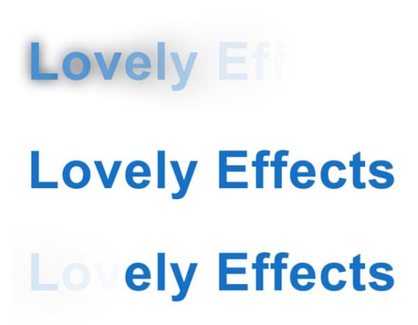
Output:
Final Thoughts
I hope this tutorial will help you create an impeccable animation effect in your web typography and lend an exquisite look and feel to your website. There are two techniques explained in this guide, you may choose a desirable one as per your needs.

Posting contributed articles about the major web design highlights and novelties. Come across a handful of useful tutorials and guides shared by experts in the web design and online marketing fields.
Get more to your email
Subscribe to our newsletter and access exclusive content and offers available only to MonsterPost subscribers.

Leave a Reply
You must be logged in to post a comment.