Get more to your email
Subscribe to our newsletter and access exclusive content and offers available only to MonsterPost subscribers.
From was successfully send!
Server error. Please, try again later.

Wordpress / Elementor
Step-by-Step Instructions on How to Create a Blog with Elementor and Monstroid2
01 September 2021
14K
How to Optimize Images for 10x Faster WordPress Product Pages
21 March 2024
586
Winners of Monster’s Award 2023 Announced!
26 December 2023
2K
Build a Charity Website: 30+ Best WordPress Themes for Nonprofits
07 April 2023
10K
40+ Best Drag and Drop WordPress Themes that Stand Out
06 April 2023
9K
Presentation
Best Digital Products Award 2023 – Honored by TemplateMonster
27 December 2023
13K
Making a Successful Presentation: How to Print Google Slides with Notes
02 February 2022
11K
15 Clever Color Combinations that Make Your Presentation Professional
31 January 2022
41K
E-commerce
Best Shopify Jewelry Stores – Shining Brighter than Diamonds
19 May 2023
20K
40 Outstanding Fashion Shopify Themes
19 May 2023
9K
Best Electronic Technology Store WooCommerce Themes
19 May 2023
7K
Useful stuff
How to Build & Maintain Elementor WordPress Website?
Choose this free course if you want to create an Elementor WordPress website! We’ll tell you how to maintain it and share our experience!
Learn More
Free landing Page Building Course
Landing pages are the best solution for any kind of business. Learn step-by-step how to build and promote them in our ultimate course!
Learn More
Shopify Online Store Creation from Ground Up Free Course
Do you want to create Shopify online stores? Or, would you like to polish your skills on this? Then, hurry to subscribe to this course!
Learn More
How to Build and Maintain an HTML5 Website? Free Course
Everything and more about HTML5 websites are waiting for you in this course. Subscribe and learn how to build and maintain them!
Learn More
Ultimate Gutenberg Editor Learning Course
Master the Gutenberg Editor with us! In this course, we’ve gathered the most detailed tutorials on how to do it on real examples.
Learn More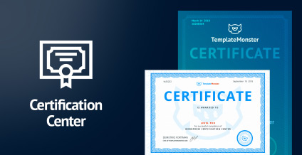
Certification Center For web-developers and web-studios
Hey, developers! Certification Center by TemplateMonster is a way to approve your professional skills and power CVs. Plus, it’s fully free! Check it!
Learn More