Material UI Typography: 20 Free Alternatives to Material Fonts
Material UI Typography. Everybody heard about Material design style. That’s not surprising as it’s a current trend. More and more websites today go material. It’s more a demand of time if you want your company website look up to date and appealing on all popular gadgets.
Would you like to refresh the definition, main goals and principles of material design in your memory? You shouldn’t even ask about that, we are always here for your service.
Material design can be called a kind of visual language invented specifically for the users. It combines the classic principles of good design with the innovations and new advanced possibilities of technology and science.
Main goal of material design is to develop a single basic system that allows for a unified experience across multiple platforms and device screens of any sizes. You can’t but agree that mobile first principles should be fundamental here, but touch, voice, mouse, and keyboard are also all <u+fb01>rst-class input methods.</u+fb01>
As you understand, the word material in “Material UI Typography” phrase is metaphoric. Actually it implies the unifying theory of a rationalized space usage and a system of motion. Notwithstanding the fact that material design is grounded in tactile reality, it is also inspired by the study of paper and ink. It is technologically advanced and open to creativity and imagination that work magic.
Surfaces and edges of the material world provide visual cues that have their analogues in reality. The employment of familiar tactile attributes helps users quickly understand their appropriations. Yet, it should be mentioned that the flexibility of the material objects creates new affordances that greatly outstrip those in the physical world, without breaking any postulates of physics.
The fundamentals of light, surface, and movement are taken as the key ones to convey how objects move, interact, and exist in virtual environments and in relation to each other. Realistic lighting doesn’t hide seams; it divides space, and indicates moving parts.
Typography, grids, space, scale, color, and imagery are foundational elements of print-based design, so they guide visual treatments. They play a much more important role than just feasting the visitor’s eye. Their arrangement creates hierarchy, meaning, and focus. Thorough color choices, edge-to-edge imagery, large-scale typography, and intentional white space create those bold and graphic interfaces that immerse the user and give them a better experience.
An emphasis on call-to-actions makes core functionality immediately apparent and provides clear waypoints for the user.
Motion in material designs appeals to the user as the prime mover. Primary user’s actions are inflection points that initiate motion and cause the transforming of the whole design.
All actions take place in a single environment. The objects are presented to the user without breaking the continuity of experience even when they transform and reorganize.
Motion is meaningful and appropriate. It serves to focus attention and maintain continuity. Feedback is subtle yet clear. Transitions are ef<u+fb01>cient yet coherent.</u+fb01>
Now, when we have briefly summarized main goals and principles of material design, we can pass to Material UI Typography. Content stays the king no matter what design style do you prefer and material web design trend is not an exception either. In fact, there are only two “material fonts” for the moment. You know them as ‘Roboto’ and ‘Noto’ fonts. But we've picked 20 material design free fonts alternatives available for free download. They look rather similar, that’s the truth. However, all 20 free alternatives to material fonts will perfectly fit your material-style designs. You can download each font separately clicking its number at the bottom of the image you see below.
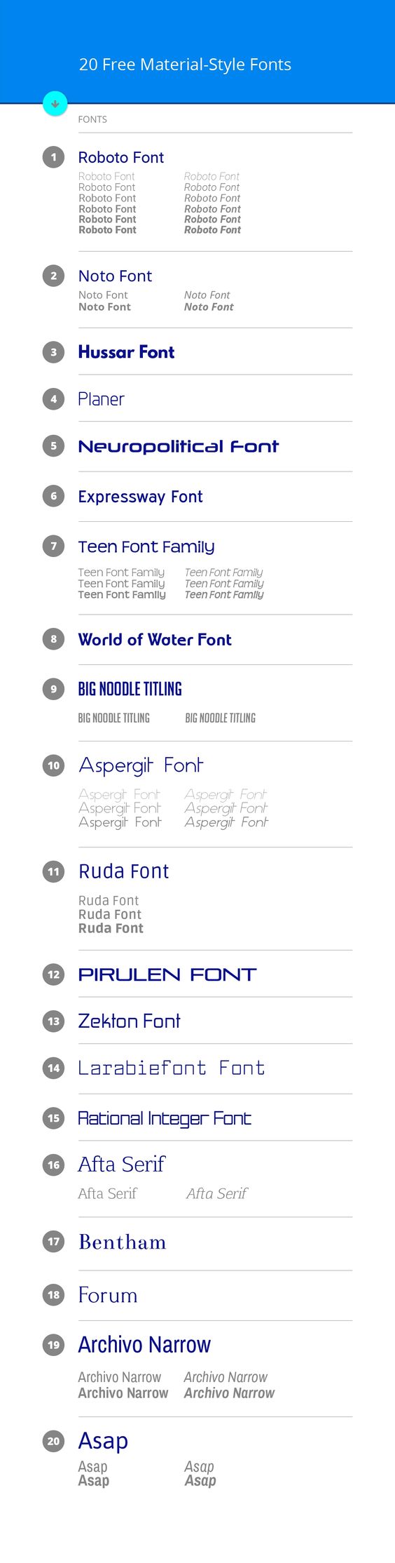
1, 2, 3, 4, 5, 6, 7, 8, 9, 10, 11, 12, 13, 14, 15, 16, 17, 18, 19, 20.
* * *
And now my favorite moment has come at last. It’s time for a small chat! You have just viewed our collection of free alternatives to material style fonts and we would like to know what do you think about them. Do you like material web design style? Do you stick to it? Will you use any of the featured fonts in your designs? Do you consider this article useful? Speak up! Your feedback is welcome as always!
7 Typography Mistakes - Checklist

Experienced writer passionate about highlighting all the topics related to web, design, marketing, SEO, and more. Follow Helga on Quora.
Get more to your email
Subscribe to our newsletter and access exclusive content and offers available only to MonsterPost subscribers.

Leave a Reply
You must be logged in to post a comment.